Row Responsive Options

Create ultra-responsive pages using row responsive functionality

Understanding how important it is for our customers to create responsive and nice looking pages on any device, we’ve developed the row responsive functionality.Row responsive options are the perfect solution for creating the responsive pages easily even without coding skills.

In this section, you are able to set any margin, border, or padding for the row on different devices, whether it is desktop, tablet or mobile.

Navigate to row settings section by clicking on the Edit button in the top right corner of each row you may reveal the row settings window and open the Responsive options tab.

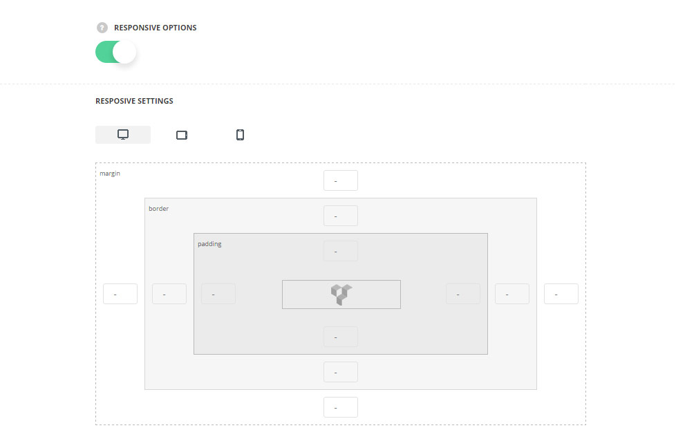
  • Responsive options  –  switch it to Enable to customize the row settings for different devices.
  • Desktop – set the desired margins, borders, and paddings for the row for the screen resolutions from 1280px to 1025px.
  • Tablet – set the desired margins, borders, and paddings for the row for the screen resolutions from 1024px to 800px.
  • Mobile – set the desired margins, borders, and paddings for the row for the screen resolutions less than 800px.
div#stuning-header .dfd-stuning-header-bg-container {background-image: url(https://nativewptheme.net/support/wp-content/uploads/2017/01/hands1.jpg);background-size: cover;background-position: center center;background-attachment: initial;background-repeat: no-repeat;}#stuning-header div.page-title-inner {min-height: 550px;}#main-content .dfd-content-wrap {margin: 0px;} #main-content .dfd-content-wrap > article {padding: 0px;}@media only screen and (min-width: 1101px) {#layout.dfd-portfolio-loop > .row.full-width > .blog-section.no-sidebars,#layout.dfd-gallery-loop > .row.full-width > .blog-section.no-sidebars {padding: 0 0px;}#layout.dfd-portfolio-loop > .row.full-width > .blog-section.no-sidebars > #main-content > .dfd-content-wrap:first-child,#layout.dfd-gallery-loop > .row.full-width > .blog-section.no-sidebars > #main-content > .dfd-content-wrap:first-child {border-top: 0px solid transparent; border-bottom: 0px solid transparent;}#layout.dfd-portfolio-loop > .row.full-width #right-sidebar,#layout.dfd-gallery-loop > .row.full-width #right-sidebar {padding-top: 0px;padding-bottom: 0px;}#layout.dfd-portfolio-loop > .row.full-width > .blog-section.no-sidebars .sort-panel,#layout.dfd-gallery-loop > .row.full-width > .blog-section.no-sidebars .sort-panel {margin-left: -0px;margin-right: -0px;}}#layout .dfd-content-wrap.layout-side-image,#layout > .row.full-width .dfd-content-wrap.layout-side-image {margin-left: 0;margin-right: 0;}