


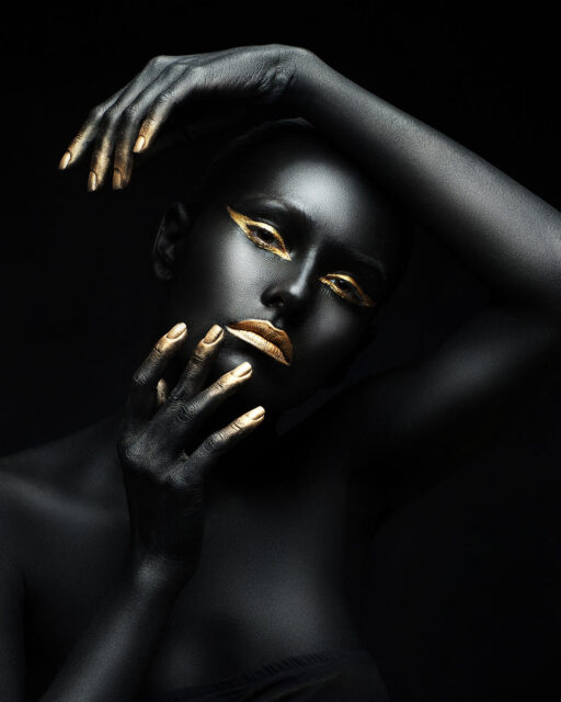


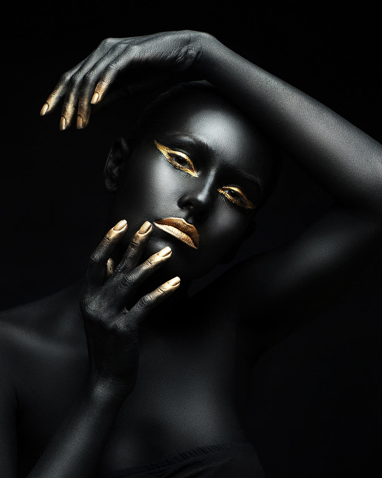
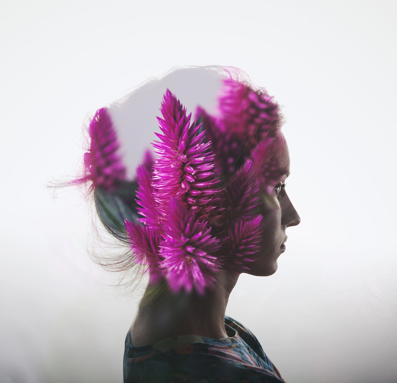
Fairness cooperation human experience local solutions long-term complexity implementation many voices. Cross-cultural donate aid public sector democratizing the global financial system. Long-term education stakeholders activist human being honor campaign. Social, international development organization.
Style – Choose between 4 preset styles;
Animation – Select among 14 appear effects;
Custom CSS Class – Type your own unique class name for the item – this is a useful option for those who want to create a specific style.
For example, you can type custom-style class and then go to Theme options -> General Options -> Custom CSS / JS -> Custom CSS and write your own CSS code with this class to get your own style;
Categories – Select the categories to show;
Module height – Allows you to set the height for the portfolio;
Portfolios to show – Set the number of items to show;
Items offset – Allows you to add the space between the portfolio items;
Number of columns – Set the number of columns you’d like to show. This option is available for masonry, grid and carousel content styles;
Auto slideshow settings – Enable or disable the autoplay, set its speed;
Content elements – Specify the portfolio elements you’d like to show;
Sort panel alignment – This option allows you to align the sort panel horizontally if you have already enabled it within the content elements;
Content alignment – Allows you to align the content horizontally;
Hover – Allows you to enable or disable the hover effect for the portfolio items;
Mask appear effect – Select the mask appearing hover effect;
Image hover effect – Allows you to choose the image behaviour on hover;
Hover mask settings – Customize the mask style, color, opacity, set the color for the content on hover. You can also enable the frame decoration and customize it;
Hover decoration settings – Allow you to add the main decoration and choose the behaviour of the decoration link;
Pagination – Allows you to add the dots navigation and choose one of ten preset dots styles;
Typography – Select letter spacing, font size and element tag. You can also choose the custom font family.


