Spacer

Add the spaces between the elements easily

Spacers are one of the simplest but important modules for creating the pages. It allows you to add the spaces between the images and thus control the displaying of them.

General settings
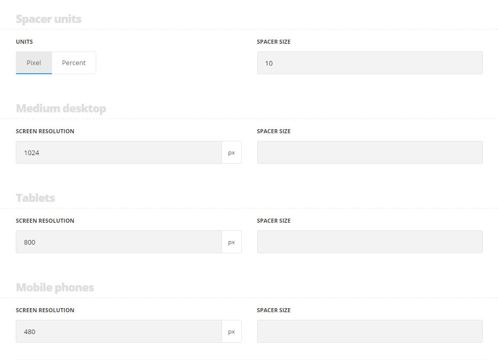
Spacer units
  • Units – select the units for the spacer. You may use pixels and percents.
  • Spacer size – the first size of the spacer is always set in pixels.
Medium screen
  • Screen resolution – set the resolution of the device to be able to set the spacer size for this resolution
  • Spacer size – set the spacer size. It may be used in either in pixels or in percents (in case you are using percents, they will be calculated according to the initial spacer size set in pixels).
Tablets
  • Screen resolution – set the resolution of the device to be able to set the spacer size for this resolution
  • Spacer size – set the spacer size. It may be used in either in pixels or in percents (in case you are using percents, they will be calculated according to the initial spacer size set in pixels).
Mobile phones
  • Screen resolution – set the resolution of the device to be able to set the spacer size for this resolution
  • Spacer size – set the spacer size. It may be used in either in pixels or in percents (in case you are using percents, they will be calculated according to the initial spacer size set in pixels).
div#stuning-header .dfd-stuning-header-bg-container {background-image: url(https://nativewptheme.net/support/wp-content/uploads/2017/01/hands1.jpg);background-size: cover;background-position: center center;background-attachment: initial;background-repeat: no-repeat;}#stuning-header div.page-title-inner {min-height: 550px;}#main-content .dfd-content-wrap {margin: 0px;} #main-content .dfd-content-wrap > article {padding: 0px;}@media only screen and (min-width: 1101px) {#layout.dfd-portfolio-loop > .row.full-width > .blog-section.no-sidebars,#layout.dfd-gallery-loop > .row.full-width > .blog-section.no-sidebars {padding: 0 0px;}#layout.dfd-portfolio-loop > .row.full-width > .blog-section.no-sidebars > #main-content > .dfd-content-wrap:first-child,#layout.dfd-gallery-loop > .row.full-width > .blog-section.no-sidebars > #main-content > .dfd-content-wrap:first-child {border-top: 0px solid transparent; border-bottom: 0px solid transparent;}#layout.dfd-portfolio-loop > .row.full-width #right-sidebar,#layout.dfd-gallery-loop > .row.full-width #right-sidebar {padding-top: 0px;padding-bottom: 0px;}#layout.dfd-portfolio-loop > .row.full-width > .blog-section.no-sidebars .sort-panel,#layout.dfd-gallery-loop > .row.full-width > .blog-section.no-sidebars .sort-panel {margin-left: -0px;margin-right: -0px;}}#layout .dfd-content-wrap.layout-side-image,#layout > .row.full-width .dfd-content-wrap.layout-side-image {margin-left: 0;margin-right: 0;}