This section allows you to style the default buttons on your site, e.g. Submit Comments button, etc.
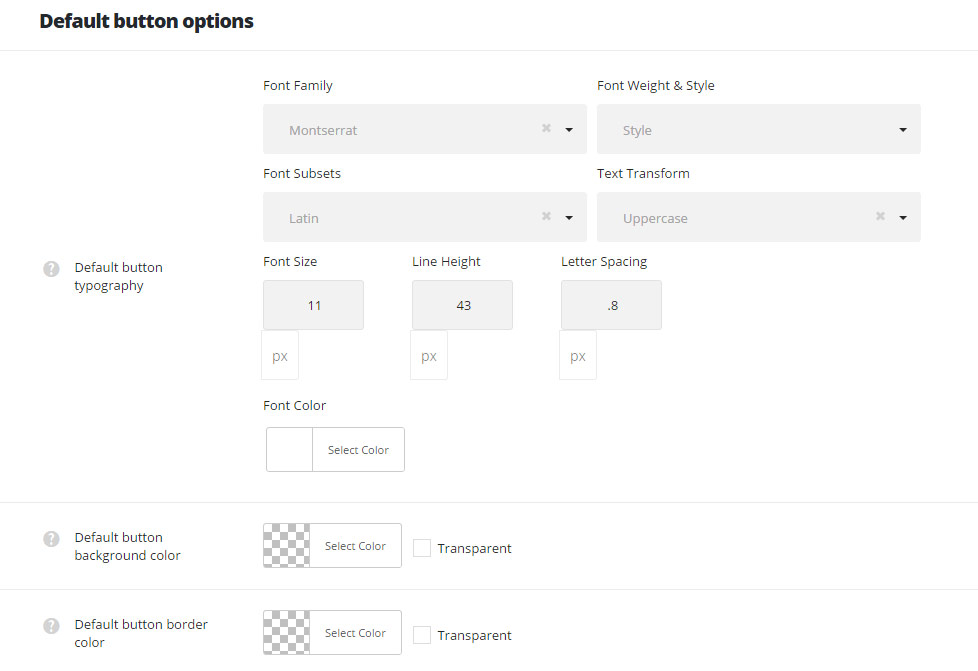
Default button typography – allows you to set the font family and styling for all the default buttons. Typography option with each property can be called individually.
Default button background color – set the background color for all the default buttons.
Default button border color – set the border color for all the default buttons.
Default button hover text color – it allows you to set the text hover color for all the default buttons.
Default button hover background color – set the button background hover color for all the default buttons of your site.
Default button border color on hover – select the button border hover color for all the default buttons.
Default button border width – set the button border width for all the default buttons (added in px).
Default button border style – select the button border style for all the default buttons. Solid, dashed and dotted variants are available.
Default button border radius – set the button border radius for all the buttons on your site.
Default button left padding – set the left padding to the button text, added in px.
Default button right padding – set the right padding to the button text, added in px.