The Typography/Fonts section contains the typography settings for each of the textual element used on the site.
Fonts styling settings can be used outside the Typography options, e.g. in Default Button options, etc. They provide you with full control over the font styles.
Headings typography
It allows you to adjust typography settings for the headings used on the site.
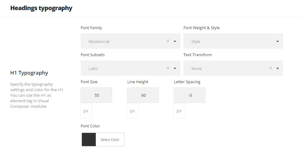
- Font Family – select the font family from the drop-down list. Here you may find the Custom fonts that can be added in
Theme optionsCustom fontssection. - Font Weight & Style – select the font weight and style (bold, italic) from the list.
- Font Subsets – select whether you need to use special characters on the site. The subsets depend on the font you select – there can be Latin Extended, Cyrillic, Greek, etc..
- Text Transform – set the font decoration and transformation, if needed (e.g.: uppercase, capitalize, etc.).
- Font size – set the font size you need to use in the certain text element.
- Line Height – set the line height for text elements to create needed effect. This will be the height of the single text string.
- Letter spacing – set the needed distance between letters.
- Font Color – set the color of the font.
The typography settings are identical for each typography item, so below you will find the detailed description for each typography item and where it is used throughout the site.
- H1 Typography – H6 Typography – style the H1-H6 titles on the site. You may use H1-H6 H5tag in Visual Composer modules.
- Content title big Typography – set the typography settings and color for the big title. The big title is used in the majority of modules as a title by default.
- Check the list of the modules with the Content title big used below:
- New Share module
- Piechart
- Team Member
- Info Background
- Testimonials
- Tilted Info
- Heading
- Pricing Table
- Info Banner
- Product category
- Animated heading
- Services
- Call to Action
- Milestone
- Client Logo
- Facts
- Gradation
- Info Box
- Check the list of the modules with the Content title big used below:
- Content title small Typography – the typography settings and color for the small title. The Small title is used in modules as content elements by default. This element will also change the typography of sort panel titles.
- Check the list of the modules with the Content title small used below:
- Heading
- Delimiter
- Icon List
- Pricing Table
- Check the list of the modules with the Content title small used below:
- Content subtitle Typography – select the typography settings and color for the content subtitle. The Content subtitle is used in modules as subtitle elements by default.
- Form heading Typography – adjust the typography settings and color for the form heading. This heading is related to the comments notification (or to the “Leave a Reply” section if the item was not commented) under the post, portfolio or gallery items.