Use the Delimiter shortcode to divide the page into sections for better comprehension of the content.
You may check the various delimiter example with this link.
Watch the video tutorial on Text Block and Delimiter module features for more details.
General settings
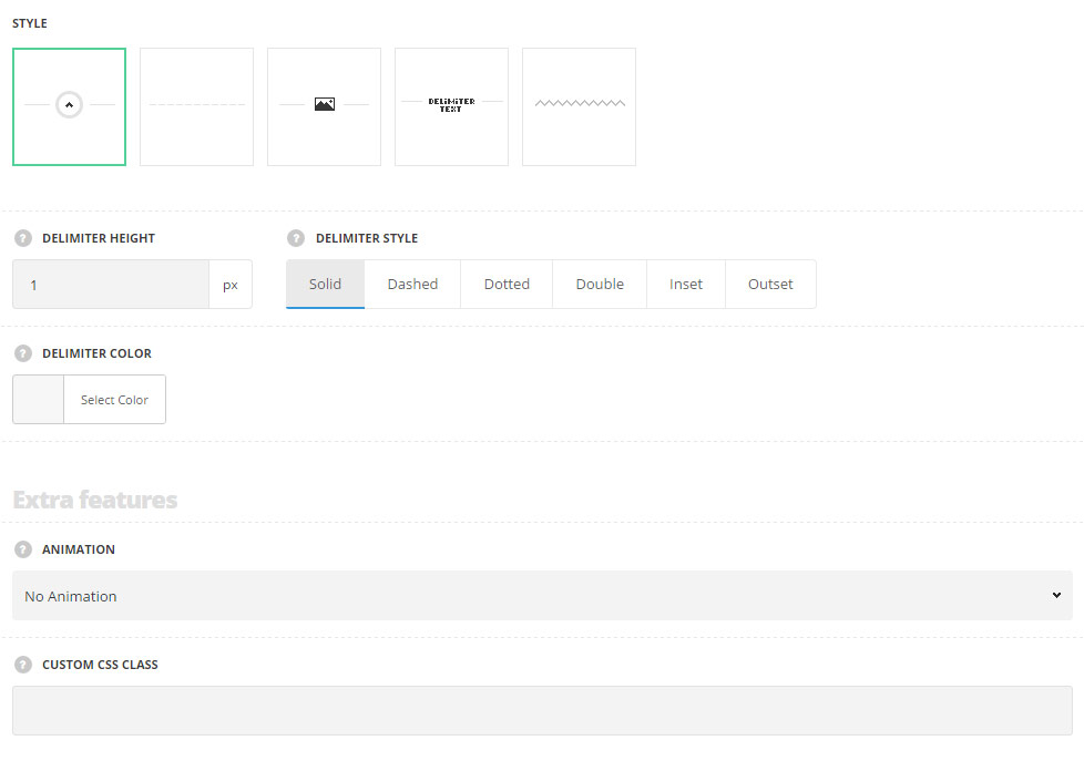
- Style – select the style of delimiter for your site.
- To top – select this style to display the delimiter with the top icon used with sliding effect on icon hover. The icon can be replaced with the custom one if needed.
- Standard – the delimiter is displayed a one line the style of which you can select in the module settings.
- With icon – the delimiter consists of left and right parts separated with the custom icon without hover effect.
- With text – the delimiter consists of left and right parts separated with the custom text without hover effect.
- Image delimiter – the custom image will be used as a delimiter.
- Delimiter height – specify the height of the delimiter line. The option is available for all the styles, except for Image delimiter.
- Delimiter style – select the best suitable style for the delimiter. Solid, dotted, dashed, double, inset and outset styles are available. The option is available for all the styles, except for Image delimiterstyle only.
- Delimiter color – select the delimiter color for your site. The default color is inherited from
Theme OptionsStyling OptionsSecond site color. - Delimiter text – enter the text for the delimiter. Available for the style With text only.
- Text color – choose the delimiter text color. These settings are inherited from
Theme optionsTypography/FontsHeadings typographyContent title small typography. - Text background color – choose the delimiter text background color. The default background color is transparent. Available for the style With text only.
- Image – upload the image or choose from the media library. Notice: The image will be shown in its origin size. For Image delimiter style only.
- Image repeating – set it to Enable to repeat the image. For Image delimiter style only.
- Image alignment – align the image horizontally. Left, right and center positions are available.
Extra features
- Animation – choose between 14 preset animation effects.
- Custom CSS class – enter our own unique class name for the item – this is a useful option for those who want to create a specific style. E.g.: you can type custom-style class and then go to
Theme optionsGeneral optionsCustom CSS/JSCustom CSSfield and write your own CSS code with this class to get your own style.
Icon settings
For To top and With icon styles only.
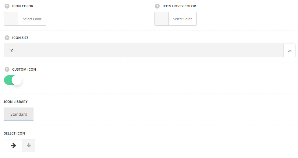
- Icon color – choose the color for the delimiter icon. The default color is #1b1b1b.
- Icon hover color – set the hover color for the delimiter icon. The default hover color for the To top style is #fff. The default hover color for the With icon style is #1b1b1b.
- Icon size – enter the icon size. The minimum value is 10px.
- Circle border color – set the circle border color for the icon. The background color by default is not set. For the With icon style only.
- Icon background hover color – set the background color for the icon on hover. The default border color is inherited from
Theme OptionsStyling OptionsSecond site color. For the With icon style only. - Custom icon – set it to Enable to display the custom icon for the delimiter.
- Icon library – choose the icon library for the module.
- Select icon – select the icon to be displayed in the module.
Typography settings
For With text style only.
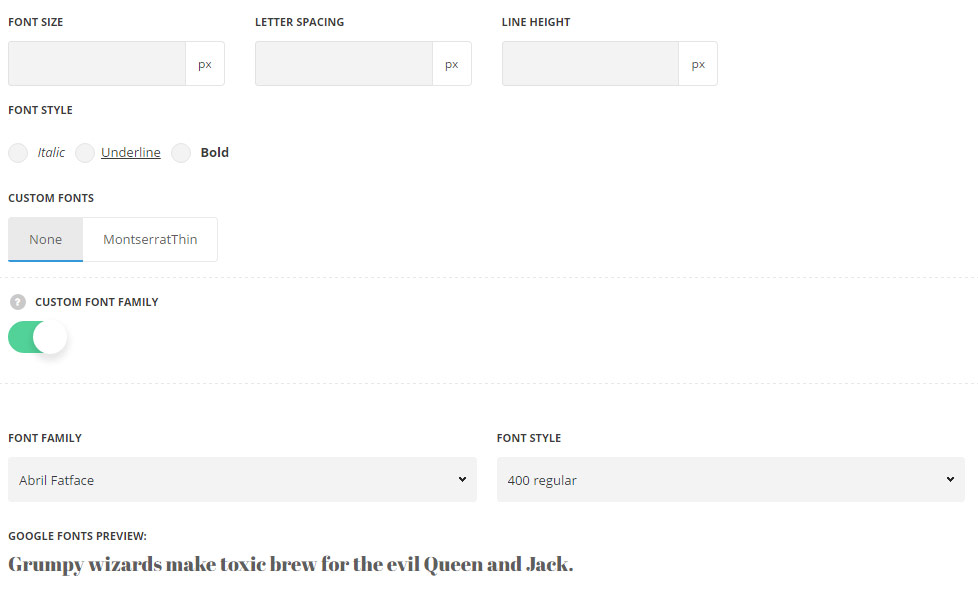
- Font size – set the font size you need to use in the delimiter text.
- Letter spacing – set the needed distance between letters.
- Line-height – set the needed distance between lines.
- Text color – set the color of the font.
- Font style – select the font weight and style (bold, italic).
- Custom fonts – select whether you’d like to use the custom font if any are uploaded.
- Custom font family – set it to Enable to use custom Google font.
- Font Family – select the font family from the drop-down list.
- Font style – select the font weight and style (bold, italic) for the delimiter text.