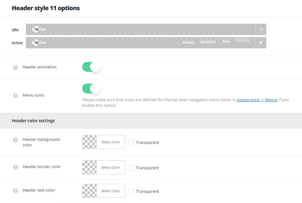
Transparent header style with hamburger menu icon, Primary Navigation menu and social icons sliding out on click.
You can see the example here.

- Header animation – switch it to Enable if you want to have the header animation on scroll (the main header will hide on scroll).
- Menu icons – switch it to Enable to display icons in primary navigation. Make sure that icons are set for the top level navigation menu items in
AppearanceMenussection.
Header color settings
- Header background color – select the background color for the header main section.
- Header border color – choose the border color for the header.
- Header elements color – set the text color for the elements set in the header.
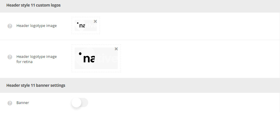
Header style 11 custom logos

- Header logotype image – select the image from the media library which will be set as logotype image for the current header style.
- Header logotype image for retina – upload the image from the media library which will be set as logotype image for retina for the current header style.
Header style 11 banner settings
- Banner – set it to Enable if you want to add the banner image with the custom link which will be set above the header.
- Banner image URL – add the custom image link or upload it from the media library for the banner image.
- Banner URL – set the custom link for the banner image.
- Header content alignment – select the horizontal alignment for the header content. Right, left and center alignment positions are available.

