To create Gallery page you need to create a single page and set Gallery page template for it.
Navigate to Pages section and add the new page with Gallery page template selected in the right sidebar of the page backend editor Page Attributes meta box.
The gallery items you’ve created will be added on the page automatically in accordance with their publication date.
This template inherits its settings from the Theme options Gallery options Gallery page options section.
The settings may be overwritten in Gallery options meta box. The settings will be applied on this gallery page only and will not affect other pages of your site.
Watch the video tutorial on gallery page creation for more details.
Gallery options
Style the gallery page with customizable Gallery options meta box to create incomparable gallery page.
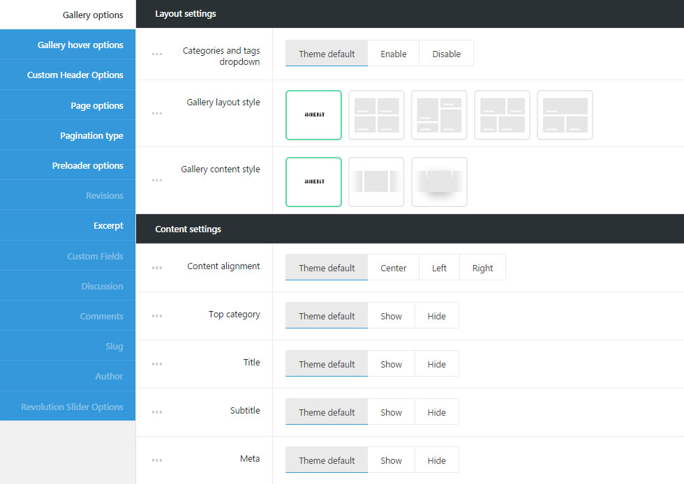
Layout settings
Customize the layout for the gallery page to arrange the gallery work in the most striking way.
- Categories and tags dropdown – adds categories, tags and author drop-down sorter before gallery works. If you choose theme default the displaying will correspond to the theme options settings.
- Gallery layout style – select layout style for the gallery items on your gallery page.
- Inherit – applies the theme default the displaying set in
Theme optionsGallery optionsGallery page optionssection. - Grid – allows you to show regularly spaced horizontal and vertical elements. The example of grid Gallery page can be found here.
- Masonry – the style when the elements are shown one after another, first in the horizontal direction, then vertically. Check the Masonry Gallery page example.
- Justified Grid – shows elements one after another, first in the vertical direction, then horizontally. Check it here.
- Metro – allows you to show thumbnails images on Gallery page according to Gallery item style set on the inner Gallery item page in
Single Gallery optionsAdvanced settingsGallery item style on Gallery page template. Check the example of the Metro gallery page.
- Inherit – applies the theme default the displaying set in
- Gallery content style – select the style of the content for gallery page. Simple and Tiled styles are available.
- Inherit – applies the theme default the displaying set in
Theme optionsGallery optionsGallery page optionssection. - Simple – allows you to have transparent background without hover effect.
- Tiled – allows you to have white background with shadow hover effect.
- Inherit – applies the theme default the displaying set in
- Number of columns – select the number of columns for gallery items on the gallery page. Five is the maximum value (for Grid, Metro and Masonry styles only!).
- Enable sort panel – allows you to enable or disable gallery categories sorter above gallery items on gallery page.
Content settings
Select the setting for content on your gallery page for better gallery works presentation.
- Content position – allows setting the gallery items content position.
- Inherit – applies the theme default the displaying set in
Theme optionsGallery optionsGallery page optionssection. - Under media – sets the content under the featured image on gallery page.
- In front of the media – the content of the gallery item is displayed over the featured image.
- Inherit – applies the theme default the displaying set in
- Content vertical alignment – set the vertical alignment for the content of the gallery item on featured image. Top, middle and bottom variants are available. You may also select theme default variant, to apply the displaying set in
Theme optionsGallery optionsGallery page optionssection. For Grid and Masonry layout styles. - Content alignment – choose the content alignment for the gallery item. Left, right and center variants are available. You may also select theme default variant, to apply the displaying set in
Theme optionsGallery optionsGallery page optionssection. - Top category – allows you to show or hide the category name on the top right side of the featured image. If you choose theme default the displaying will correspond to the
Theme optionsGallery optionsGallery page optionsContent settingsTop category setting. - Title – select whether the title of the single gallery item will be shown or hidden on the gallery page under the featured image of a single gallery item.
- Subtitle – select whether the subtitle of the single gallery item will be shown or hidden on the gallery page under the featured image of a single gallery item.
- Meta – allows you to show or hide the information about the gallery item (date of creation, category, likes, count) under the featured image.
- Date – select whether the date of single gallery item creation will be shown or hidden on the gallery page.
- Category in meta – select the category to be either shown or hidden in meta of the single gallery item.
- Comments count – allows you to show or hide the comments count of the single gallery work.
- Likes – show or hide the likes count of the single gallery item.
Advanced settings
Select the number of works to be displayed per one page, items offset, select the categories of the gallery items to be displayed and set the appear effect for single gallery items and other advanced settings for the gallery page.
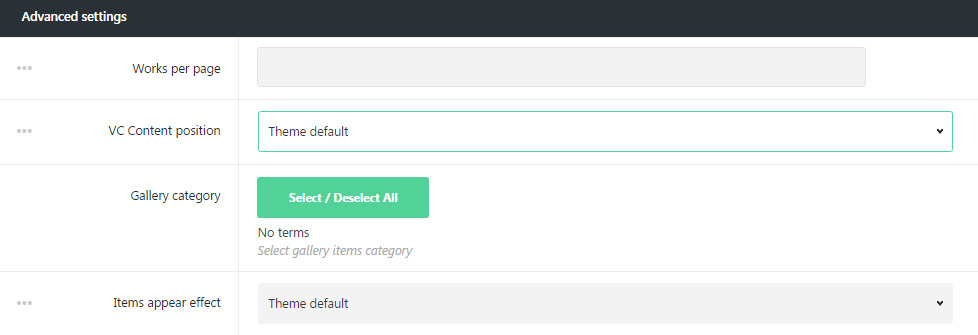
- Works per page – enter the number of gallery items to be displayed on gallery page.
- VC Content position – select the position for the Visual Composer content displaying. Two variants are available: under or over the content.
- Gallery Category – select the categories of the single gallery items to be displayed on gallery page.
- Items appear effect – allows you to select the animation appear effect for the single gallery item. If you choose theme default the displaying will correspond to the settings in
Theme optionsGallery page optionsExtra features.
Gallery hover options
Customize impressive hover effect for the gallery items to be displayed on your gallery page.
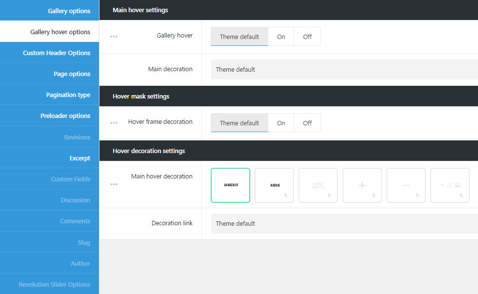
Main hover settings
Customize your gallery page and its hover effects using comprehensive Main hover settings meta box.
- Gallery hover – select whether to show or hide the effect on the mouse hover over the gallery item.
- Main decoration – choose the decoration effect you’d like to have on the gallery item mouse hover.
Hover mask settings
Set the mask settings for the hover effect on gallery items.
- Hover frame decoration – select to show or hide the custom frame decoration which will be visible on gallery item hover. Check the example of the frame here.
- Hover frame style – allows choosing the frame decoration position according to the featured image. Simple and Offset styles are available.
- Hover mask frame size – to set custom size of the hover mask frame in px.
Hover decoration settings
Add the decoration to your hover effect to amaze your visitors.
- Main hover decoration – set the decoration element which will be displayed on hover.
- Inherit – if you choose theme default the displaying will correspond to the
Theme optionsGallery options settingsGallery hover style optionsHover decoration settingsMain hover decorationsetting. - None – no decoration is set for mouse hover effect.
- Heading – allows showing the gallery item title/subtitle which is possible to link to the gallery page itself, to the external link or open the image in lightbox. Follow this link to check the example.
- Decoration link – set the external link for the heading which appears on hover on featured image of the gallery item.
- Show title – set to Enable if you want the gallery item title to be displayed on hover.
- Show subtitle – set to Enable if you want the gallery item subtitle to be displayed on hover.
- Plus – the plus icon will be displayed as hover decoration. Check the example here.
- Decoration link – set the link for the plus icon. It can link to inside (inner page of single gallery item), to the external link and to lightbox.
- Plus style – the plus icons has several styles available. It can be displayed as Big plus in the middle of the thumb, as Small plus in the middle of the thumb, it can be following the mouse.
You can set the style to inherit, applying the settings inTheme optionsGallery options settingsGallery hover style optionsHover decoration settingsMain hover decorationPlus decorationsetting.
- Dots – three dots will be displayed as hover decoration. Check the example of dots decoration with this link.
- Decoration link – set the link for the dots on mouse hover effect.
- Buttons – select the button which will appear on hover. Check the example here.
- Enable link inside gallery item – enable the link to inner gallery item page.
- Enable gallery item external link – enable the button linking to the external resource.
- Lightbox – enable lightbox button on hover.
- Inherit – if you choose theme default the displaying will correspond to the
Custom Header Options
Set unique style for custom header on gallery page if you want to add something special to your page.
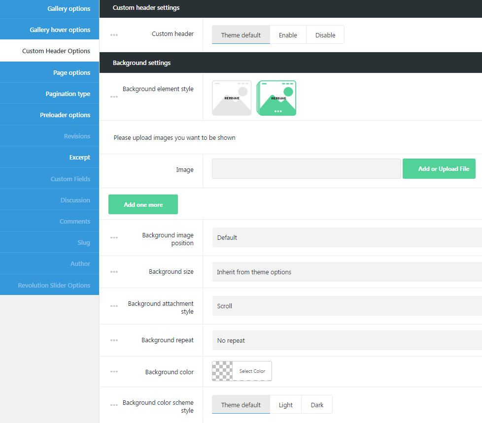
Custom header settings
Use this meta box to style the Custom header for gallery page.
- Custom header – select whether custom header will be enabled or disable for your gallery page.
Background settings
Customize background for the custom header with the Background settings meta box of gallery page.
- Background element style – select the style for the custom header. Image and Gallery variants are available.
- Image – the single image will be shown in custom header.
- Gallery – several images will be displayed as a slideshow in custom header.
- Background image – upload the background image for custom header. If Gallery is set, select several images for the slide show in custom header.
- Background image position – set the position of the image or images selected for custom header.
- Background size – allows adjusting the background image displaying. You can select: cover, contain and initial values or inherit the value set for
Theme optionsHeader optionsCustom Header optionssection. - Background attachment style – sets the background image attachment style:
- Scroll – background image scrolls with the content.
- Fixed – the background image is fixed and content scrolls over it.
- Initial – the background image and content will be fixed.
- Background repeat – select whether the custom header background image will be repeated or not repeated. You can select horizontal repeat, vertical repeat or disable repeat of the image.
- Background color – select the background color for the custom header, which will be shown if the image is not set for the custom header.
- Background color scheme style – select whether dark or light color scheme is used for custom header. According to the color scheme you choose the text colors will be changed to make it more readable. If you choose theme default the displaying will inherit the settings from
Theme optionsHeader optionsCustom Header optionssection.
Custom header video settings
Adjust the settings for the video set for custom header on gallery page.
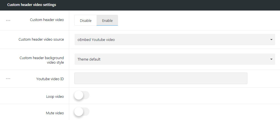
- Custom header video – allows you to set video background for the custom header.
- Custom header video source – select the source for the video for custom header. You can use self-hosted video, videos from YouTube and Vimeo resources.
- Self-hosted video file can be uploaded in mp4 format and in webM format. Select the video in mp4 format for IE, Chrome and Safari browsers and the webM/ogg video for Firefox and Opera.
Simply upload the video to Media Library and insert the link to the video. - oEmbed YouTube video – allows you to set the video from YouTube resource.
- Custom header background video style – allows you to select whether the video will be set as background for custom row or will have full-screen size.
- Youtube video ID – enter the video ID to be displayed in custom header. To find the video ID, look at the URL of that page, and at the end of it, you should see a combination of numbers and letters after an equal sign (=). Copy the numbers of an equal sign (=) and enter the ID.
- oEmbed Vimeo video – allows you to set the video from Vimeo resource.
- Custom header background video style – allows you to select whether the video will be set as background for custom row or will have full-screen size.
- Vimeo video ID – enter the video ID to be displayed in custom header. To find the video ID , copy the numeric code that appears at the end of its URL at the top of your browser window.
- Self-hosted video file can be uploaded in mp4 format and in webM format. Select the video in mp4 format for IE, Chrome and Safari browsers and the webM/ogg video for Firefox and Opera.
- Loop video – enable it to loop the video.
- Mute video – enable it to mute the video.
Content settings
Select the content settings for the custom header on the gallery page.
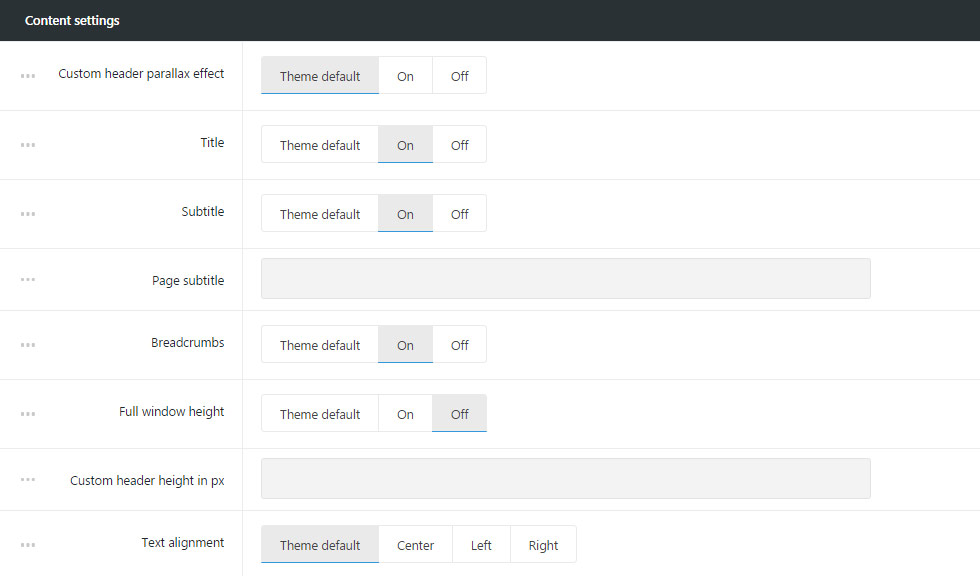
- Custom header parallax effect – switch it to Enable if you want to have parallax effect for the custom header on your gallery page.
- Title – select whether the title of the page will be shown or hidden in custom header.
- Subtitle – allows you to select whether subtitle of the page will be shown or hidden in custom header.
- Page subtitle – enter page subtitle text to be displayed in custom header.
- Breadcrumbs – show or hide the navigation links in custom header.
- Full window height – sets full window height for custom header.
- Custom header height in px – if the full window height options are disabled, you can set the height for your custom header. Note, the height should be set in px.
- Text alignment – sets the text position in custom header. Center, left and right positions are available.
Page options
You can style the Background for the whole gallery page using the comprehensive options from Page options meta box.
Layout settings
Set the layout style and sidebars for the gallery page.
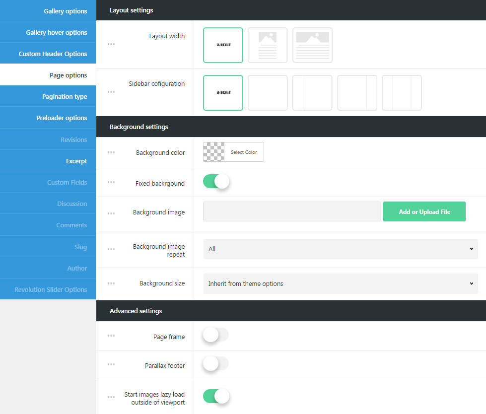
- Layout width – set your page content width to full width or boxed.
- Sidebar configuration – choose sidebars and their position. You can set the sidebar to be displayed on the left, right and as well as to use both sidebar or none of them.
Background settings
In this section you can easily set the background for the gallery page only.
- Background color – select the background color for the gallery page to be displayed in case the image background is not set for this page or image does not cover the whole page.
- Fixed background – enable fixed background to make the background image fixed, so the content will scroll separately over it. When Disable is selected , the background image scrolls with the content.
- Background image – upload the image to be displayed as a background of the gallery page or enter the URL of the image to be displayed on background.
- Background image repeat – select whether the page background image will be repeated or not repeated. You can select horizontal repeat, vertical repeat or disable repeat of the image.
- Background size – allows adjusting the background image displaying. You can select: cover, contain and initial values or inherit the value set for
Theme optionsHeader optionsCustom Header optionssection.
Advanced settings
Assign the additional setting for your gallery page using Advanced settings meta box.
- Page frame – switch it to Enable, if you want to have the frame around the gallery page. The color and width of the frame can be set in
Theme optionsGeneral optionsLayout settingsLayout frame sizeandLayout frame color. - Parallax footer – switch it to Enable to have fixed the footer with content scrolling over it.
- Start images lazy load outside of viewport – enable it if you want to have the featured images to be preloaded when they are not visible.
Pagination Type
Set the suitable pagination style for your gallery page using the options from Pagination type meta box.
Pagination settings
Here you can select the pagination styles for your gallery page for better gallery works presentation.
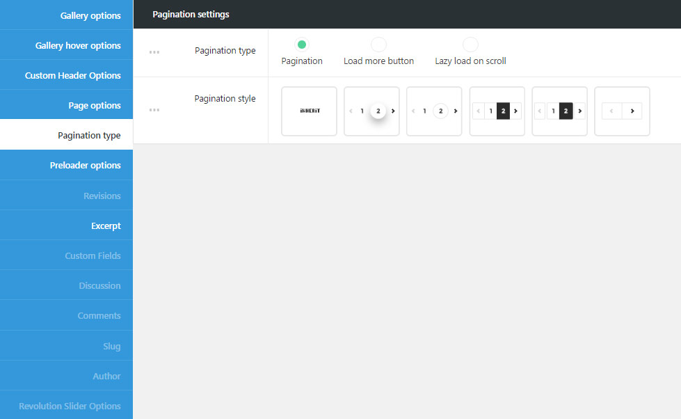
- Pagination type – select the style of the pagination – it’s the way extra content is loaded.
- Pagination – adds numbers of pages with extra content. You may see the example here.
- Pagination style – select among 5 styles available for the number on the gallery page. You can also select Inherit value, so the settings will be inherited from
Theme optionsStyling optionsContent Styling optionsPagination style.
- Pagination style – select among 5 styles available for the number on the gallery page. You can also select Inherit value, so the settings will be inherited from
- Lazy load on scroll – select it if you want to have lazy load animation. It is set in
Theme optionsGeneral optionsLayout settingsLazy Load Pagination image.Check the example here.
- Pagination – adds numbers of pages with extra content. You may see the example here.
Preloader options
Set the unique preloader style for the gallery page. It will be displayed while the content of the page is loading.
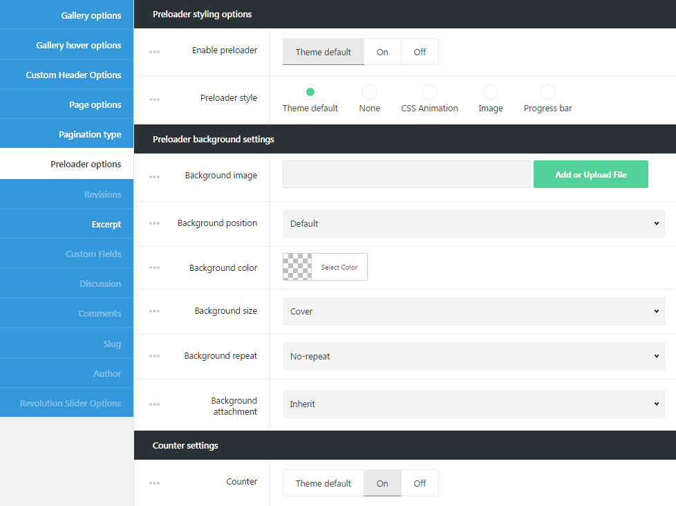
Preloader styling options
Select styling options for preloader set for gallery page.
- Enable preloader – allows you to enable site preloader. It appears while the content is loading and prevents the visitors from seeing the content restructures while all the images and text are rendered.
- Preloader style – select the preloader style for your page.
- Theme default – will inherit the settings from
Theme optionsGeneral optionsSite preloader optionsection. - None – no style is selected for site preloader.
- СSS Animation – adds animated element to the preloader.
- Animation style – select the animation elements site for the preloader.
- Animation base color – set the color of the animated element.
- Image – set the image that will be displayed on the preloader (*.gif images can be used as well).
- Preloader image – upload the image for the site preloader.
- Progress bar – adds the horizontal progress bar to the preloader.
- Preloader bar height in px – set the height of the progress bar. Note, you don’t have to add px to the input field.
- Preloader bar background color – select the color for your preloader bar to be displayed on the page.
- Preloader bar position – allows you to select the preloader bar position. Top, Middle and Bottom positions are available. You may also select Inherit value to apply the settings from
Theme optionsGeneral optionsSite preloader optionsection.
- Theme default – will inherit the settings from
Preloader background settings
Customize background style of the preloader for gallery page.
- Background image – upload the image to set it as site preloader background.
- Background position – select the position for the image for its better displaying.
- Background color – pick up the site preloader background color to be displayed as a background for the preloader.
- Background size – allows adjusting the background image displaying. You can select: cover, contain and initial values or inherit the value set
Theme optionsGeneral optionsSite preloader optionsection. - Background repeat – select whether the site preloader background image will be repeated or not repeated. You can select horizontal repeat, vertical repeat or disable repeat of the image.
- Background attachment – sets the background image attachment style:
- Scroll – background image scrolls with the content.
- Fixed – the background image is fixed and content scrolls over it.
- Initial – the background image and content will be fixed.
Counter settings
Set the counter style for the preloader.
- Counter – set it to Enable to display per cent counter for the page loading.