Portfolio item post type is the perfect choice for demonstration the creative projects for your visitors. To create a new portfolio item, simply navigate to Portfolios section of the admin area and click on Add New.
It is important to set featured image for the portfolio item in Featured Image meta box in the right sidebar of the portfolio item editor since there will be no content to be displayed on the portfolio page.
The single portfolio item can be created either using the default structure (various Image gallery style and description for it in the different position), you can use the elements of Visual Composer plugin or both: default structure with Visual Composer elements.
In case you’d like to use the Visual Composer content, you can specify its position inside portfolio item. It can be displayed on top or bottom of portfolio single page.
It can be set in Single Portfolio Item options Advanced settings Visual Composer content position for each portfolio item.
You can also set the default position for all the portfolio items in Theme options Portfolio options Single Portfolio item options Layout settings Visual Composer default content position section.
To facilitate the navigation within the portfolio items, make sure that the portfolio categories and tags are set.
Watch the video tutorial on portfolio item creation for more details.
Portfolio Categories
The most convenient way to group the portfolio projects.
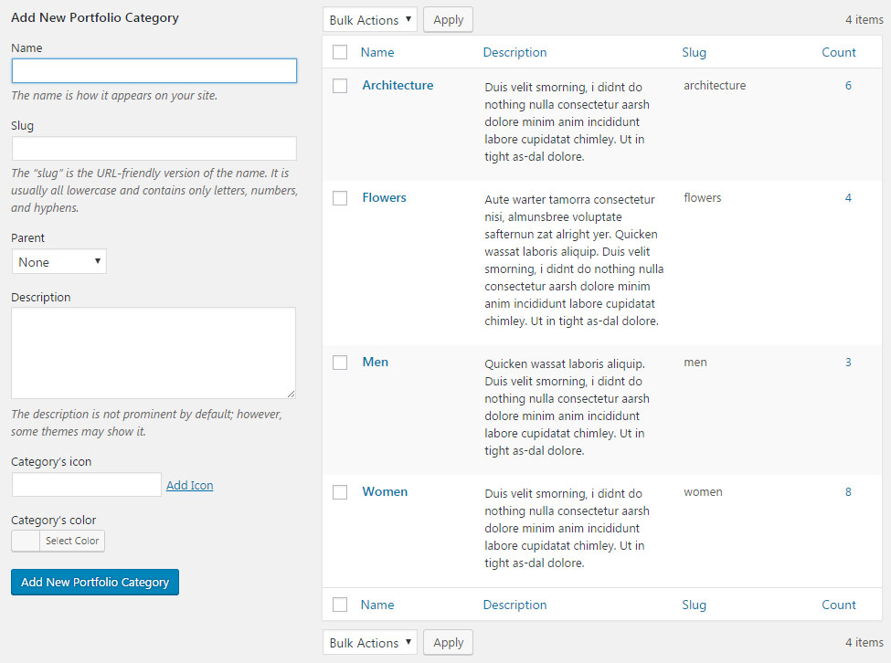
The Categories can be added in Portfolios Categories section of admin panel.
To create a new Category for portfolio items, check the short steps to be followed:
- Name – add the title of the category.
- Slug – enter the title of the category in the URL. Leave the field blank to make Slug the same as the Name.
- Parent – you may also select the Parent category to achieve the hierarchy on the site.
- Description – you may leave this field empty, the description will be visible in admin panel only.
- Category’s icon – category’s icon will be used in the Category, Tags and Author sort panel on the portfolio page.
- Category’s color – set the category’s color for category button to be displayed on single portfolio items.
Portfolio Tags
Tags allow to arrange the single portfolio items structurally and to facilitate the navigation among single portfolios.
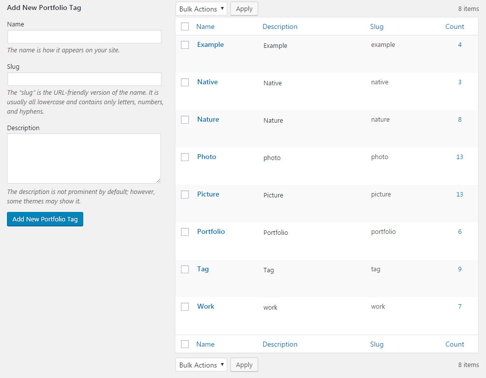
To add new Tag for portfolio item, go to Portfolios Tags section of admin area.
Check the step by step instruction on creating new tags for portfolio items below:
- Name – add the title of the tag.
- Slug – enter the title of the tag in the URL. Leave the field blank to make Slug the same as the Name.
- Description – you may leave this field empty, the description will be visible in admin panel only, it is added for your convenience.
Single Portfolio Item Options
Using this meta box you may overwrite the settings set for single portfolio and customize the variations of portfolio works for your visitors.
The settings are inherited from Theme options Portfolio options Single Portfolio item options section.
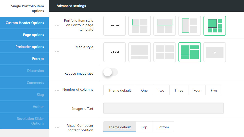
Advanced settings
Set the single portfolio item displaying for portfolio page.
- Portfolio item style on Portfolio page template – select the item style for the portfolio’s featured image for Portfolio layout style – Metro only. If you choose theme default the displaying will correspond to the theme options settings.
- Standard – allows you to show standard featured image size on portfolio page template. The featured image will have square form.
- Wide – allows you to show a wide featured image on portfolio page template. Wide style has the size of two standard ones in the horizontal dimension.
- Tall – allows you to show a tall featured image on portfolio page template. Tall style has the displaying of two standard featured images in the vertical dimension.
- Large – allows you to show a large featured image on portfolio page template. The displaying of the Large style has the approximate the square form with the size of four standard featured images.
- Media style – select the gallery appearance on the item inner page. You may add the gallery images to the Images gallery meta box. If you choose theme default the displaying will correspond to the theme options settings.
- Carousel – arranges the images into a slideshow with the big image and the gallery carousel under it. Check the example of Carousel portfolio with this link.
- Grid – shows regularly spaced horizontal and vertical images. Check the Grid portfolio item here.
- Number of columns – set the number of columns for the images inside portfolio item. Five is the maximum value. If you choose theme default the displaying will correspond to the theme options settings.
- Images offset – set the space in px to add space between images in your portfolio images gallery.
- Masonry – allows you to show images one after another, first in the horizontal direction, then vertically. Check the example of Masonry portfolio following this link.
- Number of columns – set the number of columns for the images inside portfolio item. Five is the maximum value. If you choose theme default the displaying will correspond to the theme options settings.
- Images offset – set the space in px to add space between images in your portfolio images gallery.
- Video – select this media type to set video on the portfolio item. Here the example of Video portfolio can be found.
- Video source – select the video source for the video file on the single portfolio page.
- YouTube – allows you to set the video from YouTube resource.
- YouTube video URL – enter the video ID to be displayed on the single portfolio page. To find the video ID, look at the URL of that page, and at the end of it, you should see a combination of numbers and letters after an equal sign (=). Copy the numbers of an equal sign (=) and enter the ID.
- Vimeo – allows you to set the video from Vimeo resource.
- Vimeo video URL – enter the video ID to be displayed on the single portfolio page. To find the video ID , copy the numeric code that appears at the end of its URL at the top of your browser window.
- Self hosted video in MP4 format – allows uploading the video in mp4 format for IE, Chrome and Safari browsers.
- Self hosted video file in mp4 format – enter the video URL or select the necessary video file from the media library.
- Self hosted video in WebM format – allows uploading the video the WebM format for Firefox and Opera.
- Self hosted video file in WebM format – enter the video URL or select the video file from the media library.
- YouTube – allows you to set the video from YouTube resource.
- Video source – select the video source for the video file on the single portfolio page.
- Visual Composer content position – defines the Visual Composer content position inside portfolio item. It can be displayed on top or bottom of portfolio single page.
Description settings
Add the special extra information for your portfolio works to tell more about your projects.
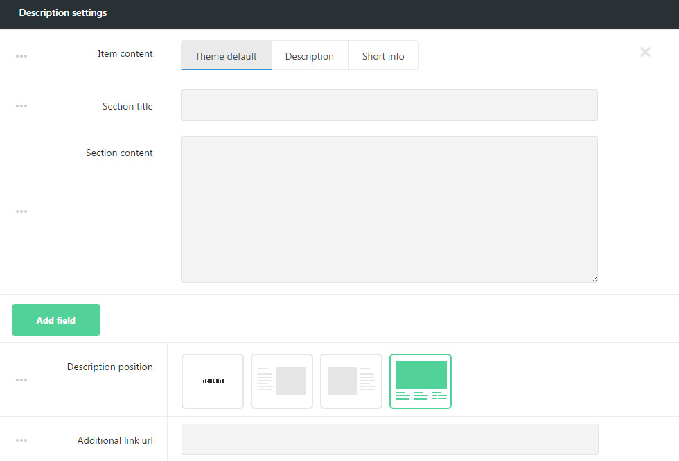
- Item content – select the content type for your portfolio item. If you choose theme default the displaying will correspond to the theme options settings.
Description and Short Info types are available.
Description is a wonderful choice for creating custom sections and adding extra information about the portfolio item project.
- Description – allows you to add the section title and the section content.
- Section title – enter the title of the description section.
- Section content – enter the description for the section.
By clicking on Add field button you’ll be able to add extra sections and enter all the necessary information for your project.
Check the example of the portfolio work with Description following this link.
Short Info allows presenting the essential information about the portfolio work.
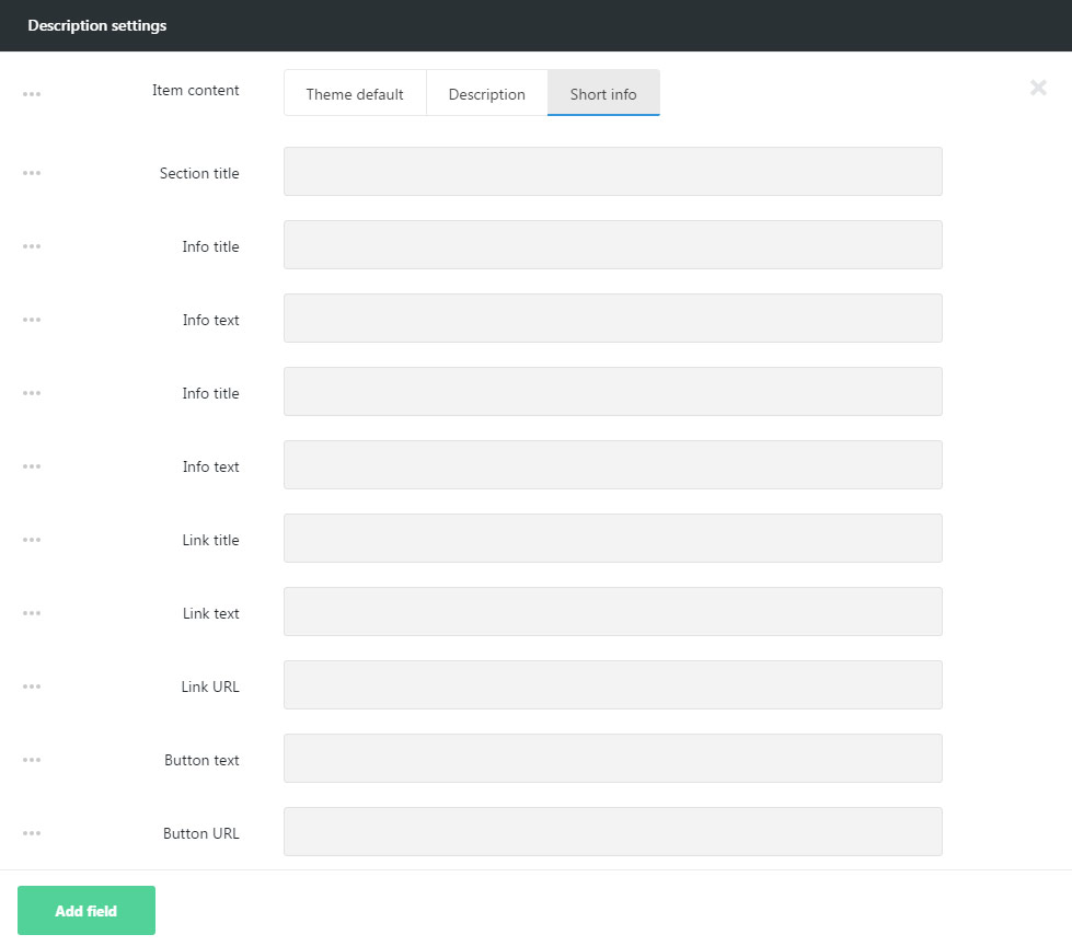
- Short Info -allows you to add section title without the section content, such as short description, link, button etc.
- Section title – enter the title of the description section.
- Info title – allows you to add the title for the textual info.
- Info text – enter the content of the description for your visitors.
- Link title – allows you to add the title for the link.
- Link text – allows you to add the textual content for the link.
- Link URL – enter the link URL
- Button text – enter the button text in this field.
- Button URL – add the URL for the button.
By clicking on Add field button you’ll be able to add extra sections and enter all the necessary information for your project.
Here you can find the example of the Short info for portfolio item added.
- Description position – select the description position in respect to the media content. Left, right and bottom position are available, if you choose theme default the displaying will correspond to the theme options settings.
- Additional link URL – allows you to add the external link which will be shown on hover on the portfolio page template if the Main hover decoration is set to Buttons.
In case you’d like to have only the content of the portfolio item without any description, simply navigate to Description settings of single portfolio item and clear all the information added in description fields and delete the section using the ‘X’ button in the right corner of the Description section. In such a way the redundant sections also can be removed.
Layout settings
In this meta box section, you can easily set the inside pagination style (navigation between previous and next portfolio works).
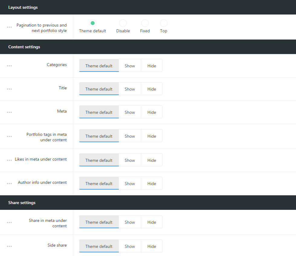
- Pagination to previous and next posts style – allows you to select the inner pagination style for portfolios. Switch it to Disable to remove inside pagination. If you choose theme default the displaying will correspond to the theme options settings.
- Fixed – the pagination arrows for previous and next portfolio items will be displayed on scroll.
- Top – the pagination arrows are displayed on top of the portfolio items.
Content settings
Arrange the inner content of the portfolio according to your needs, such as meta information, title, author’s information etc.
- Categories – select whether the categories of portfolio item will be displayed or hidden.
- Title – set the title of the portfolio item will be shown or hidden above the portfolio item.
- Meta – allows you to show or hide meta information on portfolio item. If you choose theme default the displaying will correspond to the theme options settings.
- Date – select whether the date of single portfolio item creation will be shown or hidden.
- Category in meta – select the category to be either shown or hidden in meta of the portfolio item.
- Comments count – allows you to show or hide the comments count of the portfolio work.
- Likes – you to show or hide the likes count of the portfolio item.
- Portfolio tags in meta under content – show or hide the portfolio tags in meta under the portfolio item.
- Likes in meta under content – show or hide portfolio likes in meta under the portfolio item.
- Author info under content – show or hide author info under the portfolio item.
Share settings
Customize social share for single portfolio item to share it on different social networks.
- Share in meta under content – allows you to show or hide the share in meta on portfolio item.
- Side share – allows you to show or hide the side share on portfolio item.
The social networks can be set in Theme options Social Accounts Social share options section.
Custom Header Options
Style the custom header section for your portfolio item in order to add something special on your page.
The custom header options are inherited from Theme options Header options Custom Header Options section.
The configurations set in this meta box section will be applied to the portfolio item page only and will not affect other pages of your site.
Since the Custom Header options meta box is the same for all posts and pages types, more details can be found in Single Page Creation Custom Header Options section.
Follow this link to check the post.
Page options
Allows to select the style for the layout for your portfolio item.
The configurations set in this meta box section will be applied to the portfolio item page only and will not affect other pages of your site.
Since the Page options meta box is the same for all posts and pages types, more details can be found in Single Page Creation Page Options section.
Follow this link to check the post.
Preloader options
Contains options for setting special preloader style for single portfolio page which will appear on the screen till the content is fully loaded.
The configurations set in this meta box section will be applied to the portfolio item page only and will not affect other pages of your site.
Since the Preloader options meta box is the same for all posts and pages types, more details can be found in Single Page Creation Preloader Options section.
Follow this link to check the post.
Excerpt
Allows to add the short description for your portfolio item.
-
Excerpt – enter the description for your portfolio item to be displayed on the portfolio page.