Pages are the most frequently used post type on the site.
Using this post type you can create various pages for your site and impress your customers with the great variety of features.
Watch the video tutorial on Single Page creation for more details.
Publish section
This section allows you to set the visibility parameters of the page.
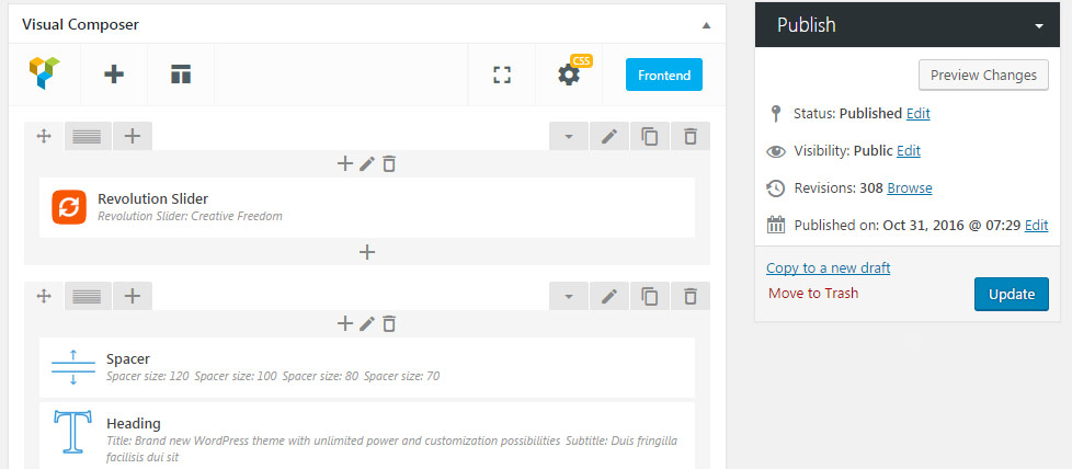
- Status – here you can set the type of the page – whether it’s already Published, Pending Review or is a Draft.
- Visibility – set whether you want to make the page Public visible, Password protected (type the password to allow the access to the page for only users with that password), Private (and you’ll be the only one who can see the page).
- Revisions – allows you to check how the structure of the page was changing in the process of its creation. Autosaving is also available in this section.
- Published on – here you can change the publication date of the page. You can use this option to change the order of the single posts, portfolios, and gallery items (by date) or to schedule their publication in future.
Page attributes
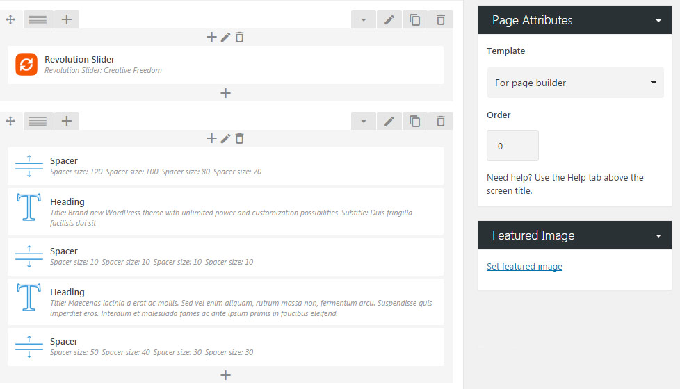
- Parent – set the hierarchy of the pages on your site.
- Template – select the page template for every certain page:
- Default – default WordPress page. We don’t recommend you to use it for your site, as some options are not working properly with such template.
- For page builder – custom page template that allows you to use Visual Composer modules and creates simple scroll page. We recommend you to use it for creating custom pages.
- For one page scroll – creates a page with vertically scrolling slides set to full height. You may see the example here.
Within this page template, you are able to enable Smart Header option. So the header will adjust its color scheme depending on the background: if the dark background is used, the header will be automatically changed into white and vice versa. For this, you need to go to each rowRow settingsBackground optionsRow background styleand select whether dark or light background is used for the row. - Blog page template – is used to create a blog page. This page template displays the single posts automatically in accordance with their publication date. More details about Blog page template you can find in Blog Page Creation post.
- Portfolio page template – used to create the portfolio page. It can be customized globally from
Theme optionsPortfolio optionsPortfolio page optionssection. Check more details on Portfolio Page Creation here. - Gallery page template – can be used to create the gallery page. Check the details about this page template in this post.
- Order – you can set the order for the pages using this field.
Featured image
- Featured image – upload the image that will be the main image of the page, post, portfolio, etc.
This option is essential for such post types, as a single post, portfolio and gallery item, products than Page. This is the thumbnail image that will represent the work.
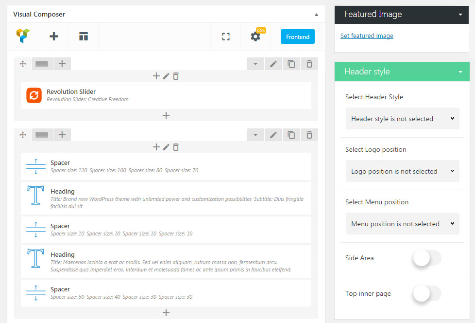
Header style
- Select Header Style – this option allows you to select the header style for the current page from the drop-down list.
You may find more details about each header style in Header options section of the documentation.
If the header style is not selected the default header style set for the single page is displayed. The default header style is set in Theme options General options Layout settings Single pages header.
- Select Logo position – set the logo position different from the default one. Note, that the top logo position adds the extra row for the logo. So, if you want to display the logo on the same line with the menu, leave the Select logo position option not selected.
- Select Menu position – select the menu position – at the Top or Bottom of the screen.
-
Side area – enable or disable the Side Area (hamburger icon) on the page.
-
Top inner page – enable or disable the Top inner page with additional information and animation effect. You can set different effects for the page in
Theme optionsHeader optionsBase Header OptionsTop panel settingssection.
Sidebar
This section allows you to set the sidebar configurations for your page.
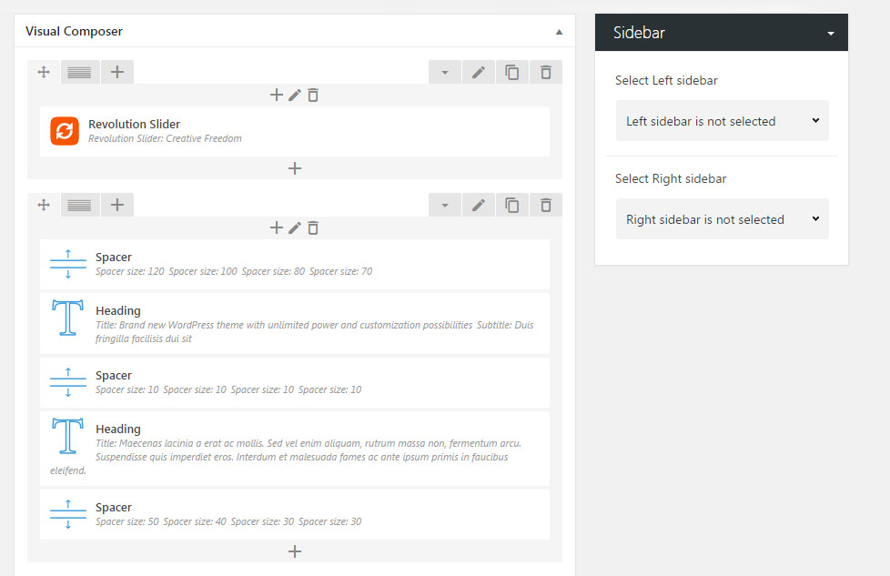
- Select Left Sidebar – select the sidebar which will be displayed on your page from the left.
- Select Right Sidebar – select the sidebar which will be displayed on your page from the right.
More details about creating a new sidebar you can find in the Widgets post.
Custom Header Options
Use this meta box to style the unique Custom header for a single page in case you want to add something special to your page.
- Custom header – select whether custom header will be enabled or disable for your page. If you choose theme default the displaying will correspond to
Theme optionsGeneral optionsLayouts SettingsCustom Header.
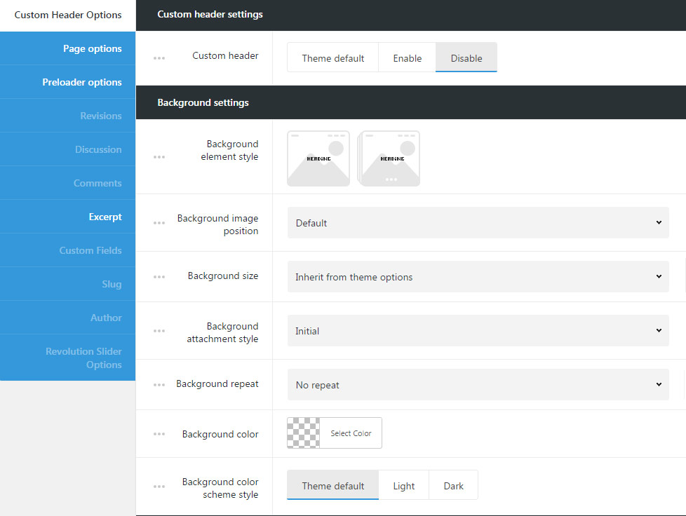
Background settings
Use this meta box for styling the background for custom header on the page.
- Background element style – select the style for the custom header. Image and Gallery variants are available.
- Image – the single image will be shown in custom header.
- Gallery – several images will be displayed as a slideshow in custom header.
- Background image – upload the background image for custom header. If Gallery is set, select several images for the slide show in custom header.
- Background image position – set the position of the image or images selected for custom header.
- Background size – allows adjusting the background image displaying. You can select: cover, contain and initial values or inherit the value set for
Theme optionsHeader optionsCustom Header optionssection. - Background attachment style – sets the background image attachment style:
- Scroll – background image scrolls with the content.
- Fixed – the background image is fixed and content scrolls over it.
- Initial – the background image and content will be fixed.
- Background repeat – select whether the custom header background image will be repeated or not repeated. You can select horizontal repeat, vertical repeat or disable repeat of the image.
- Background color – select the background color for the custom header, which will be shown if the image is not set for the custom header.
- Background color scheme style – select whether dark or light color scheme is used for custom header. According to the color scheme you choose the text colors will be changed to make it more readable. If you choose theme default the displaying will inherit the settings from
Theme optionsHeader optionsCustom Header options section.
Custom header video settings
In this section, you can set the video as a background for the stunning header for your the page.
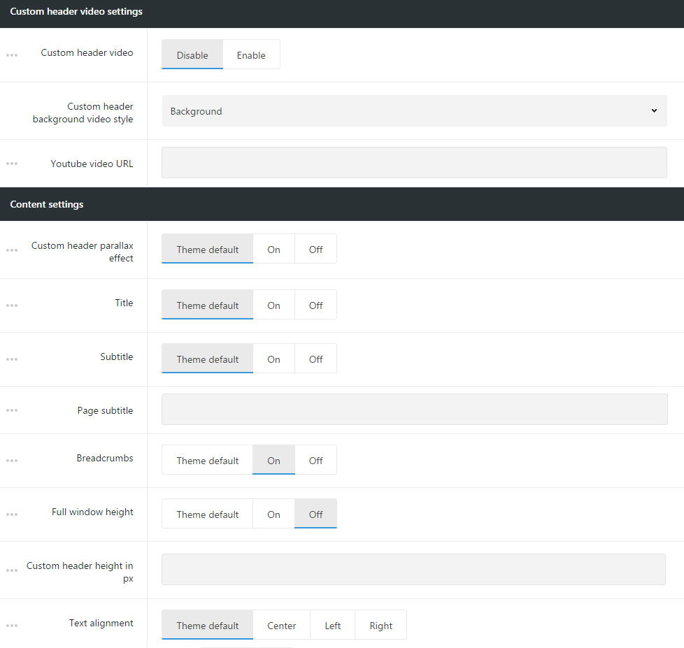
- Custom header video – allows you to set video background for the custom header.
- Custom header video source – select the source for the video for custom header. You can use self-hosted video, videos from YouTube and Vimeo resources.
- Self-hosted video file can be uploaded in mp4 format and in webM format. Select the video in mp4 format for IE, Chrome and Safari browsers and the webM/ogg video for Firefox and Opera.
Simply upload the video to Media Library and insert the link to the video. - oEmbed YouTube video – allows you to set the video from YouTube resource.
- Custom header background video style – allows you to select whether the video will be set as background for custom header or will have full screen size.
- Youtube video ID – enter the video ID to be displayed in custom header. To find the video ID, look at the URL of that page, and at the end of it, you should see a combination of numbers and letters after an equal sign (=). Copy the numbers of an equal sign (=) and enter the ID.
- oEmbed Vimeo video – allows you to set the video from Vimeo resource.
- Custom header background video style – allows you to select whether the video will be set as background for custom header or will have full screen size.
- Vimeo video ID – enter the video ID to be displayed in custom header. To find the video ID , copy the numeric code that appears at the end of its URL at the top of your browser window.
- Self-hosted video file can be uploaded in mp4 format and in webM format. Select the video in mp4 format for IE, Chrome and Safari browsers and the webM/ogg video for Firefox and Opera.
- Loop video – enable it to loop the video.
- Mute video – enable it to mute the video.
Content settings
Select the content settings for the custom header on the page.
- Custom header parallax effect – switch it to Enable if you want to have parallax effect for custom header.
- Title – select whether the title of the page will be shown or hidden in custom header.
- Subtitle – allows you to select whether subtitle of the page will be shown or hidden in custom header.
- Page subtitle – enter page subtitle text to be displayed in custom header.
- Breadcrumbs – show or hide the navigation links in custom header.
- Full window height – sets full window height for custom header.
- Custom header height in px – if the full window height options are disabled, you can set the height for your custom header. Note, the height should be set in px.
- Text alignment – sets the text position in custom header. Center, left and right positions are available.
Page options
You can set the Background for the whole page in this meta box. You can also enable parallax effect for the page, add the white frame around etc.
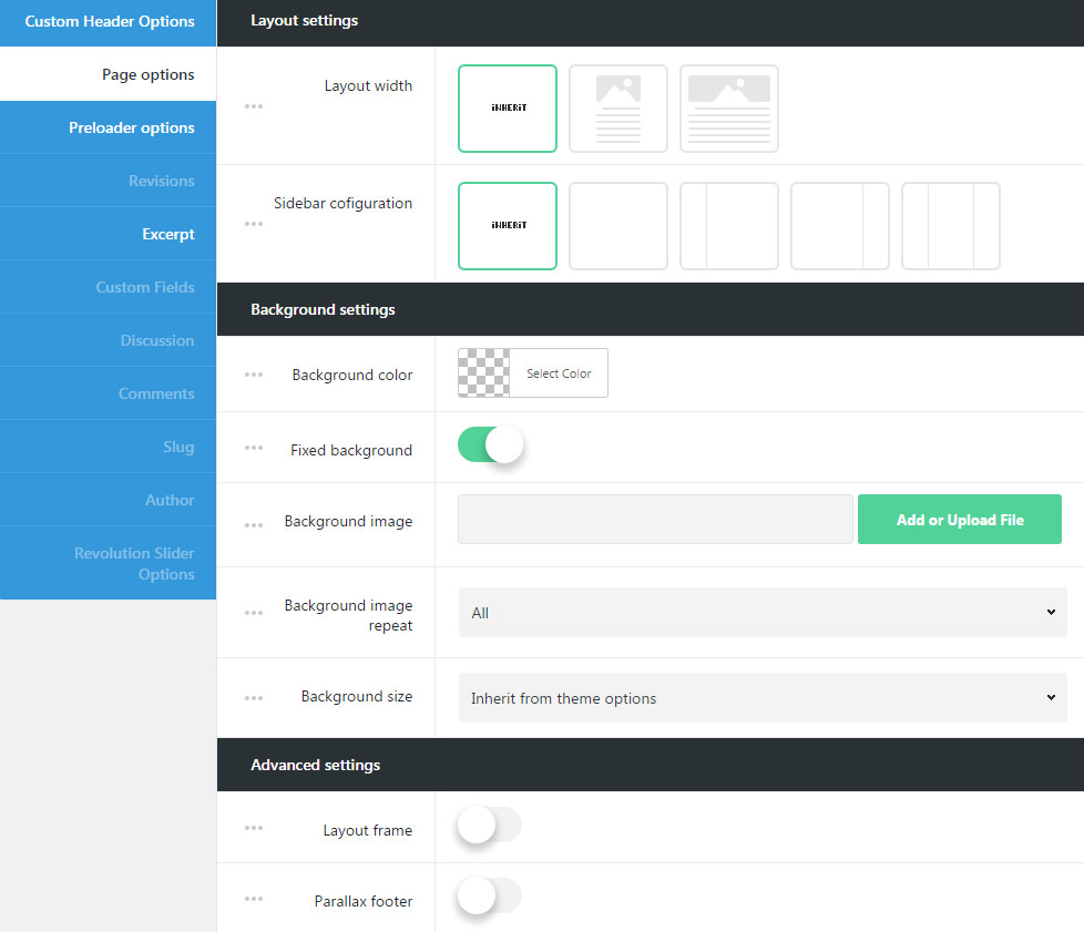
Layout settings
You can set the layout width and sidebar configurations for the whole page in this meta box.
- Layout width – set your page content width to full width or boxed.
- Sidebar configuration – choose sidebars and their position. You can set the sidebar to be displayed on the left, right and as well as to use both sidebars or none of them.
Background settings
Customize the background for the page to add the individuality to your page.
- Background color – select the background color for the page to be seen if the image background is not set for the page or image does not cover the whole page.
- Fixed background – enable fixed background to make the background image fixed, so the content will scroll separately over it. When Disable is selected , the background image scrolls with the content.
- Background image – upload the image to be displayed as a background of the page or enter the URL of the image.
- Background image repeat – select whether the page background image will be repeated or not repeated. You can select horizontal repeat, vertical repeat or disable repeat of the image.
- Background size – allows adjusting the background image displaying. You can select: cover, contain and initial values or inherit the value set for
Theme optionsStyling optionsMain styling optionssection.
Advanced settings
Customize your page using additional settings available for you.
- Page frame – switch it to Enable, if you want to have the frame around the page. The color and width of the frame can be set in
Theme optionsGeneral optionsLayout settingsLayout frame sizeandLayout frame color. - Parallax footer – switch it to Enable to have fixed the footer with content scrolling over it.
- Start images lazy load outside of viewport – enable it if you want to have the images to be preloaded when they are not visible.
Preloader options
Set certain preloader style for the page on the site.
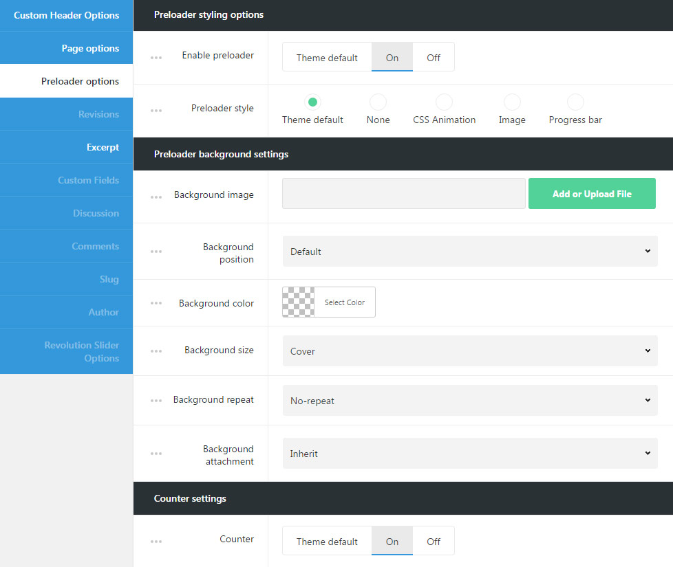
Preloader styling options
Customize the unique preloader style for the page.
- Enable preloader – allows you to enable site preloader. It appears while the content is loading and prevents the visitors from seeing the content restructures while all the images and text are rendered.
- Preloader style – select the preloader style for your page.
- Theme default – will inherit the settings from
Theme optionsGeneral optionsSite preloader optionsection. - None – no style is selected for site preloader.
- СSS Animation – adds animated element to the preloader.
- Animation style – select the animation elements site for the preloader.
- Animation base color – set the color of the animated element.
- Image – set the image that will be displayed on the preloader (*.gif images can be used as well).
- Preloader image – upload the image for the site preloader.
- Progress bar – adds the horizontal progress bar to the preloader.
- Preloader bar height in px – set the height of the progress bar. Note, you don’t have to add px to the input field.
- Preloader bar background color – select the color for your preloader bar to be displayed on the page.
- Preloader bar position – allows you to select the preloader bar position. Top, middle and bottom positions are available. You may also select Inherit value to apply the settings from
Theme optionsGeneral optionsSite preloader optionsection.
- Theme default – will inherit the settings from
Preloader background settings
Set the background for the site preloader for your page.
- Background image – upload the image to set it as site preloader background.
- Background position – select the position for the image for its better displaying.
- Background color – pick up the site preloader background color to be displayed as a background for the preloader.
- Background size – allows adjusting the background image displaying. You can select: cover, contain and initial values or inherit the value set
Theme optionsGeneral optionsSite preloader optionsection. - Background repeat – select whether the site preloader background image will be repeated or not repeated. You can select horizontal repeat, vertical repeat or disable repeat of the image.
- Background attachment – sets the background image attachment style:
- Scroll – background image scrolls with the content.
- Fixed – the background image is fixed and content scrolls over it.
- Initial – the background image and content will be fixed.
Counter settings
Set the counter style for the preloader.
- Counter – set it to Enable to display percents counter for the page loading.