Create the stylish representation of gallery works arranging multipurpose gallery section.
Check this post to learn more about Gallery page creation.
Base gallery options
In this section, you’ll be able to adjust main gallery settings for your site.
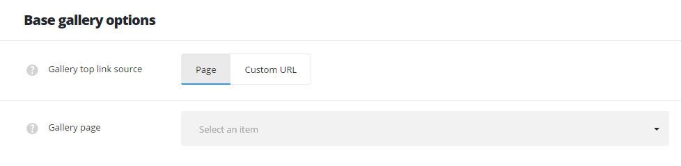
- Gallery top link source – allows you to set the page or custom link which will be used for the button placed next to the categories and tags dropdown on pages with Gallery page template selected.
- Page – allows you to select the page from the existing on your site to be set as main gallery page.
- Gallery page – select the page which will be used as main gallery page from the drop-down list.
- Custom URL – allows you to set the custom link for the gallery page.
- Gallery page URL – enter the link which will be used as the main gallery page.
- Page – allows you to select the page from the existing on your site to be set as main gallery page.
Single gallery item options
Adjust the default settings for all the gallery items on your site using the options from this section.
All the settings can be overwritten for each gallery item individually in galley item editor Single Gallery Options meta box.
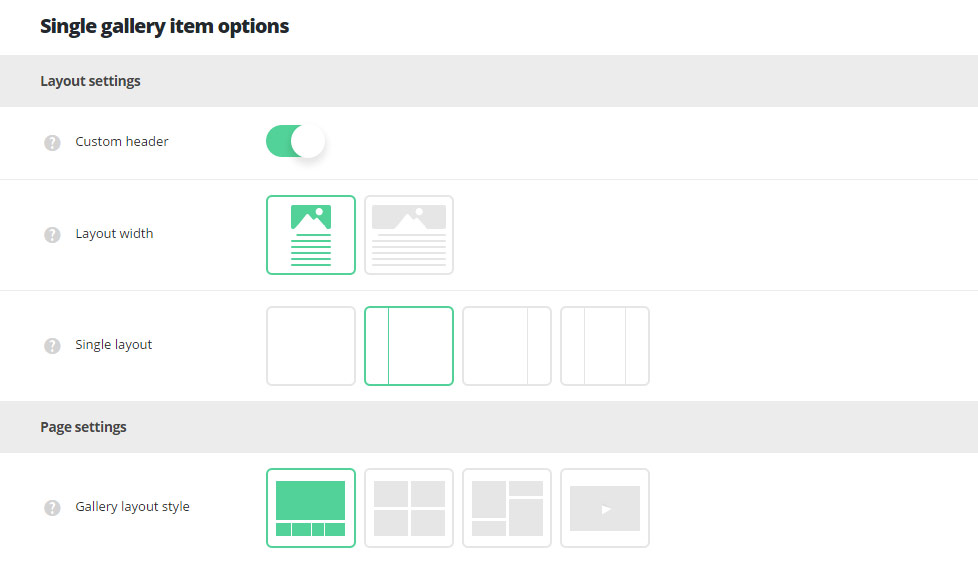
Layout settings
- Custom header – switch it to Enable to have the custom header on gallery items by default. It inherits the settings from
Theme optionsHeader optionsCustom header optionssection or you may overwrite them in single gallery item editorCustom Header optionsmeta box. - Layout width – set the single gallery content width. Boxed and full width variants are available.
- Single layout – select the layout type which will be set as default for all the single galleries. Layout with right, left, both or no sidebars are available.
Page settings
- Gallery layout style – choose layout style for the single gallery item. Carousel, Masonry, Grid, Video variants are available. Check more about each layout style in this post (
Single Gallery optionsAdvanced settingsmeta box).
Content settings
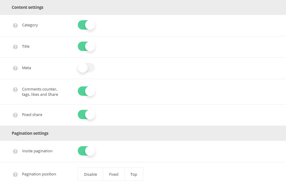
- Categories – select whether the categories of single gallery will be displayed or hidden.
- Title – set the title of the single gallery to be shown or hidden above the gallery item.
- Meta – allows you to show or hide meta information of single gallery item.
- Date – select whether the date of single gallery creation will be shown or hidden.
- Category – select the category to be either shown or hidden in meta of the gallery item.
- Comments – allows you to show or hide the comments counter of the gallery work.
- Likes – you to show or hide the likes count of the single gallery item.
- Comments counter, tags, likes and share – allows you to show or hide the comments counter, tags, likes and share on single gallery page.
- Fixed share – select whether you want to show or hide the fixed share (side share) on single gallery page. Check this link with fixed share enabled for single gallery.
Pagination settings
- Inside pagination – switch it to Enable if you want to display pagination between previous and next single galleries in single gallery item page.
- Pagination position – select the position of the inside pagination on single gallery page. Fixed and Top variants are available. You can also disable pagination.
Gallery page options
Customize the main gallery section of your site using easy and comprehensible Gallery page options section.
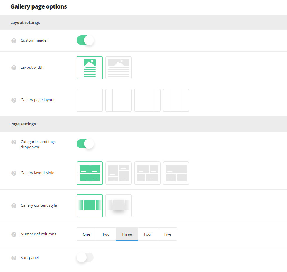
Layout settings
- Custom header – switch it to Enable to have the custom header on the pages with Gallery page template selected by default. It inherits the settings from
Theme optionsHeader optionsCustom header optionssection or you may overwrite them in single page editorCustom Header optionsmeta box. - Layout width – set the gallery page content width. Boxed and full width variants are available.
- Gallery page layout – select the layout type which will be set as default for the gallery page. Layout with right, left, both or no sidebars are available.
Page settings
- Categories and tags dropdown – allows you to show or hide categories, tags and author drop-down sorter before single galleries. Check this page as an example.
- Gallery layout style – select layout style for the gallery items on your gallery page.
- Grid – allows you to show regularly spaced horizontal and vertical elements. The example of grid Gallery page can be found here.
- Masonry – the style when the elements are shown one after another, first in the horizontal direction, then vertically. Check the Masonry Gallery page example.
- Justified Grid – shows elements one after another, first in the vertical direction, then horizontally. Check it here.
- Metro – allows you to show thumbnails images on Gallery page according to Gallery item style set on the inner Gallery item page in
Single Gallery optionsAdvanced settingsGallery item style on Gallery page template. Check the example of the Metro gallery page.
- Gallery content style – select the style of the content for gallery page. Simple and Tiled styles are available.
- Simple – allows you to have transparent background without hover effect.
- Tiled – allows you to have white background with shadow hover effect.
- Number of columns – select the number of columns for gallery items on the gallery page. Five is the maximum value (for Grid, Metro and Masonry styles only!).
- Sort panel – allows you to enable or disable gallery categories sorter above gallery items on gallery page.
- Sort panel alignment – allows you to align the sort panel horizontally. Left, right and center positions are available.
Content settings
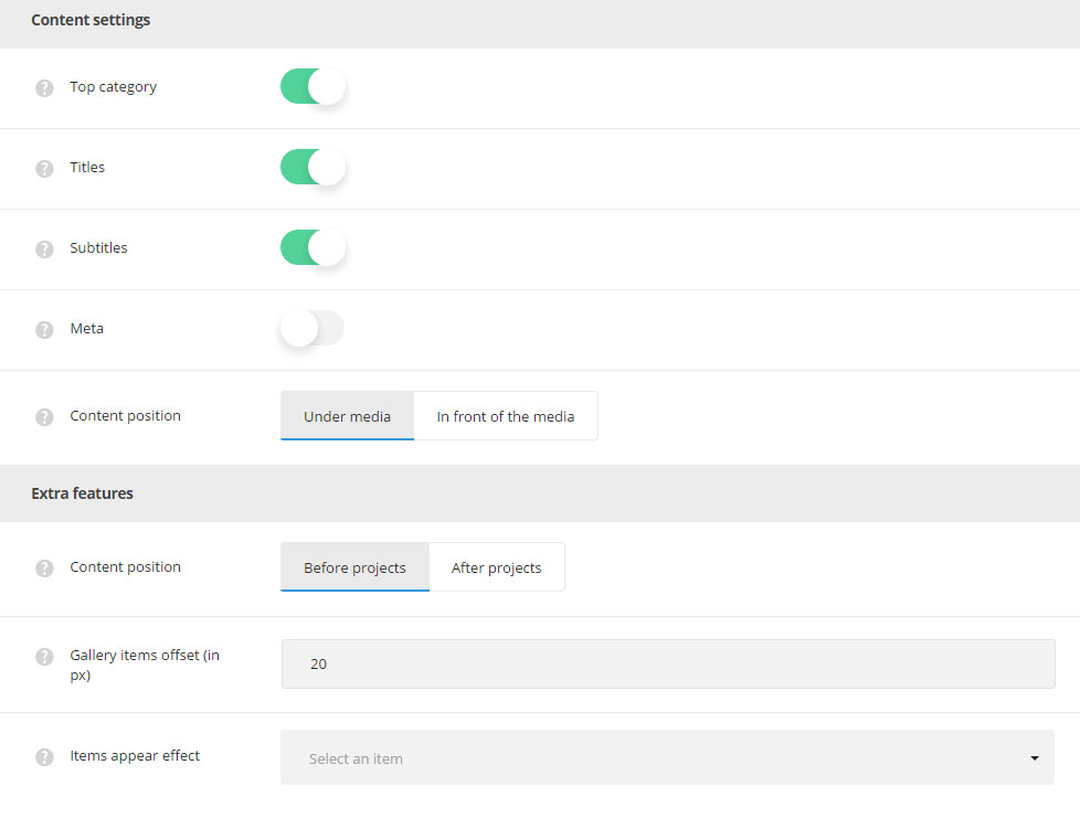
- Top category – allows you to show or hide the category name on the top right side of the featured image on the gallery page.
- Titles – select whether the title of the single gallery will be shown or hidden on the gallery page under the featured image of a single gallery.
- Subtitles – select whether the subtitle of the single gallery will be shown or hidden on the gallery page under the featured image of a single gallery item.
- Meta – allows you to show or hide the information about the gallery item (date of creation, category, likes, count) under the featured image.
- Date – select whether the date of single gallery item creation will be shown or hidden on the gallery page.
- Category – select the category to be either shown or hidden in meta of the single gallery.
- Comments – allows you to show or hide the comments count of the single gallery.
- Likes – you to show or hide the likes count of the single gallery.
- Content position – choose the position of the gallery info content. You can set the content under or in front of the media.
Extra features
- Content position – allows you to select the position of the Visual Composer content. You can set the content before or after the gallery items.
- Gallery items offset (in px) – add space between single gallery items, do not type”px” for this field.
- Items appear effect – select the most suitable the appear effect for the single gallery works.
Gallery archive page options
In this section, you can easily customize archive pages for gallery section on your site.
Layout settings
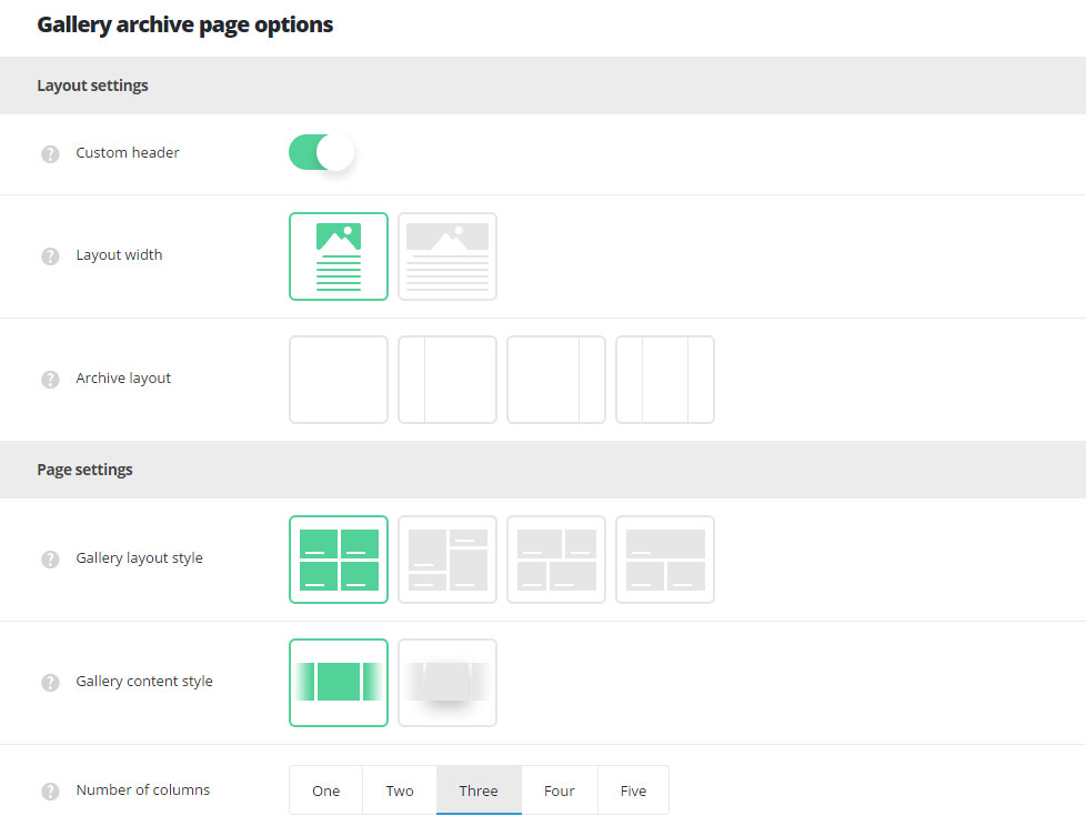
- Custom header – switch it to Enable to have the custom header on the archive gallery pages. It inherits the settings from
Theme optionsHeader optionsCustom header optionssection or you may overwrite them in single page editorCustom Header optionsmeta box. - Layout width – set the archive gallery page content width. Boxed and full width variants are available.
- Archive layout – select the layout type which will be set as default for the archive gallery page. Layout with right, left, both or no sidebars are available.
Page settings
- Gallery layout style – select layout style for the gallery items on your archive gallery page.
- Grid – allows you to show regularly spaced horizontal and vertical elements. The example of grid Gallery page can be found here.
- Masonry – the style when the elements are shown one after another, first in the horizontal direction, then vertically. Check the Masonry Gallery page example.
- Justified Grid – shows elements one after another, first in the vertical direction, then horizontally. Check it here.
- Metro – allows you to show thumbnails images on Gallery page according to Gallery item style set on the inner Gallery item page in
Single Gallery optionsAdvanced settingsGallery item style on Gallery page template. Check the example of the Metro gallery page.
- Gallery content style – select the style of the content for archive gallery page. Simple and Tiled styles are available.
- Simple – allows you to have transparent background without hover effect.
- Tiled – allows you to have white background with shadow hover effect.
- Number of columns – select the number of columns for gallery items on the gallery page. Five is the maximum value (for Grid, Metro and Masonry styles only!).
Content settings
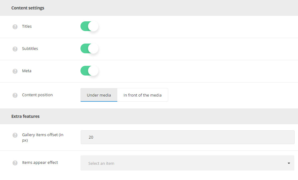
- Titles – select whether the title of the single gallery will be shown or hidden on the archive gallery page under the featured image of a single gallery.
- Subtitles – select whether the subtitle of the single gallery will be shown or hidden on the gallery page under the featured image of a single gallery item.
- Meta – allows you to show or hide the information about the gallery item (date of creation, category, likes, count) under the featured image.
- Date – select whether the date of single gallery item creation will be shown or hidden on the archive gallery page.
- Category – select the category to be either shown or hidden in meta of the single gallery.
- Comments – allows you to show or hide the comments count of the single gallery.
- Likes – you to show or hide the likes count of the single gallery.
- Content position – choose the position of the gallery info content. You can set the content under or in front of the media.
Extra features
- Gallery items offset (in px) – add space between single gallery items on archive gallery page, do not type”px” for this field.
- Items appear effect – select the most suitable appear effect for the single gallery works.
Gallery hover style options
Create the stylish and impressive hover effect for the single galleries on your site.
Main hover settings
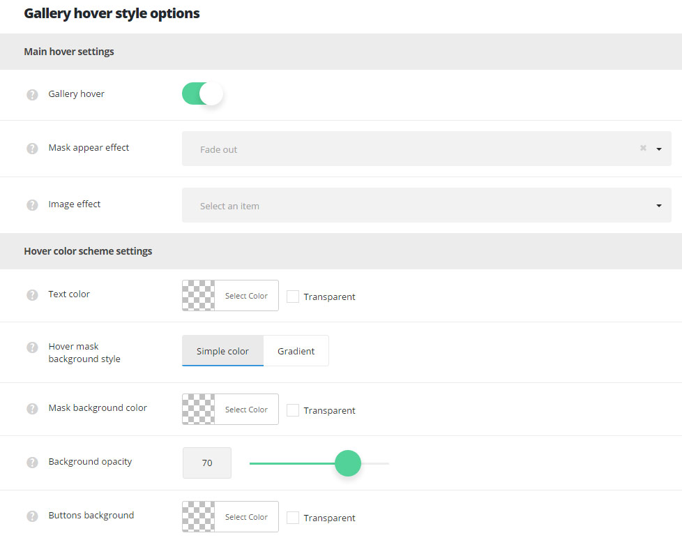
- Gallery hover – switch it to Enable to activate hover effect for the gallery works.
- Mask appear effect – allows you to select the appear effect fort the mask on hover for the gallery items.
- Image effect – This option allows you to choose the image behavior for the gallery items.
Hover color scheme settings
- Text color – select the color for the text which will appear on gallery item hover.
- Hover mask background style – set the background style for the hover mask.
- Simple – select this style to have one color for the gallery hover.
- Mask background color – select the background color for the hover mask.
- Gradient – select this style to have the gradient style for gallery hover.
- Background gradient – choose the start and end color for the hover mask gradient color for gallery work.
- Simple – select this style to have one color for the gallery hover.
- Background opacity – set the opacity value for the hover mask background.
- Buttons background – select the background color for buttons, works for Buttons selected as main hover decoration in
Theme optionsGallery optionsGallery hover optionssection.
Hover mask settings
- Frame decoration – switch it to Enable if you want to activate the frame decoration for the hover effect on gallery items. Check the example of the frame here.
- Frame style – select the frame style for your gallery items.
- Simple border – it allows you to add the border on hover for gallery items.
- Frame size – set the width for the border to be displayed on hover.
- Frame border color – сhoose the color for the frame decoration on hover.
- Offset – it allows you to add the offset for the hover effect on gallery items (so the offset will be displayed around the featured image of gallery item).
- Frame size – set the width for the offset to be displayed on hover for gallery items.
- Simple border – it allows you to add the border on hover for gallery items.
Hover decoration settings
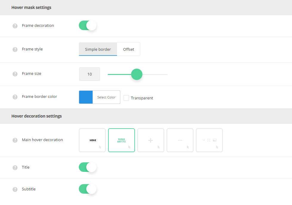
- Main hover decoration – set the decoration which will be displayed on hover.
- None – no decoration is set for mouse hover effect.
- Heading – allows showing the gallery title/subtitle which is possible to link to the single gallery item page itself, to the external link or open the image in lightbox. Follow this link to check the example.
- Title – set it to Enable if you want the gallery item title to be displayed on hover.
- Subtitle – set it to Enable if you want the gallery item subtitle to be displayed on hover.
- Plus – the plus icon will be displayed as hover decoration. Check the example here.
- Plus decoration – the plus icons has several styles available. It can be displayed as Big plus in the middle of the thumb, as Small plus in the middle of the thumb, it can be following the mouse.
- Dots – three dots will be displayed as hover decoration. Check the example of dots decoration with this link.
- Buttons – select the button which will appear on hover. Check the example here.
More details can be found in the Gallery Page Creation post Gallery hover options meta box Hover mask settings section.