Header Builder is the brand new feature of the Native theme. It allows creating unforgettable and unique header styles using Drag&Drop editor for your site in a couple of easy steps.
Now, to create the stunning header is simpler as than ever before: all you need is to select the element you’d like to add, select its location in the header and save changes.
Please, note, that it is a beta version of the builder that we offer and we’ll be constantly working on improving its functionality to make it the most convenient and easy way for creating the amazing header styles.
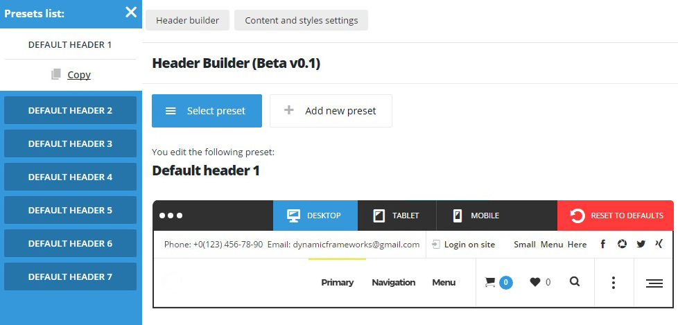
Note! By default, header builder consists of three panels: top, middle and bottom, in each turn each panel has left, right and main (middle) fields.
Also, you may edit the header appearance for the desktops, tablets and mobile devices. Its advanced responsive settings allow you to control the header appearance on any device.
The header builder comes with 7 prebuilt header styles. In case you need to modify any of them, select the prebuilt style and copy it to be able to adjust it to your needs.
Header Builder
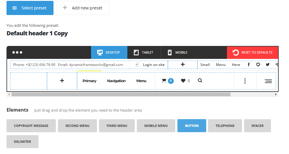
Check the list of the elements available within header Builder:
- Copyright message – inform your users about the copyright ownership in a published work.
- Menu – main menu assigned for Primary navigation in
AppearanceMenusManage locationssection. - Second menu – menu assigned for Second Navigation in
AppearanceMenusManage locationssection. - Third menu – menu assigned for Third Navigation in
AppearanceMenusManage locationssection. - Additional menu – additional menu assigned for Additional Navigation in
AppearanceMenusManage locationssection. - Wishlist – the wishlist icon (note, the WooCoomerce, and YITH Wishlist plugins need to be installed and activated for this).
- Cart – cart icon for shop site (note, the WooCoomerce plugin needs to be installed and activated for this).
- Search – search icon used for searching on the site.
- Logo – main logo for the site. By default, it is set to full-width.
- Language – language switcher for multi-language sites.
- Social icon – social accounts the links to which are entered in
Theme optionsSocial AccountsSocial networkssection. - Login on site – login form used for the fast and convenience access to the admin area of the site.
- Info – short contact information, such as telephone number and email address.
- Mobile menu – hamburger menu button with the mobile menu inside.
- Side Area – hamburger menu which reveals additional section on click with widgets inside.
- Inner page – kebab button in the header which activates top inner page on click, the example can be found here. Note, you have to be sure, that the top inner page and the main page are not the same to avoid conflicts and errors on the page.
- Button – additional button with external link assigned.
- Telephone – the telephone number.
- Delimiter – decoration element used for elements separation.
- Spacer – allows adding the space between elements in the header.
Below you may find more details about each option available within Native Header Builder:
Header Builder
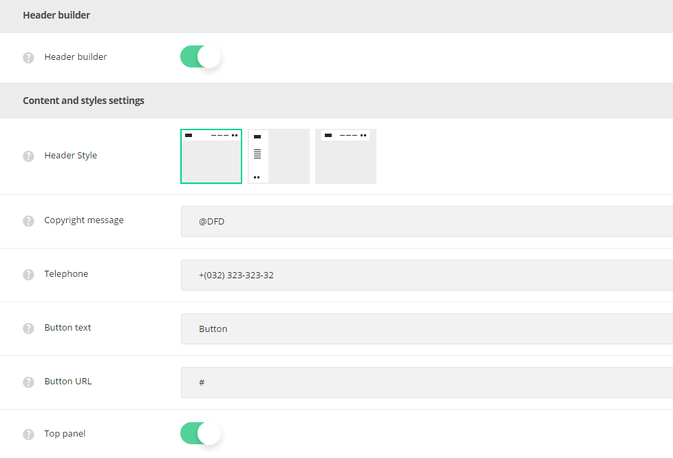
- Header Builder – set it to Enable to activate Header Builder and design you own header style.
Content and styles settings
- Header style – select one of the preset header styles. Standard, Side and Boxed styles are available.
- Within Side Header functionality, some of the header elements have the options to be set to full width within to take 100% width of the space available.
Side header has separate settings, you may check them below:- Background image – select the image from the media library which will be set as a header background image.
- Side header width -set the width of the side header. Minimum value is 125px and maximum value is 450px.
- Boxed header has the same appearance as the standard one, but it has 25px padding from top, left and right sides.
- Within Side Header functionality, some of the header elements have the options to be set to full width within to take 100% width of the space available.
- Copyright message – enter the copyright message used in the header.
- Telephone – enter the telephone number which will be displayed in the header.
- Button text – enter the title for the button.
- Button URL – specify the link for the button used in the header. It will inherit the styles from
Theme optionsGeneral optionsDefault button optionssection. - Top panel – set it to Enable to display Top Panel section in the header.
- Middle panel – set it to Enable to display Middle Panel in the header.
- Bottom panel – set it to Enable to display Bottom Panel in the header.
- Top panel min-height – set the min-height for the Top panel section in the header.
- Middle panel min-height – set the min-height for the Middle panel section in the header.
- Bottom panel min-height – set the min-height for the Bottom panel section in the header.
- Set main field in Top panel to center – since each panel consists of left, right and main (middle) section, there is an option to set the main (middle) field to be aligned to center permanently. Set this option to Enable to set the main field of the Top panel to center.
- Set main field in Middle panel to center – switch it to Enable to set the main field of the Middle panel the to center.
- Set main field in Bottom panel to center – this option to Enable to set the main field of the Bottom panel the to center.
- Top panel background color – select the background color for the top section of the header.
- Middle panel background color – select the background color for the middle section of the header.
- Bottom panel background color – select the background color for the bottom section of the header.
- Top panel text color – choose the text color for the elements inside the top section in the header.
- Middle panel text color – choose the text color for the elements inside the middle section in the header.
- Bottom panel text color – choose the text color for the elements inside the bottom section in the header.
- Border color – select the color of the delimiter and separator line between sections.
- Header logotype image – select the image from the media library which will be set as logotype image for the current header style.
- Header logotype image for retina – upload the image from the media library which will be set as logotype image for retina for the current header style.
- Header animation – switch it to Enable if you want to have the header animation on scroll (the main header will hide on scroll).