Allows you to create a Call to Action item with or without icons or text. Create the noticeable element for your site to get the immediate response from your customers.
Check the Call to Action module example following this link.
Watch the video tutorial on Call to Action module creation for more details.
General settings
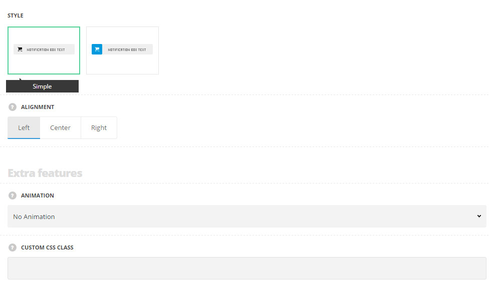
- Style – choose between 2 preset styles.
- Simple – the icon and text content are displayed on one background color.
- Separated – the icon has its own background color set and text content has its own background color.
- Alignment – select the horizontal alignment of the element: Left, right and center positions are available.
Extra features
- Animation – choose between 14 preset animation effects.
- Custom CSS class – enter our own unique class name for the item – this is a useful option for those who want to create a specific style. E.g.: you can type custom-style class and then go to
Theme optionsGeneral optionsCustom CSS/JSCustom CSSfield and write your own CSS code with this class to get your own style.
Main content settings
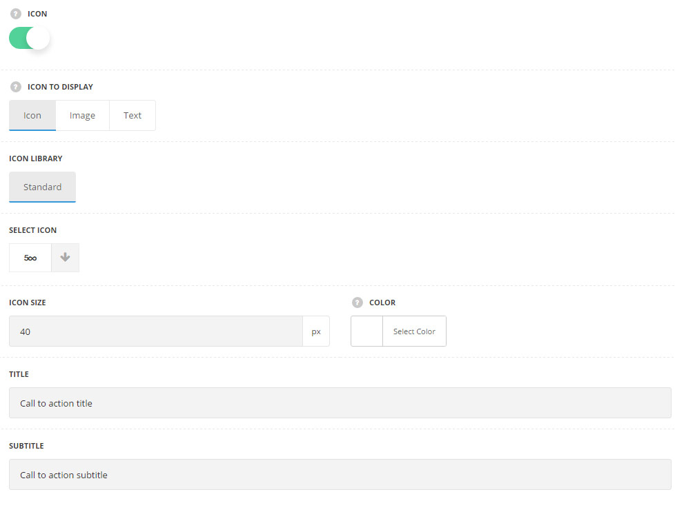
- Icon – set it to Enable to add the icon to the call to action content.
- Icon to display – select the element to be displayed on the left side from the text.
- Icon – select this variant to display icon on the left side from the text.
- Icon library – choose the icon library for the module.
- Select icon – select the icon to be displayed in the module.
- Icon size – select the size for the icon for Call to Action module.
- Icon color – select the color for the icon for Call to Action module. Default icon color is #fff.
- Image – select this variant to display custom image on the left side from the text.
- Upload image – select the image from media library for Call to Action module.
- Text – select this variant to display custom text for Call to Action module. The default settings are inherited from theme files and are as following: line-height:1 em, font-family: Montserrat, font-weight: 700, letter-spacing: -1px.
- Font size – set the font size you need to use for the text displayed on the left site.
- Letter spacing – set the needed distance between letters.
- Text color – set the color of the font of the text.
- Font style – select the font weight and style (bold, italic) for the text.
- Custom font family – set it to Enable to use custom Google font.
- Font Family – select the font family from the drop-down list.
- Font style – select the font weight and style (bold, italic) from the list.
- Icon – select this variant to display icon on the left side from the text.
- Title – enter the title for the Call to Action module.
- Subtitle – enter the subtitle for the Call to Action module.
Button settings
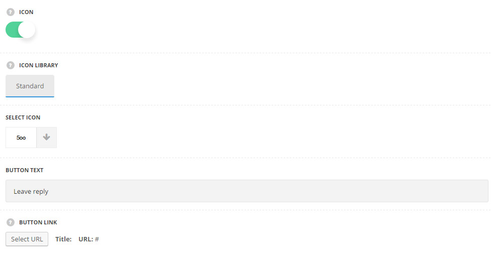
- Icon – set it to Enable to you to add the icon to the Call to Action button.
- Icon library – choose the icon library for the module. Standard and none variants are available.
- Select icon – select the icon to be displayed in the button.
- Button text – enter the text for the Call to Action button.
- Button link – assign the link for the button in the Call to Action module.
Styles
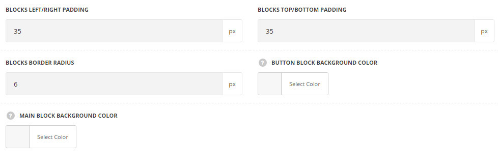
- Blocks left/right padding – set the value for the left and right paddings of the Call to Action button.
- Blocks top/bottom padding – set the value for the top and bottom paddings of the Call to Action button.
- Blocks border radius – set the border radius to have rounded corners for the Call to Action module.
- Button block background color – select the background color for the button container. Default button block background color is #f4f4f4.
- Main block background color -select the background color for the main content container. The default value is inherited from
Theme OptionsStyling optionsMain site color.
Button styles
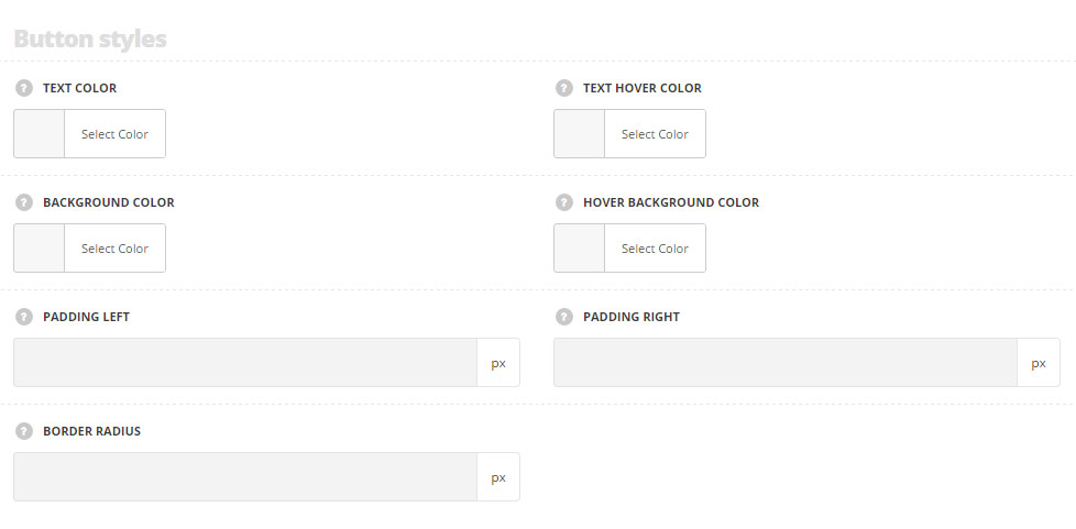
- Text color – select the text color for the button. The default value is inherited from
Theme optionsGeneral optionsDefault button optionsDefault Button Typographysection. - Text hover color – select the text color for the button on hover. The default value is inherited from
Theme optionsGeneral optionsDefault button optionsDefault button hover text color. - Background color – select the background color for the button. The default value is inherited from
Theme optionsGeneral optionsDefault button optionsDefault button background colorsection. - Hover background color – select the background color for the button on hover. The default value is inherited from
Theme optionsGeneral optionsDefault button optionsDefault button hover background colorsection. - Padding left – set the padding left for the button, from button text to the edge of the button. The default value is 40 px, if the icon is set for the button the value is 50px.
- Padding right – set the padding right for the button, from button text to the edge of the button. The default value is 40 px.
- Border radius – select the border radius for the button to have rounded corners.
Typography settings
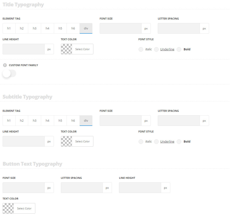
Title Typography
The settings are inherited from Theme options Typography/Fonts Headings typography Content title big Typography section and the following values are inherited direct from theme files and are as follows: font-size: 21px, color: #fff, line-height: 1.2.
- Element tag – select the tag for the title.
- Font size – set the font size you need to use in the title.
- Letter spacing – set the needed distance between letters.
- Line-height – set the needed distance between lines in the title text.
- Text color – set the color of the font.
- Font style – select the font weight and style (bold, italic) for the title.
- Custom font family – set it to Enable to use custom Google font.
- Font Family – select the font family from the drop-down list.
- Font style – select the font weight and style (bold, italic) for the title.
Subtitle Typography
The settings are inherited from Theme options Typography/Fonts Text typography default text Typography section and the following values are inherited direct from theme files and are as follows:color: rgba(255,255,255,.4), line-height: 1.6, padding-top: 7px.
- Element tag – select the tag for the subtitle.
- Font size – set the font size you need to use in the subtitle.
- Letter spacing – set the needed distance between letters in the subtitle.
- Line-height – set the needed distance between lines in the subtitle text.
- Text color – set the color of the font.
- Font style – select the font weight and style (bold, italic) for the subtitle.
- Custom font family – set it to Enable to use custom Google font.
- Font Family – select the font family from the drop-down list.
- Font style – select the font weight and style (bold, italic) for the subtitle.
Button Text Typography
The button settings for Call to Action module are inherited from Theme options General options Default button options Default button typography section.
- Font size – set the font size you need to use in the button text.
- Letter spacing – set the needed distance between letters in the button text.
- Line-height – set the needed distance between lines in the button text.
- Text color – set the color of the font.