This module gives a great possibility to inform your visitors about events, meetings, exhibitions, sales, etc.
You may check the customization example on the Countdown page.
Watch the video tutorial on Countdown module creation for more details.
General settings
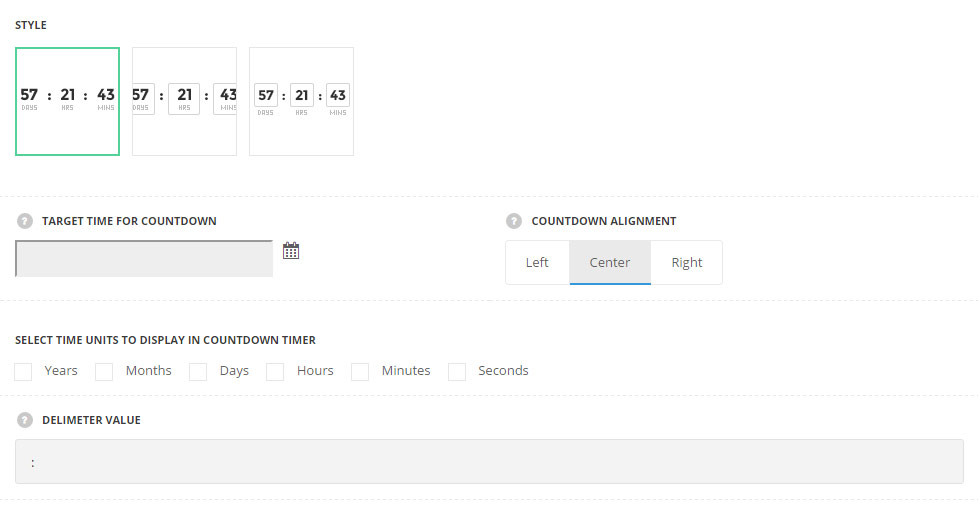
- Style – choose between 3 preset styles.
- Simple – only the number are displayed in count-down.
- Bordered – the border is displayed around the module.
- Bordered number – the border is displayed around the numbers only.
- Target time for countdown – select the target time using the built-in calendar. The data and time are displayed in the following format:(yyyy/mm/dd hh:mm:ss).
- Countdown alignment – select the horizontal alignment for the countdown element. Left, right and center positions are available.
- Select time units to display in countdown timer – select the necessary units among the following: years, month, days, hours, minutes, seconds.
- Delimiter value – enter the symbol for desired delimiter (e.g.: “:”, “/” etc).
Extra features
- Animation – choose between 14 preset animation effects.
- Custom CSS class – enter our own unique class name for the item – this is a useful option for those who want to create a specific style. E.g.: you can type custom-style class and then go to
Theme optionsGeneral optionsCustom CSS/JSCustom CSSfield and write your own CSS code with this class to get your own style.
Style settings
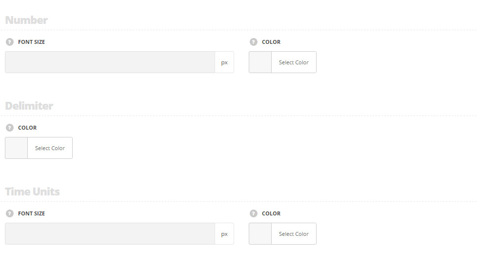
Number
- Font size – enter the font size for the number. The default size for the simple style is 45px. The default size for the bordered and bordered number styles is 35px.
- Color – choose the color for the number. The default color is inherited from
Theme optionsTypography/FontsHeadings typographyContent title big Typography.
Delimiter
- Color – choose the color for the delimiter. The default color is inherited from
Theme optionsTypography/FontsHeadings typographyContent title big Typography.
Time units
- Font size – enter the font size for the time units titles. These settings are inherited from
Theme optionsTypography/FontsText typographyDefault text Typographyfor simple styles. The default size for the bordered and bordered number styles is 13px. - Color – choose the color for the number. The default color is inherited from
Theme optionsTypography/FontsText typographyDefault text Typography.