DFD Tours module is the excellent module for stylish presentation of the information and saving the page space at once.
You may add as many tours as you want.
More examples can be found on Tours page.
This is a nested shortcode – module that includes other modules. You may style the container and then fill it in with elements.
Watch the video tutorial on DFD Tours module creation for more details.
General settings
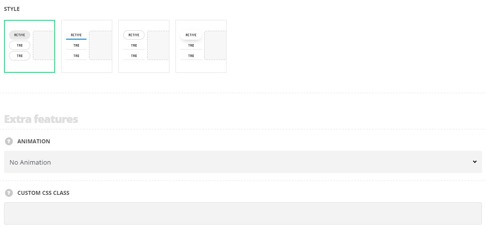
- Style – select the style of the Tour section for your site.
- Classic – the tour sections have the transparent background color set for each of them, except for the active tour section, the background color for which can be set in module settings.
- Underline – the tour sections are displayed with underline decoration. The underline color is different for the active tour section.
- Active tour border – the inactive tour sections are displayed with underline decoration while the active tour section has the transparent background color with the border around.
- Active tour background – the inactive tour sections are displayed with underline decoration while the active tour section has the transparent background color with the shadow decoration effect.
Extra features
- Animation – choose between 14 preset animation effects.
- Custom CSS class – enter our own unique class name for the item – this is a useful option for those who want to create a specific style. E.g.: you can type custom-style class and then go to
Theme optionsGeneral optionsCustom CSS/JSCustom CSSfield and write your own CSS code with this class to get your own style.
Tour style
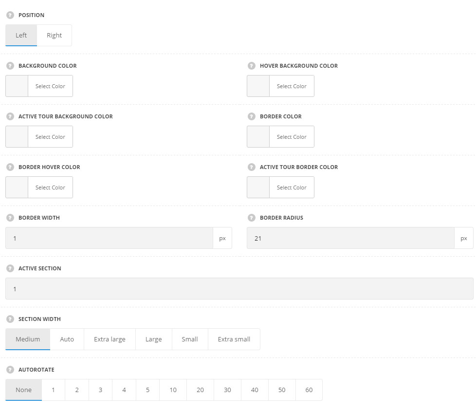
- Position – select tour sections position. They can be displayed on the left or right side.
- Background color – set the background color for the tour section. The background is not set by default. For Classic style only.
- Hover background color – select the background hover color for inactive tours. The background is not set by default. For Classic style only.
- Active tour background color – set the background color for the active tour. The default background color for style Classic is inherited from
Theme OptionsStyling OptionsSecond site color. The color for the styles Active tour border and Active tour background is not set by default. - Border color – specify the border color for the tour. The default border color is inherited from
Theme OptionsStyling OptionsSecond site color. - Border hover color – specify the border color for the tour on hover. The default border color is inherited from
Theme OptionsStyling OptionsSecond site color. - Active tour border color – choose the border color for the active tour. For the style Underline it is set as underline color for the active tour. The default underline color for the style Underline is inherited from
Theme OptionsStyling OptionsMain site color. The default border color for others styles is inherited fromTheme OptionsStyling OptionsSecond site color. - Border width – set the border width for the tours.
- Border radius – set the border radius for the tabs.
- Active tour border width – set the border width for the active tour. For Underline style only.
- Active tour border radius – set the border radius for the active tour. For Active tour border and Active tour background styles only.
- Underline on inactive tab – set it to Enable to display the underline decoration under inactive tabs. For Underline, Active tour border and Active tour background styles only.
- Underline height – specify the height of the underline decoration in px. For Underline, Active tour border and Active tour background styles only.
- Underline color – choose the underline color for the inactive tabs. The default underline color is inherited from
Theme OptionsStyling OptionsSecond site color. For Underline, Active tour border and Active tour background styles only. - Underline hover color – choose the underline color for the inactive tabs on hover. The default underline color is inherited from
Theme OptionsStyling OptionsSecond site color. For Underline, Active tab border and Active tab background styles only. - Active section – enter the number of the section which should be active on page load. Note: to have all sections closed on initial load enter non-existing number of the tours in the module used.
- Section width – select the width of the tour section.
- Medium – the tour will take 30% of the container width it is inside (row/column).
- Auto – the tour will take 30% of the container width it is inside (row/column).
- Extra large – the tour will take 50% of the container width it is inside (row/column).
- Large – the tour will take 40% of the container width it is inside (row/column).
- Small – the tour will take 20% of the container width it is inside (row/column).
- Extra small – the tour will take 10% of the container width it is inside (row/column).
- Autorotate – enable the automatical tabs rotation, choose the periodicity of tours rotation in seconds.
Title style
These settings are inherited directly from theme files and are as follows: font-family: “Montserrat”, “Open Sans”, “PT Sans”, sans-serif, font-size: 11px, letter-spacing: 0.6pt, color: #28262b.
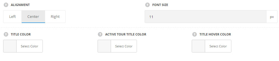
- Alignment – set the tour title alignment. Left, right and center positions are available.
- Font size – set the font size for the tour title.
- Title color – set the color for the tour title. The default color is #28262b.
- Active tour title color – set the color for the active tour title. The default color is #28262b.
- Title hover color – select the color of the tour title on hover. The default color is inherited from
Theme OptionsStyling OptionsMain site color.
Icon style
Set the style of the icon used in the tour section. Each icon can be set in Section settings of the tour.
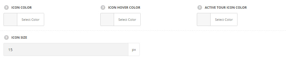
- Icon color – set the icon color. The default color is #28262b.
- Icon hover color – set the icon color on hover. The default color is inherited from
Theme OptionsStyling OptionsMain site color. - Active tour icon color – choose the icon color for the active tour. The default color is #28262b.
- Icon size – choose the size for the icon set for the tour section.
Content style
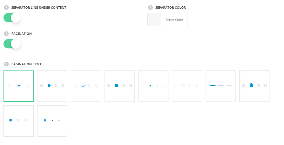
- Separator line under content – set it to Enable to display the separator line below each tour content.
- Separator color – select the color for the separator decoration.The default color is #28262b with opacity 20%.
- Pagination – set it to Enable to display the pagination dots for your tours
- Pagination style – select the best suitable pagination style for your tours section.
Section settings
By clicking on edit icon of each section you can set the icons for it and customize it to your needs.
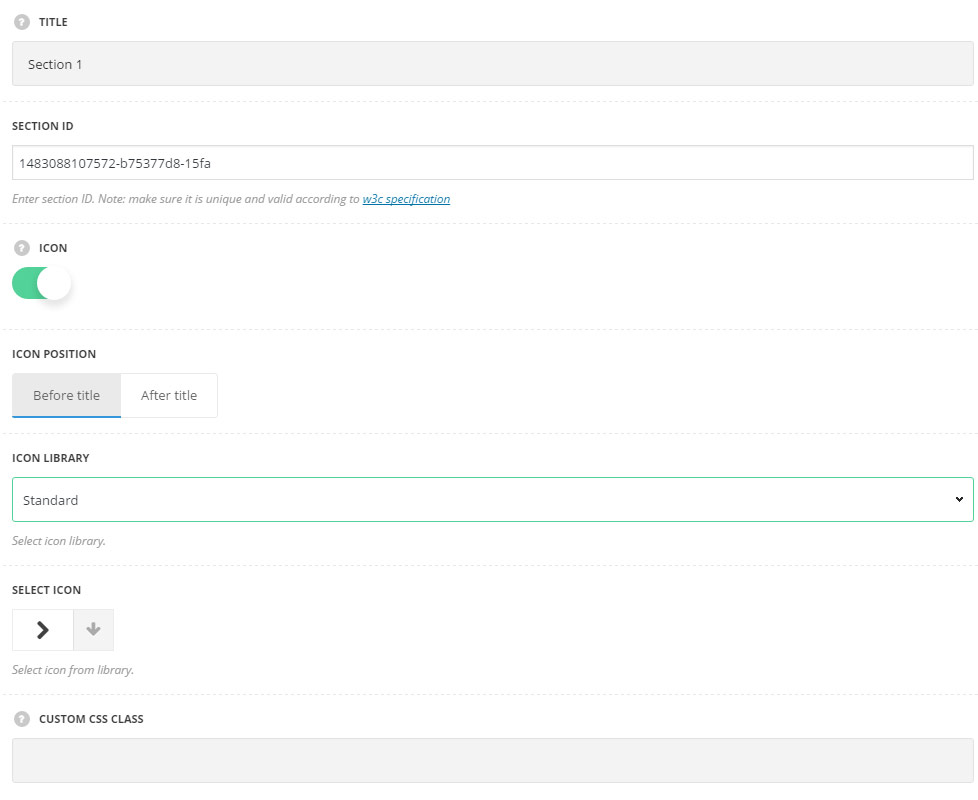
- Title – enter the title of the section.
- Section ID – enter section ID. Note: make sure it is unique and valid according to W3c specification.
- Icon – set it to Enable to show the icon in the tour.
- Icon position – select position of the icon in the tour. It can be set before and after the title.
- Icon library – choose the icon library for the module.
- Select icon – select the icon to be displayed in the module.
- Custom CSS class – enter our own unique class name for the item – this is a useful option for those who want to create a specific style. E.g.: you can type custom-style class and then go to
Theme optionsGeneral optionsCustom CSS/JSCustom CSSfield and write your own CSS code with this class to get your own style.