Full Screen Portfolio module allows you to create the extra stylish portfolio section on the page arranged into either vertical or horizontal carousel. The portfolio featured image is displayed on its background with blur and overlay effect.
Note, this portfolio module is designed to be used inside the full-width containers (rows and columns) for its better displaying.
The portfolio title also has the peculiarities of displaying: the first word of the portfolio title is displayed on the first line, while all the others are displayed on the second line by default.
Check the examples of the module variations on this page.
Watch the video tutorial on Full Screen Portfolio module creation for more details.
General settings
Portfolio items settings
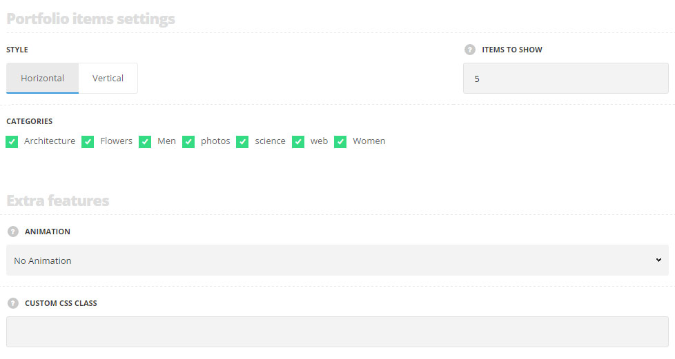
- Style – choose the carousel style of the portfolio module which suits you most of all.
- Horizontal – select this style to have the portfolio carousel with the horizontal scroll.
- Vertical – select this style to have the portfolio carousel with the vertical scroll.
- Items to show – set the number of works to be displayed in the module.
- Categories – select the categories of the portfolio items to be displayed within the module.
Extra features
- Animation – choose between 14 preset animation effects.
- Custom CSS class – enter our own unique class name for the item – this is a useful option for those who want to create a specific style. E.g.: you can type custom-style class and then go to
Theme optionsGeneral optionsCustom CSS/JSCustom CSSfield and write your own CSS code with this class to get your own style.
Content settings
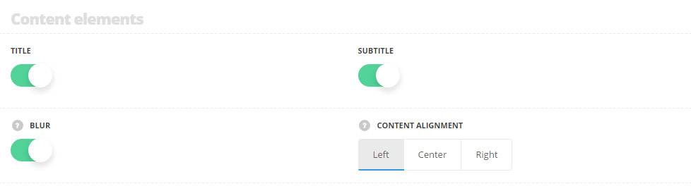
- Title – set it to Enable to display the category of the portfolio on the featured image of the single portfolio item.
- Subtitle – set it to Enable to display the subtitle of the single portfolio item.
- Blur – set it to Enable to enable the blur effect for background image fade carousel.
- Content alignment – select the horizontal alignment of the content. Left, right and center positions are available.
Style settings
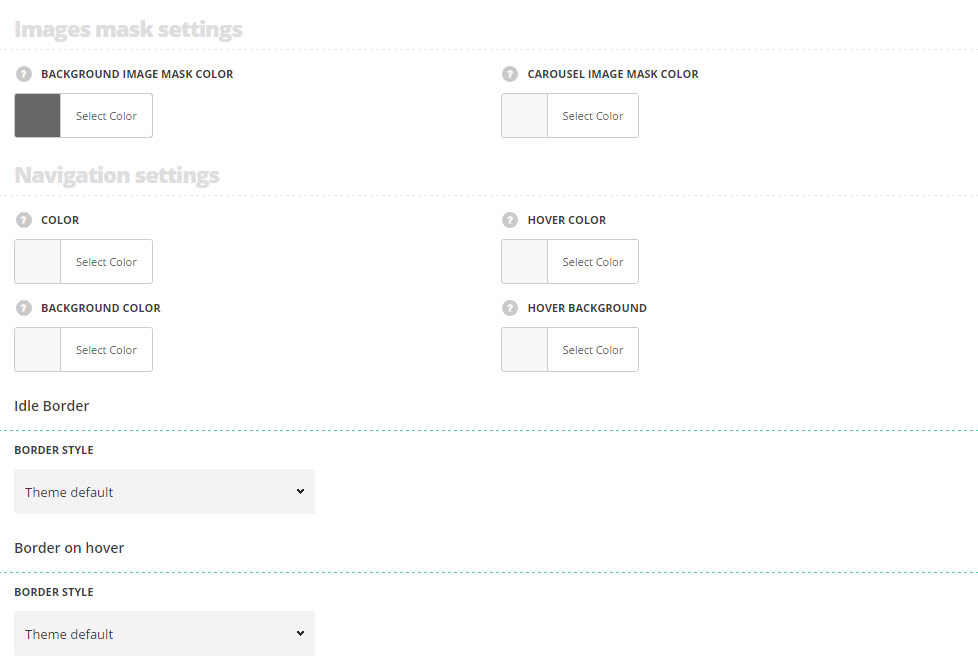
Images mask settings
- Background image mask color – set the color for the background overlay applied to the featured image of the portfolio item displayed as a background.
- Carousel image mask color – set the color for the background overlay applied to the featured image of the portfolio item displayed inside of the carousel.
Navigation settings
- Color – set the color for the navigation arrows. White (#fff) color is set by default.
- Hover color – set the color for the navigation arrows on hover. White (#fff) color is set by default.
- Background color – set the background color for the navigation arrows. Transparent is set by default.
- Hover background – set the background color for the navigation arrows on hover. The default value inherits from
Theme OptionsStyling OptionsMain site color.
Idle Border
- Border style – select one of the available border styles for the navigation arrows in idle state. Dotted, dashed and solid variants are available.
- Color – specify the color of the border.
- Border radius – select the border radius for button module to have rounded corners.
- Border width – set the width of the border. You may set the desired width each border: top, right, left and bottom.
Border on hover
- Border style – select one of the available border styles for the navigation arrows on hover. Dotted, dashed and solid variants are available.
- Color – specify the color of the border.
- Border radius – select the border radius for button module to have rounded corners.
- Border width – set the width of the border. You may set the desired width each border: top, right, left and bottom.
Typography settings
Title typography
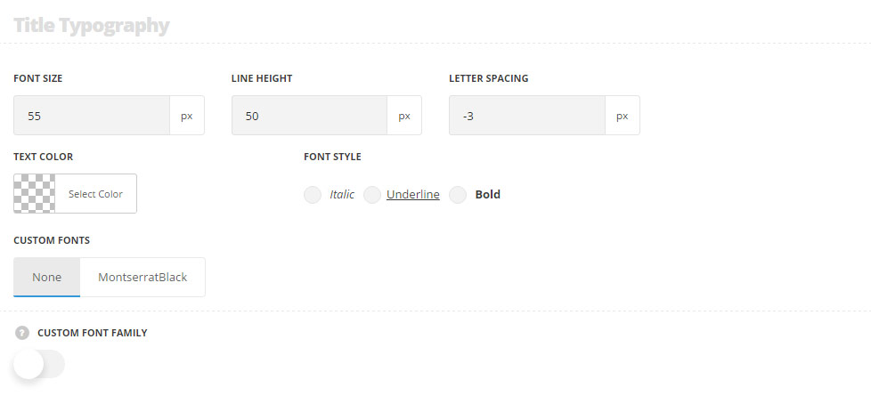
These settings are inherited from Theme options Typography/Fonts Portfolio typography Portfolio item title Typography with font-size set to 55px, line-height 50px, letter-spacing set to -3px by default.
- Font size – set the font size you need to use in the title.
- Letter spacing – set the needed distance between letters.
- Line-height – set the needed distance between lines in the title text.
- Text color – set the color of the font.
- Font style – select the font weight and style (bold, italic) for the title.
- Custom font family – set it to Enable to use custom Google font.
- Font Family – select the font family from the drop-down list.
- Font style – select the font weight and style (bold, italic) for the title.
Subtitle Typography
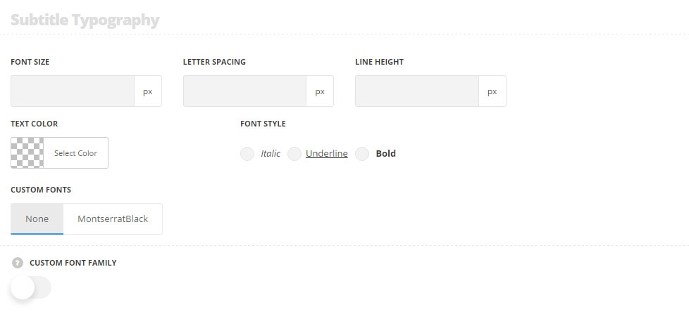
These settings are inherited from Theme optionsTypography/FontsPortfolio typography Portfolio item subtitle Typography.
- Font size – set the font size you need to use in the subtitle.
- Letter spacing – set the needed distance between letters in the subtitle.
- Line-height – set the needed distance between lines in the subtitle text.
- Text color – set the color of the font.
- Font style – select the font weight and style (bold, italic) for the subtitle.
- Custom font family – set it to Enable to use custom Google font.
- Font Family – select the font family for the drop-down list.
- Font style – select the font weight and style (bold, italic) for the subtitle.
The pagination typography settings are inherited from Theme optionsTypography/Fonts Text typography Default text Typography.
Responsive settings
Title responsive settings
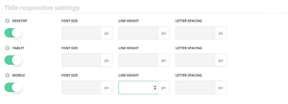
These settings are inherited from Theme options Typography/Fonts Portfolio typography Portfolio item title Typography, font-size is set to 55px, line-height -50px, letter-spacing is set to -3px by default.
- Desktop – set the title font size, line height and letter spacing for the screen resolutions from 1280px to 1025px.
- Tablet – set the title font size, line height and letter spacing for the screen resolutions from 1024px to 800px.
- Mobile – set the title font size, line height and letter spacing for the screen resolutions less than 800px.