Impress your visitors with the metro style of your gallery section. More example of the module can be found on Gallery Metro page.
Before displaying the gallery items in Gallery module, you need to create gallery items in the corresponding section of the admin panel. Check the Gallery item creation section of the theme documentation for more information.
Watch the video tutorial on Gallery Metro module creation for more details.
General settings
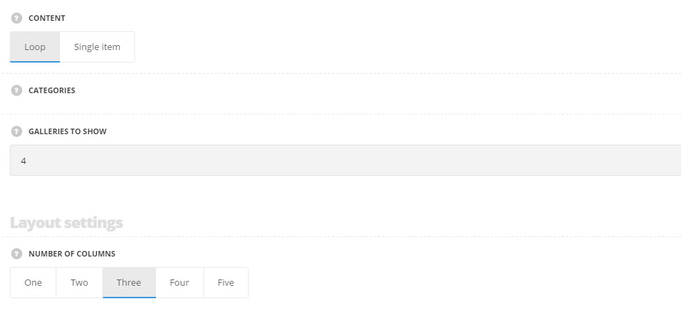
- Content – select the content to be displayed in the module.
- Loop – choose this style to display the latest gallery works.
- Single item – select this content type to display single gallery work on the page.
- Categories – select the categories of the gallery items to be displayed within the module. For Loop style only.
- Galleries to show – select the number of the gallery to be displayed in the module. For Loop style only.
For Single item style there is an option to select the items to be displayed.
By clicking on the arrow down icon you can reveal the whole section to adjust it to your needs. Here you are also able to duplicate the gallery items, change their order (simply drag-n-drop the blocks) and delete the unnecessary ones as well.
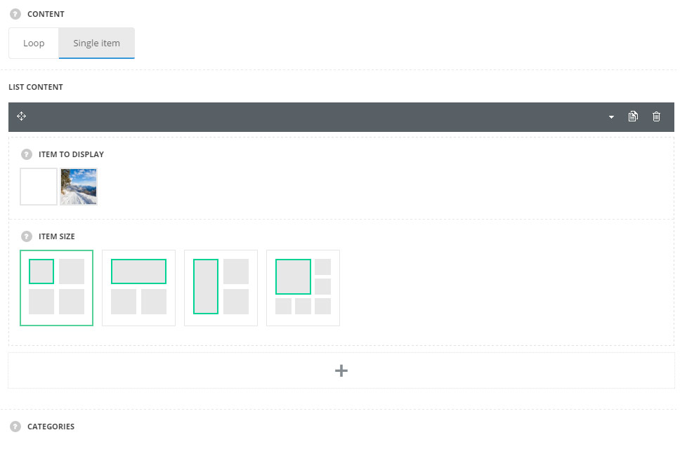
- Item to display – select the gallery work you want to show.
- Item size – select the size of the featured image of the gallery work.
Using this section you can create your own structure and achieve any displaying you may need.
Layout settings
- Number of columns – select the number of the columns you want to have for your gallery section.
Extra features
- Animation – choose between 14 preset animation effects.
- Custom CSS class – enter our own unique class name for the item – this is a useful option for those who want to create a specific style. E.g.: you can type custom-style class and then go to
Theme optionsGeneral optionsCustom CSS/JSCustom CSSfield and write your own CSS code with this class to get your own style.
Content settings
Content elements
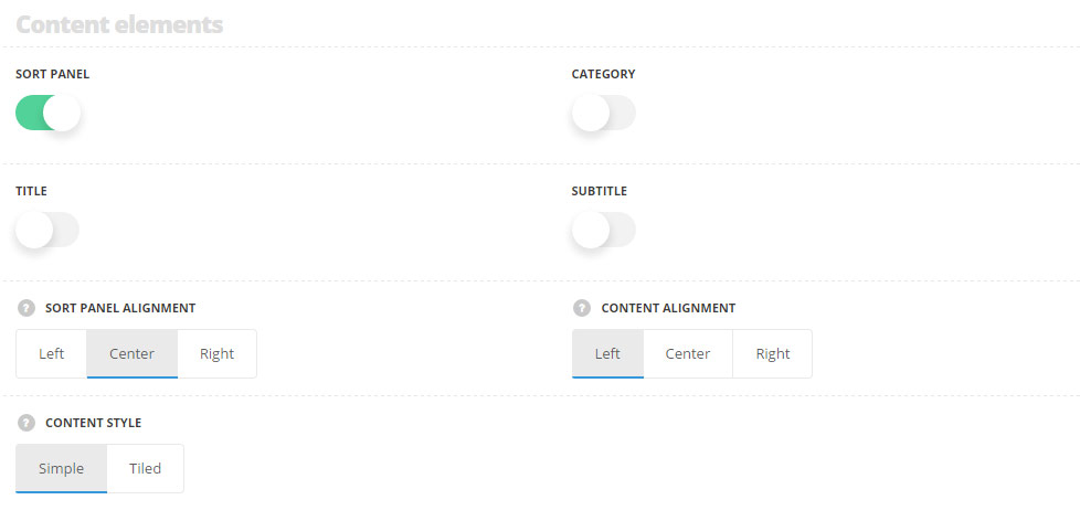
- Sort panel – set it to Enable to display the sort panel with the gallery categories above the single gallery items.
- Category – switch it to Enable to display the featured image of the single gallery item.
- Title – set it to Enable to display the category of the gallery on the featured image of the single gallery item.
- Subtitle – set it to Enable to display the subtitle of the single gallery item.
- Enable excerpt – switch it to Enable to display the excerpt of the single gallery item as its description.
- Sort panel alignment – select the horizontal alignment of the sort panel. Left, right and center positions are available.
- Content style – choose the content hover style.
- Simple – the gallery works are displayed on the transparent background without hover effect.
- Tiled – the gallery works are displayed on white background with shadow hover effect.
Hover settings
More information regarding the gallery hover settings may find in the Gallery options post (Gallery hover style options section).
Main hover settings
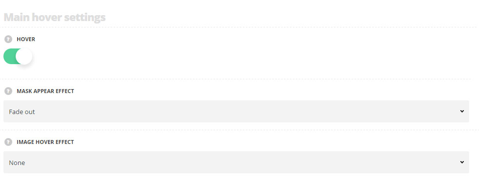
- Hover – switch it to Enable to activate hover effect for your gallery items inside the module.
- Mask appear effect – select the hover effect for the mask appearing from the available ones.
- Image hover effect – choose behavior for the featured image on hover.
Hover mask settings
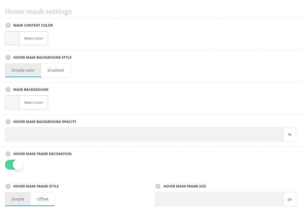
- Mask content color – choose the color for the content text. The default value is inherited from
Theme optionsGallery optionsGallery hover style optionsText color. - Hover mask background style – select the mask background style, you can choose simple color or gradient. The default value is inherited from
Theme optionsGallery optionsGallery hover style optionsHover mask background style. - Mask background – choose the mask background color. The default value is inherited from
Theme optionsGallery optionsGallery hover style optionsHover mask background color. - Mask background opacity– choose the mask background color. The default value is inherited from
Theme optionsGallery optionsGallery hover style optionsHover mask background opacity. - Hover mask frame decoration – set it to Enable to display the frame decoration on hover.
- Hover mask background style – select the style of the mask decoration. Simple and Offset styles are available.
- Hover mask frame size – set the size for the frame decoration on hover.
Hover decoration settings
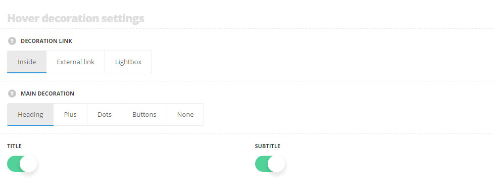
- Decoration link – choose the behavior for the decoration link. It may be leading to the inner gallery item page, to the external link or to the lightbox.
- Main decoration – choose the main decoration style for the hover. More information regarding each style you may find in the Gallery options post (Gallery hover style options section).
- Title – set it to Enable to display the title of the gallery item on hover.
- Subtitle – set it to Enable to display the subtitle of the gallery item on hover.
Typography settings
Title typography
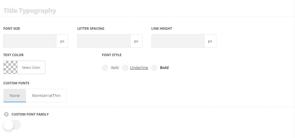
These settings are inherited from Theme options Typography/Fonts Gallery typography Gallery item title Typography.Default color is #fff. If the title is set to be displayed, but no hover effect is set for the gallery items, the setting for title are inherited from Theme optionsTypography/FontsBlog typography Blog title Typography.
- Font size – set the font size you need to use in the title.
- Letter spacing – set the needed distance between letters.
- Line-height – set the needed distance between lines in the title text.
- Text color – set the color of the font.
- Font style – select the font weight and style (bold, italic) for the title.
- Custom font family – set it to Enable to use custom Google font.
- Font Family – select the font family from the drop-down list.
- Font style – select the font weight and style (bold, italic) for the title.
Subtitle typography
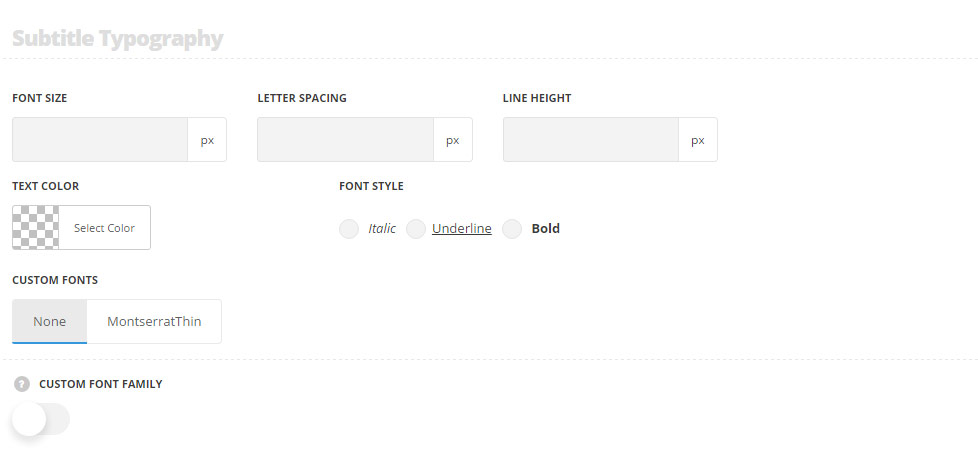
These settings are inherited from Theme optionsTypography/FontsGallery typography Gallery item subtitle Typography. Default color is #fff.
- Font size – set the font size you need to use in the subtitle.
- Letter spacing – set the needed distance between letters.
- Line-height – set the needed distance between lines in the subtitle text.
- Text color – set the color of the font.
- Font style – select the font weight and style (bold, italic) for the subtitle.
- Custom font family – set it to Enable to use custom Google font.
- Font Family – select the font family from the drop-down list.
- Font style – select the font weight and style (bold, italic) for the subtitle.