This module allows you to display the images in a carousel.
Moreover, you may add the link to the images to show the external pages.
Check more examples following this link.
Watch the video tutorial on Image Carousel module creation for more details.
General settings
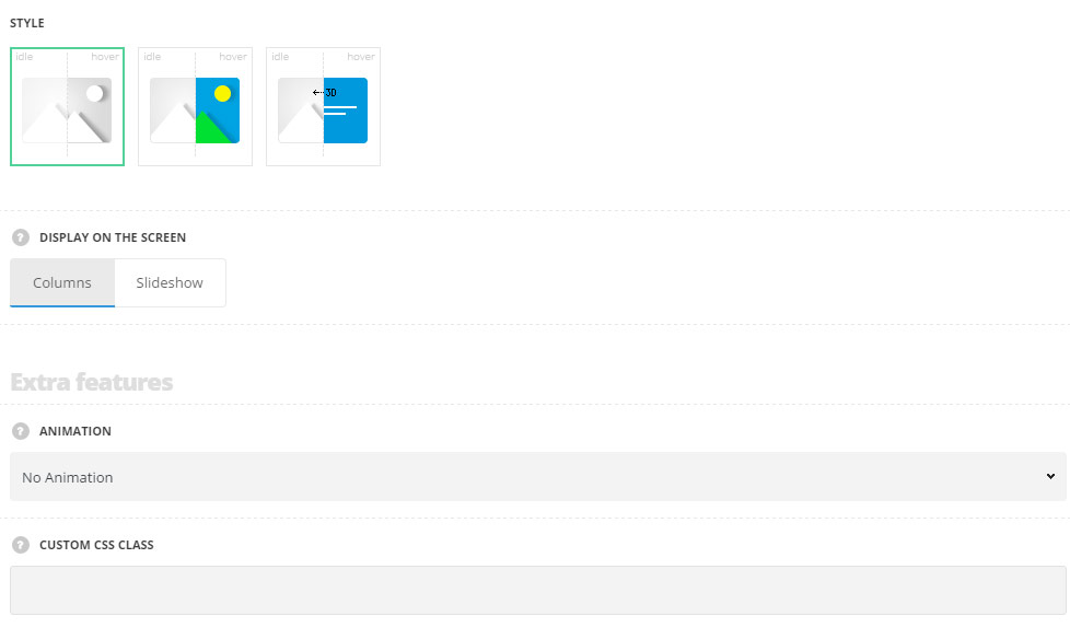
- Style – choose between 3 preset styles.
- Opacity – the carousel is displayed on a transparent background.
- Greyscale – the images inside carousel are displayed in black and white colors which become colorful on hover.
- Rotate – there is back side of the image on which ou can set the background color and add the description. The image has the stylish flip hover effect.
- Display on screen – select whether the images inside carousel will be displayed in columns or in a slideshow.
Extra features
- Animation – choose between 14 preset animation effects.
- Custom CSS class – enter our own unique class name for the item – this is a useful option for those who want to create a specific style. E.g.: you can type custom-style class and then go to
Theme optionsGeneral optionsCustom CSS/JSCustom CSSfield and write your own CSS code with this class to get your own style.
Content settings
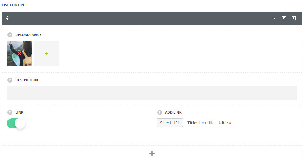
In this section, you can customize the images inside carousel.
By clicking on the arrow down icon you can reveal the whole section to adjust it to your needs. Here you are also able to duplicate the images, change their order (simply drag-n-drop the blocks) and delete the unnecessary images as well.
- Upload image – upload the custom image from the media library.
- Description – add the description information for the image. For the Rotate style only. It will be displayed on image hover.
- Link – switch it to Enable to add the link to your image.
- Add link – set a custom link for your page.
Settings
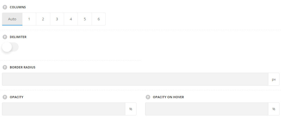
- Columns – choose the number of columns you would like to show your image. Auto sets the client logos in 4 columns automatically.
- Delimiter – switch it to Enable to display the delimiter between the images.
- Border radius – set the border radius for the image to have rounded corners. The border radius is not set by default.
- Opacity – allows you to set the opacity of the image in idle state. The default opacity is 50%. For Opacity style only.
- Opacity on hover – allows you to set the opacity of the image on hover. The default opacity is 50%. For Opacity style only.
Typography settings
For Rotate style only.
These settings are inherited from Theme options Typography/Fonts Text typography Default text Typography. The color is set to #fff by default.
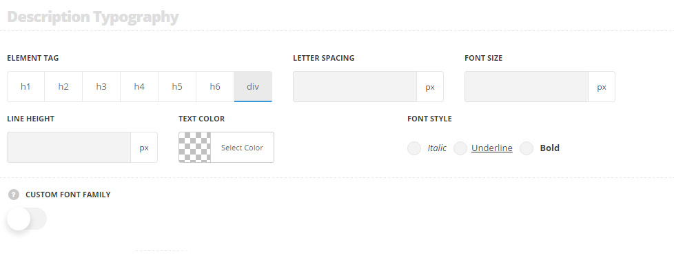
- Element tag – select the tag for the description.
- Font size – set the font size you need to use in the description.
- Letter spacing – set the needed distance between letters in the description.
- Line-height – set the needed distance between lines in the description text.
- Text color – set the color of the font.
- Font style – select the font weight and style (bold, italic) for the description.
- Custom font family – set it to Enable to use custom Google font.
- Font Family – select the font family from the drop-down list.
- Font style – select the font weight and style (bold, italic) for the description.