Modal box allows you to add the content into a multipurpose and ultra stylish shortcode and create popup element on the page.
You customers will definitely notice it.
This is a nested shortcode – module that includes other modules. You may style the container and then fill it in with elements.
It is important to know, that in order to check the Modal Box popup window for the second time on the page, you need to clear all browser cache and cookies for the page in your browser!
Also, only one Modal Box element is supposed to be added per page!
Watch the video tutorial on Modal Box module creation for more details.
General settings
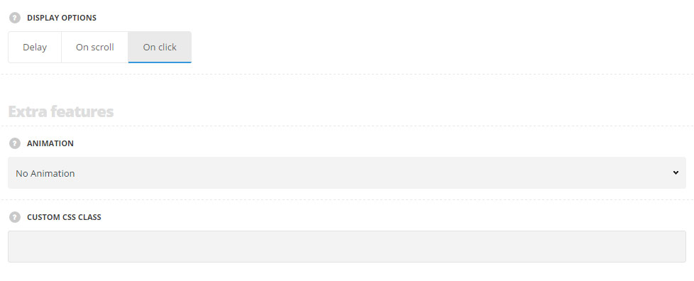
- Display options – select the style of the displaying of the modal box element on the page.
- Delay – select this style to set the delay for the modal box displaying.
- On scroll – select this style to show the modal box on scroll.
- On click – select this style to show the modal box on click on button.
- Timeout – set the delay timeout for the modal box in milliseconds. For Delay style only.
Extra features
- Animation – choose between 14 preset animation effects.
- Custom CSS class – enter our own unique class name for the item – this is a useful option for those who want to create a specific style. E.g.: you can type custom-style class and then go to
Theme optionsGeneral optionsCustom CSS/JSCustom CSSfield and write your own CSS code with this class to get your own style.
Style settings
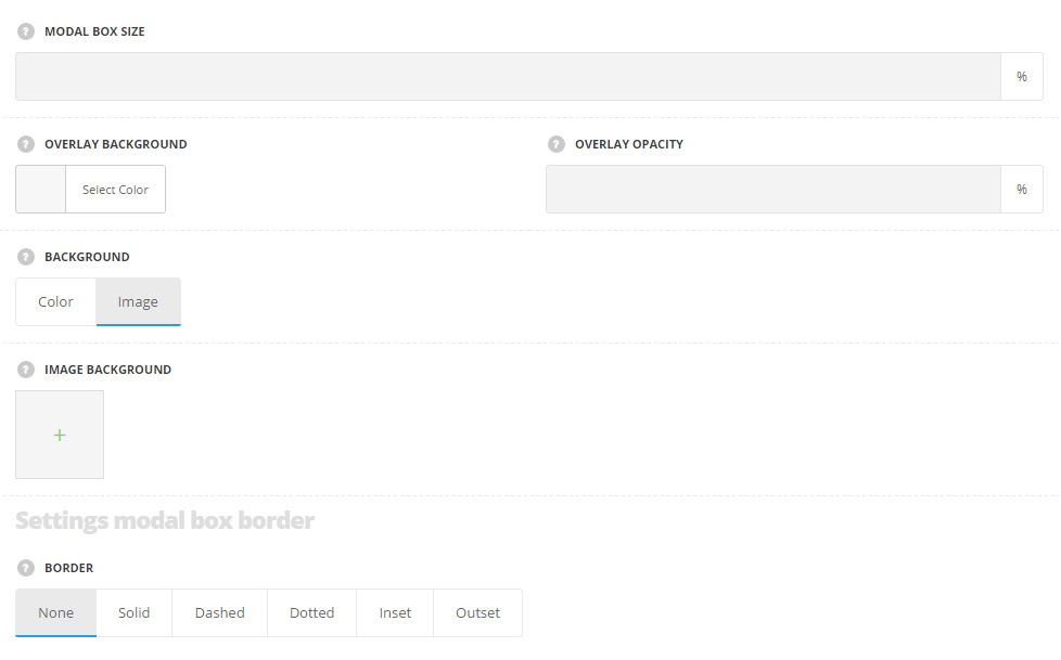
- Modal box size – specify the width of the modal box according to the width of the container.
- Overlay background – select the background color for the content around the popup element. The default color is #000.
- Overlay opacity – allows you to set the overlay’s opacity. The default opacity is 70%.
- Background – select the background style for the modal box element.
- Color – set the background color for the popup content. The default color is #fff.
- Image – select this style to show the image as a background for the modal box.
- Image background – select the image from the media library for the modal box background.
Modal box border settings
- Border – select the border for the modal box. You may select solid, dashed, dotted, inset and outset variants.
Button Settings (For On Click Style Only)
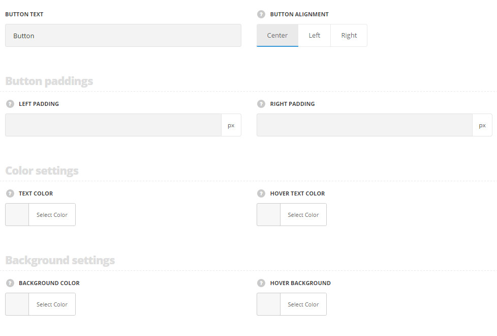
- Button text – enter the title for the button.
- Button alignment – select the horizontal alignment of the button. Left, right and center positions are available.
Button paddings
- Left padding – set the left padding for the button in px. Default left padding is inherited from
Theme optionsGeneral optionsDefault button optionsDefault button left padding. - Right padding – set the left padding for the button in px. Default right padding is inherited from
Theme optionsGeneral optionsDefault button optionsDefault button right padding.
Color settings
- Text color – set the text color for the button. It is inherited from
Theme optionsGeneral optionsDefault button optionsDefault Button Typographysection. - Hover text color – set the text color on hover for the button. It is inherited from
Theme optionsGeneral optionsDefault button optionsDefault button hover text color.
Background settings
- Background color – set the background color for the button.It is inherited from
Theme optionsGeneral optionsDefault button optionsDefault button background color. - Hover background color – set the hover background color for the button.It is inherited from
Theme optionsGeneral optionsDefault button optionsDefault button hover background color.
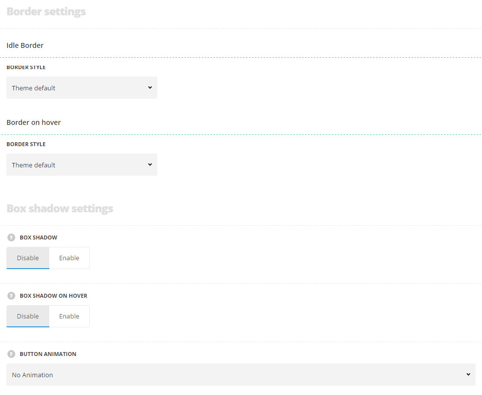
Idle Border
- Border style – select one of the available border styles for the button. Dotted, dashed and solid variants are available.Theme default style will be inherited directly from
Theme optionsGeneral optionsDefault button optionsDefault button border style. - Color – specify the color of the border.
- Border radius – select the border radius for button module to have rounded corners.
- Border width – set the width of the border. You may set the desired width each border: top, right, left and bottom.
Border on hover
- Border style – select one of the available border styles on hover for the button. Dotted, dashed and solid variants are available.Theme default style will be inherited directly from
Theme optionsGeneral optionsDefault button optionsDefault button border style. - Color – specify the color of the border on hover.
- Border radius – select the border radius for button module to have rounded corners on hover.
- Border width – set the width of the border on hover. You may set the desired width each border: top, right, left and bottom.
Box shadow settings
- Box shadow – set it to Enable to activate shadow for the button.
- Shadow parameters – choose shadow parameter and set the color, in accordance with the following structure: horizontal shadow, vertical shadow, blur, and spread. More details can be found following this link.
- Color – set the color for the button shadow.
- Box shadow on hover – set it to Enable to activate shadow for the button on hover.
- Shadow parameters – choose shadow parameter on hover and set the color, in accordance with the following structure: horizontal shadow, vertical shadow, blur, and spread. More details can be found following this link.
- Color – set the color for the button shadow on hover.
- Button animation – choose between 14 preset animation effects and select one for the appears effect.
Typography settings (For On Click Style Only)
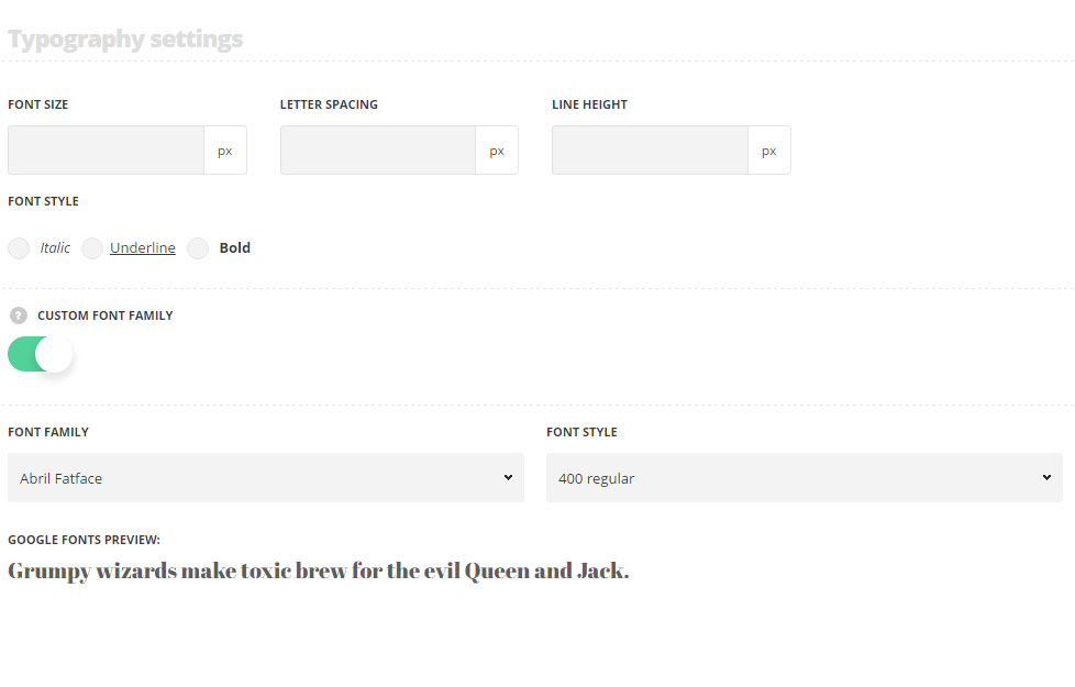
The settings are inherited from inherited from Theme options General options Default button options Default button typography section.
- Font size – set the font size you need to use for the text in the button.
- Letter spacing – set the needed distance between letters.
- Line-height – set the needed distance between lines in the button text.
- Text color – set the color of the font of the button text.
- Font style – select the font weight and style (bold, italic) for the button text.
- Custom font family – set it to Enable to use custom Google font.
- Font Family – select the font family from the drop-down list.
- Font style – select the font weight and style (bold, italic) from the list.