Pricing Tables module allows you to create stylish information blocks and to present your services and features for your customers.
Check the module variations here to learn more about this shortcode.
Watch the video tutorial on Pricing Table module creation for more details.
General settings
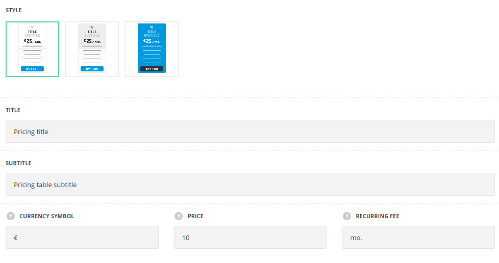
- Style – choose between 3 preset styles.
- Classic – the content part of the pricing table and its features have #ffffff background color set by default.
- Simple – you may set the background color of the content part of the pricing table.
- Advanced – you may set the background color for both: the content part of the pricing table and its features.
- Title – enter the title of the pricing table on your site.
- Subtitle – enter the subtitle of the pricing table on your site.
- Currency symbol – set the currency symbol you need for your pricing table.
- Price – set the price for the table.
- Recurring fee – allows you to set the recurring fee for your pricing table to be displayed at the right side of the price.
Extra features
- Animation – choose between 14 preset animation effects.
- Custom CSS class – enter our own unique class name for the item – this is a useful option for those who want to create a specific style. E.g.: you can type custom-style class and then go to
Theme optionsGeneral optionsCustom CSS/JSCustom CSSfield and write your own CSS code with this class to get your own style.
Icon settings
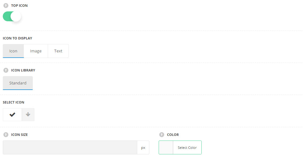
- Top icon – switch it to Enable to display the top icon. The icon will be placed at the top of pricing table.
- Icon to display – select the element to be displayed in the module.
- Icon – select this variant to display the icon in the module.
- Icon library – choose the icon library for the module.
- Select icon – select the icon to be displayed in the module.
- Icon size – set the size for the icon or image.
- Icon color – choose the icon or image color. For the classic style the color is #e7e7e7. For the simple style the color is inherited from
Theme OptionsStyling OptionsMain site color. For the advanced style the color is #fff.
- Image – select this variant to display custom image on the left side from the text.
- Upload image – select the image from media library for the module.
- Icon size – set the size for the icon or image.
- Text – select this variant to display custom text for the module. The default settings are inherited from theme files and are as following: line-height: 1 em, font-family: Montserrat, font-weight: 700, letter-spacing: -1px.
- Text – enter the content to be displayed in the module.
- Font size – set the font size you need to use in the text.
- Letter spacing – set the needed distance between letters.
- Line-height – set the needed distance between lines.
- Text color – set the color of the font.
- Font style – select the font weight and style (bold, italic).
- Custom font family – set it to Enable to use custom Google font.
- Font Family – select the font family from the drop-down list.
- Font style – select the font weight and style (bold, italic) for the text.
Content settings
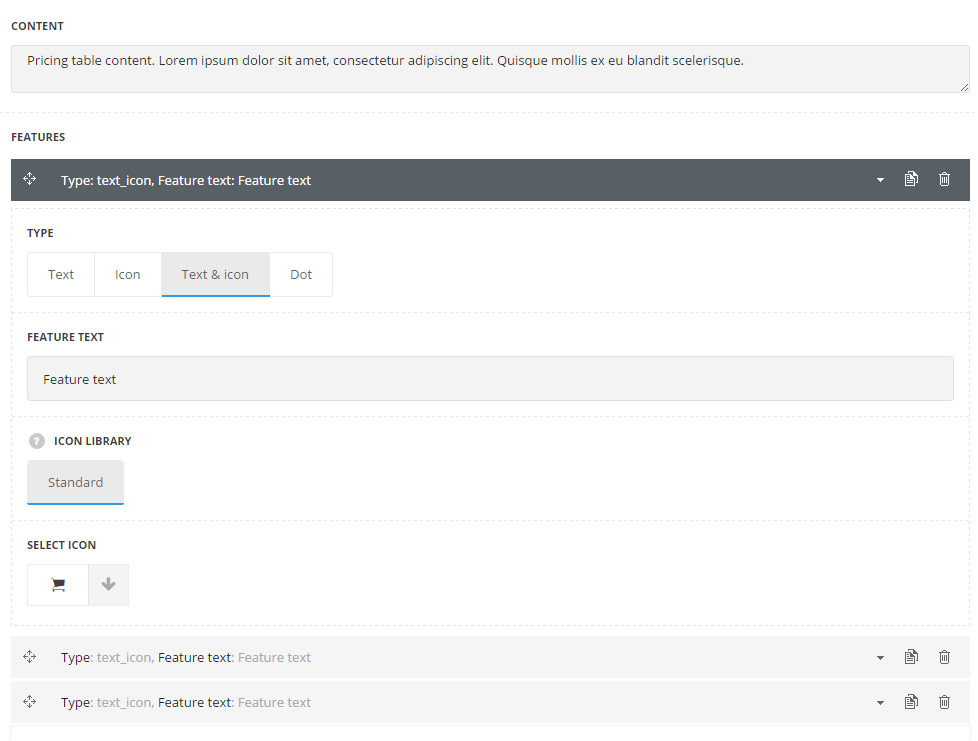
- Content – enter the main content for the pricing table. It is displayed under title and price section.
Features
In this section, you can customize the features blocks of the module.
By clicking on the arrow down icon you can reveal the whole section to adjust it to your needs. Here you are also able to duplicate the blocks, change their order (simply drag-n-drop the blocks) and delete the unnecessary blocks as well.
- Type – select the type of the feature to be presented in the pricing table.
- Text – select this variant to display text in the feature field.
- Feature text – enter the text of the feature.
- Icon – select this variant if you want to display the icons as a feature in the pricing table.
- Icon library – choose the icon library for the feature.
- Select icon – select the icon to be displayed in the feature.
- Text & icon – select this variant to display both: icon and text for the feature.
- Feature text – enter the text of the feature.
- Icon library – choose the icon library for the feature.
- Select icon – select the icon to be displayed in the feature.
- Dot – select this variant to display a dot image as a feature of the pricing table.
- Text – select this variant to display text in the feature field.
Button settings
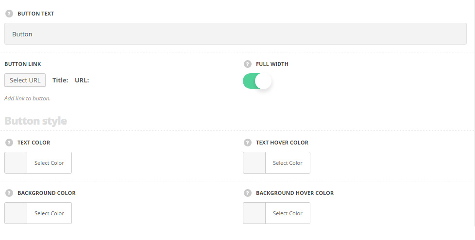
- Button text – enter the button title for the pricing table.
- Button link – enter the link for the button in the pricing table.
- Full width – set it to Enable to have the full-width button according to the pricing table width. If this option is disabled the button inherits
Theme optionsGeneral optionsDefault button options.
Button style
- Text color – set the text color for the button. It is inherited from
Theme optionsGeneral optionsDefault button optionsDefault Button Typographysection. - Text hover color – set the text color on hover for the button. It is inherited from
Theme optionsGeneral optionsDefault button optionsDefault button hover text color. - Background color – set the background color for the button. It is inherited from
Theme optionsGeneral optionsDefault button optionsDefault button background color. For the advanced style the default background color is #323232. - Background hover color – set the hover background color for the button.It is inherited from
Theme optionsGeneral optionsDefault button optionsDefault button hover background color. For the advanced style the default background color is #323232 with opacity 0.5.
Border
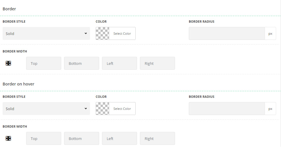
- Border style – select one of the available border styles for the button. Dotted, dashed and solid variants are available. Theme default style will be inherited directly from
Theme optionsGeneral optionsDefault button optionsDefault button border style. - Color – specify the color of the border.
- Border radius – select the border radius for button module to have rounded corners.
- Border width – set the width of the border. You may set the desired width each border: top, right, left and bottom.
Border on hover
- Border style – select one of the available border styles on hover for the button. Dotted, dashed and solid variants are available.Theme default style will be inherited directly from
Theme optionsGeneral optionsDefault button optionsDefault button border style. - Color – specify the color of the border on hover.
- Border radius – select the border radius for button module to have rounded corners on hover.
- Border width – set the width of the border on hover. You may set the desired width each border: top, right, left and bottom.
Label settings
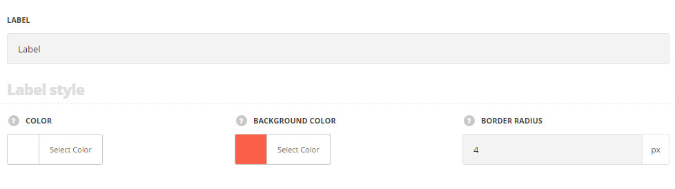
- Label – enter the title of the label displayed in the top right corner of the pricing table.
Label style
- Color – choose the color for the label text.
- Background color – choose the color for the label background.
- Border radius – choose the border radius for the label background to have rounded corners.
Typography settings
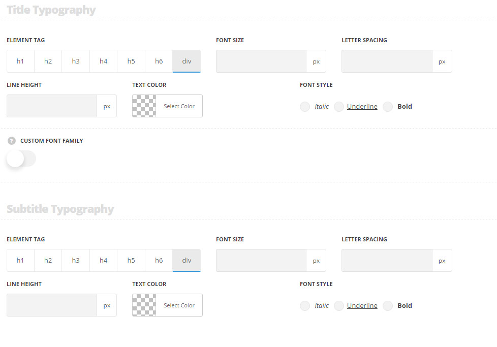
Title typography
These settings are inherited from Theme options Typography/Fonts Headings typography Content title big Typography.
- Element tag – select the tag for the title.
- Font size – set the font size you need to use in the title.
- Letter spacing – set the needed distance between letters.
- Line-height – set the needed distance between lines in the title text.
- Text color – set the color of the font.
- Font style – select the font weight and style (bold, italic) for the title.
- Custom font family – set it to Enable to use custom Google font.
- Font Family – select the font family from the drop-down list.
- Font style – select the font weight and style (bold, italic) for the title.
Subtitle typography
These settings are inherited from Theme options Typography/Fonts Headings typography Content subtitle Typography.
- Element tag – select the tag for the subtitle.
- Font size – set the font size you need to use in the subtitle.
- Letter spacing – set the needed distance between letters in the subtitle.
- Line-height – set the needed distance between lines in the subtitle text.
- Text color – set the color of the font.
- Font style – select the font weight and style (bold, italic) for the subtitle.
Content typography
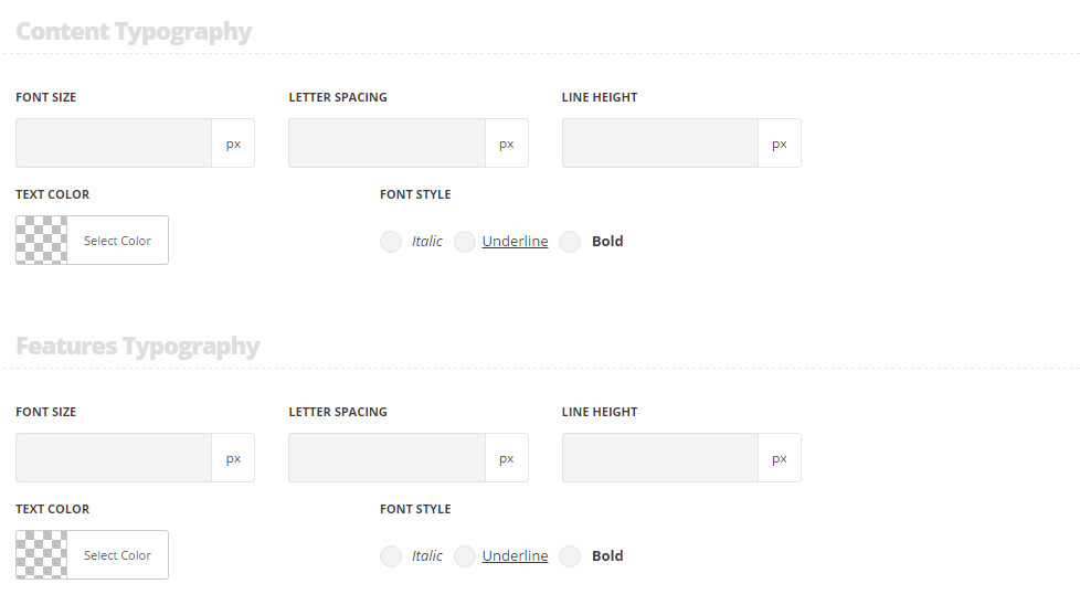
These settings are inherited from Theme options Typography/Fonts Headings typography Content subtitle Typography. And the following settings are inherited directly from theme files are as follows: line-height: 25px, font-size: 14px, padding-top: 25px, padding-bottom: 35px.
- Font size – set the font size you need to use in the text in the module.
- Letter spacing – set the needed distance between letters.
- Line-height – set the needed distance between lines.
- Text color – set the color of the font.
- Font style – select the font weight and style (bold, italic).
Features typography
These settings are inherited from Theme options Typography/Fonts Text typography Default text Typography.
- Font size – set the font size you need to use in the text in the module.
- Letter spacing – set the needed distance between letters.
- Line-height – set the needed distance between lines.
- Text color – set the color of the font.
- Font style – select the font weight and style (bold, italic).
Price typography
These settings are inherited from Theme options Typography/Fonts Headings typography Content title big Typography and the font size is 55px by default.
Recurring fee typography
These settings are inherited from Theme options Typography/Fonts Headings typography Content title big Typography and the font size is 25px by default.
Button typography
The settings are inherited from inherited from Theme options General options Default button options Default button typographysection.
Styles
General styles
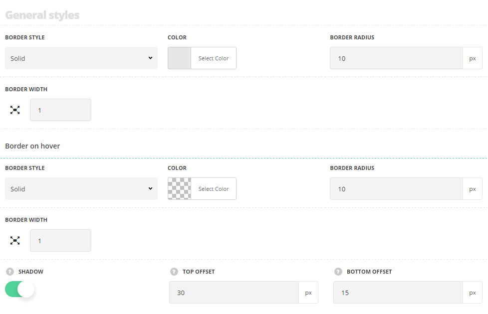
- Border radius – select the border radius for the module to have rounded corners.
- Content background color – choose the background color for the content part of the pricing table. For Simple and Advanced styles only.
- Features background color – choose the background color for the features part of the pricing table. For Advanced style only.
- Shadow – switch it to Enable to have the shadow for the pricing table on hover.
- Top offset – set the top offset, it will be added above the pricing table content.
- Bottom offset – set the bottom offset, it will be added under the pricing table content.
Content delimiter style
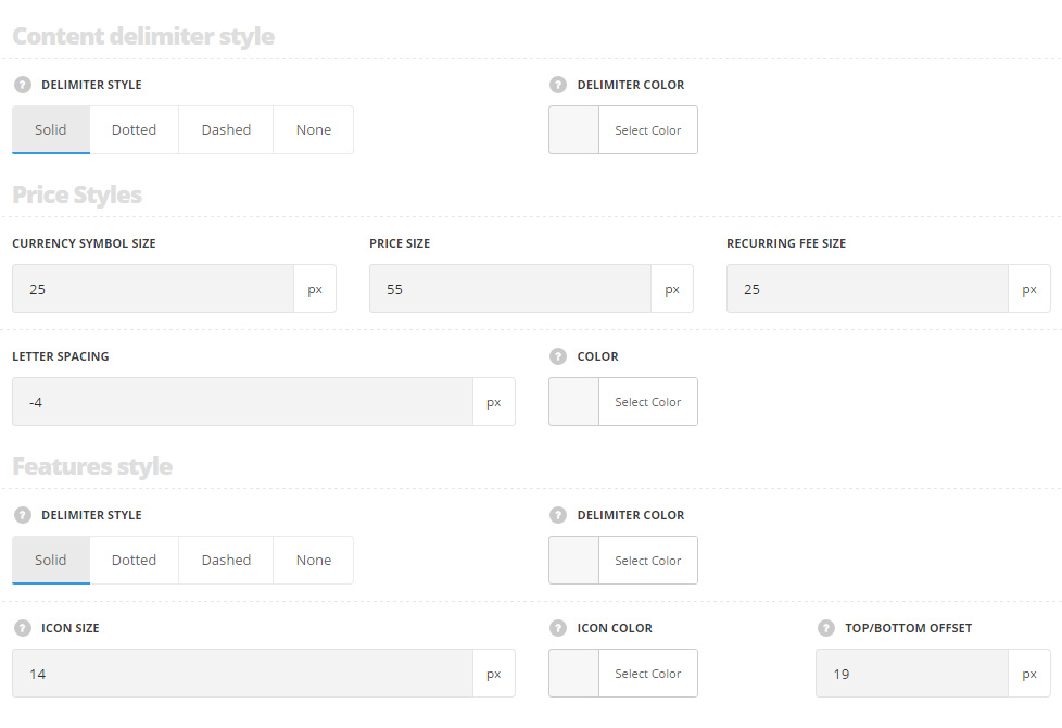
- Delimiter style – choose one of the available delimiter styles. It is displayed between the features and content section in the pricing table. You may select solid, dotted, dashed and none delimiter.
- Delimiter color – set the delimiter color. The default color is #e7e7e7.
Price styles
- Currency symbol size – set the font-size for the currency.
- Price size – set the font-size for the price in the pricing table.
- Recurring fee size – set the font-size for the recurring fee size.
- Letter spacing – set the needed distance between letters.
Features style
- Delimiter style – choose one of the available delimiter styles. It is displayed between the features in the pricing table. You may select solid, dotted, dashed and none delimiter.
- Delimiter color – set the delimiter color. The default color is #e7e7e7.
- Icon size – to set the icon size.
- Icon color – the color for the feature icon. The default color is inherited from
Theme optionsTypography/FontsText typographyDefault text Typography. For advanced style the default color is #fff. - Top/bottom offset – set the top/bottom offset between the pricing features.