Present the progress bar in the stylish way for your customers with multi-purpose Progress Bar module.
You may check the examples of the modules with this link.
Watch the video tutorial on Progress Bar module creation for more details.
General settings
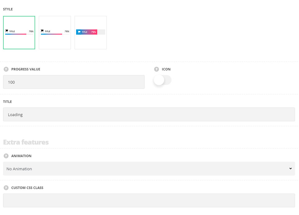
- Style – select the style of the progress bar which suits you more.
- Simple – the progress bar is displayed in a simple style, without the decorations borders.
- Underlined – there is bottom lime decoration added for the progress bar.
- Info inside – the progress bar content is displayed inside the bar itself.
- Progress value – enter the progress value.
- Icon – switch it to Enable to display the icons for the progress bar.
- Title – enter the title for the progress bar element.
Extra features
- Animation – choose between 14 preset animation effects.
- Custom CSS class – enter our own unique class name for the item – this is a useful option for those who want to create a specific style. E.g.: you can type custom-style class and then go to
Theme optionsGeneral optionsCustom CSS/JSCustom CSSfield and write your own CSS code with this class to get your own style.
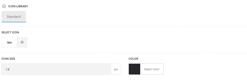
Icon settings
Available if the Icon is enabled in general settings section of the module.
- Icon library – choose the icon library for the module.
- Select icon – select the icon to be displayed in the module.
- Size – set the size for the icon.
- Color – choose the icon color. The default color is #28262b.
Style settings
General styles
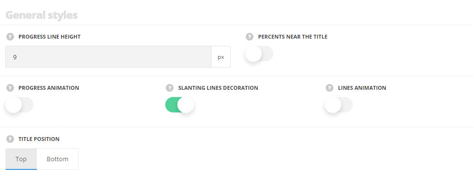
- Progress line height – allows you to set the progress bar height.
- Percents near title – switch it to Enable to display percents to the left from title.
- Progress animation – allows you to enable or disable the progress animation.
- Slanting lines decoration – switch it to Enable to display the slanting lines inside the bar (effect of constantly moving bar).
- Lines animation – set it to Enable to activate the effect of constantly moving bar with slanting lines inside.
- Title position – select the position of the title. It can be displayed at the top and bottom from the progress bar.
Back line
Style the general line background of the module not filled with the progress line.
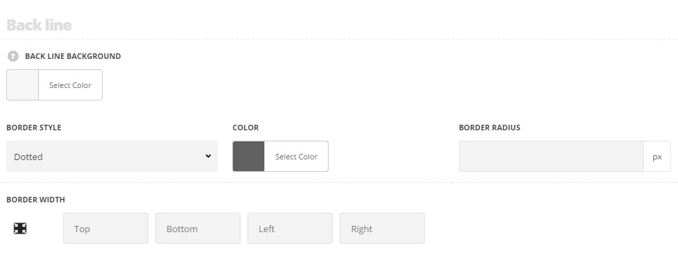
- Back line background – select the background color for the back line. The default color is #e7e7e7.
- Border style – select one of the available border styles for the button. Dotted, dashed and solid variants are available. Theme default style will be inherited directly from
Theme optionsGeneral optionsDefault button optionsDefault button border style. - Color – specify the color of the border.
- Border radius – select the border radius for button module to have rounded corners.
- Border width – set the width of the border. You may set the desired width each border: top, right, left and bottom.
Progress line
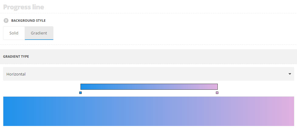
- Background style – select the background style for the progress line.
- Solid – one background color is set for the progress bar.
- Background – choose the color for the progress line. The default color is inherited from
Theme OptionsStyling OptionsMain site color.
- Background – choose the color for the progress line. The default color is inherited from
- Gradient – you may select several color to be displayed as gradient background color for the progress line. (You may select as many color as you want simply clicking on the color bar in the necessary place to add a new color).
- Gradient type – select what gradient type you want to apply for the progress bar. You may select horizontal, vertical or custom to be able to enter custom direction in degrees.
- Solid – one background color is set for the progress bar.
Typography settings
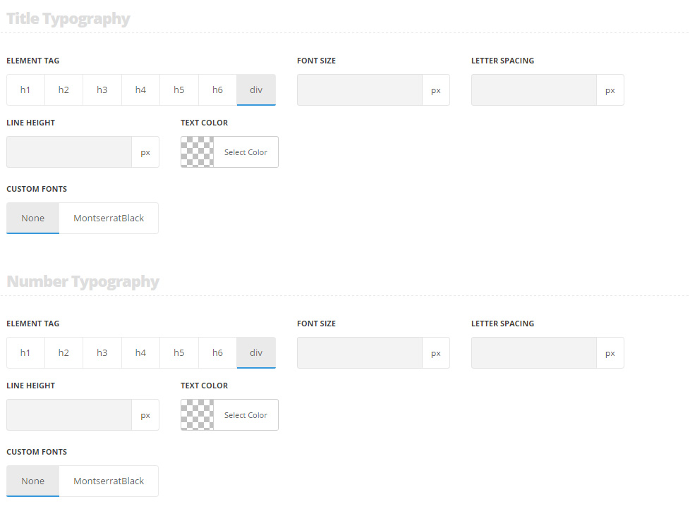
Title typography
These settings are inherited from Theme options Typography/Fonts Text typography Default text Typography . Font size is 13px by default. For the Info inside, the color is set to #fff by default.
- Element tag – select the tag for the title.
- Font size – set the font size you need to use in the title.
- Letter spacing – set the needed distance between letters.
- Line-height – set the needed distance between lines in the title text.
- Text color – set the color of the font.
- Custom font family – set it to Enable to use custom Google font.
- Font Family – select the font family from the drop-down list.
- Font style – select the font weight and style (bold, italic) from the list.
Number typography
These settings are inherited from Theme options Typography/Fonts Text typography Default text Typography . For the Info inside, the color is set to #fff by default.
- Element tag – select the tag for the numbers.
- Font size – set the font size you need to use in the numbers.
- Letter spacing – set the needed distance between letters in the numbers.
- Line-height – set the needed distance between lines in the numbers text.
- Text color – set the color of the font.
- Custom font family – set it to Enable to use custom Google font.
- Font Family – select the font family from the drop-down list.
- Font style – select the font weight and style (bold, italic) from the list.