The Services module is the element for presenting the services available for your customers which allow you to attract more visitors with customizable hover effect.
More module examples can be found here.
Watch the video tutorial on Services module creation for more details.
General settings
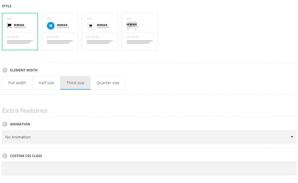
- Style – choose between 4 preset styles.
- Simple – the service item has the icon, title and subtitle on the front and description on the back part.
- Background – the service item has the icon with the background color.
- Bordered – the service item has the icon with the border around it.
- Overlay – the icons is displayed as a background for the front part of the service item.
- Element width – select the width of the elements depending on the width of the container.
- Full width – the module will take the full width of the container it is inside.
- Half size – the module will take the half of the width of the container it is inside.
- Third size – the module will take the third part of the width of the container it is inside.
- Quarter size – the module will take the quarter of the width of the container it is inside.
Extra features
- Animation – choose between 14 preset animation effects.
- Custom CSS class – enter our own unique class name for the item – this is a useful option for those who want to create a specific style. E.g.: you can type custom-style class and then go to
Theme optionsGeneral optionsCustom CSS/JSCustom CSSfield and write your own CSS code with this class to get your own style.
Content settings
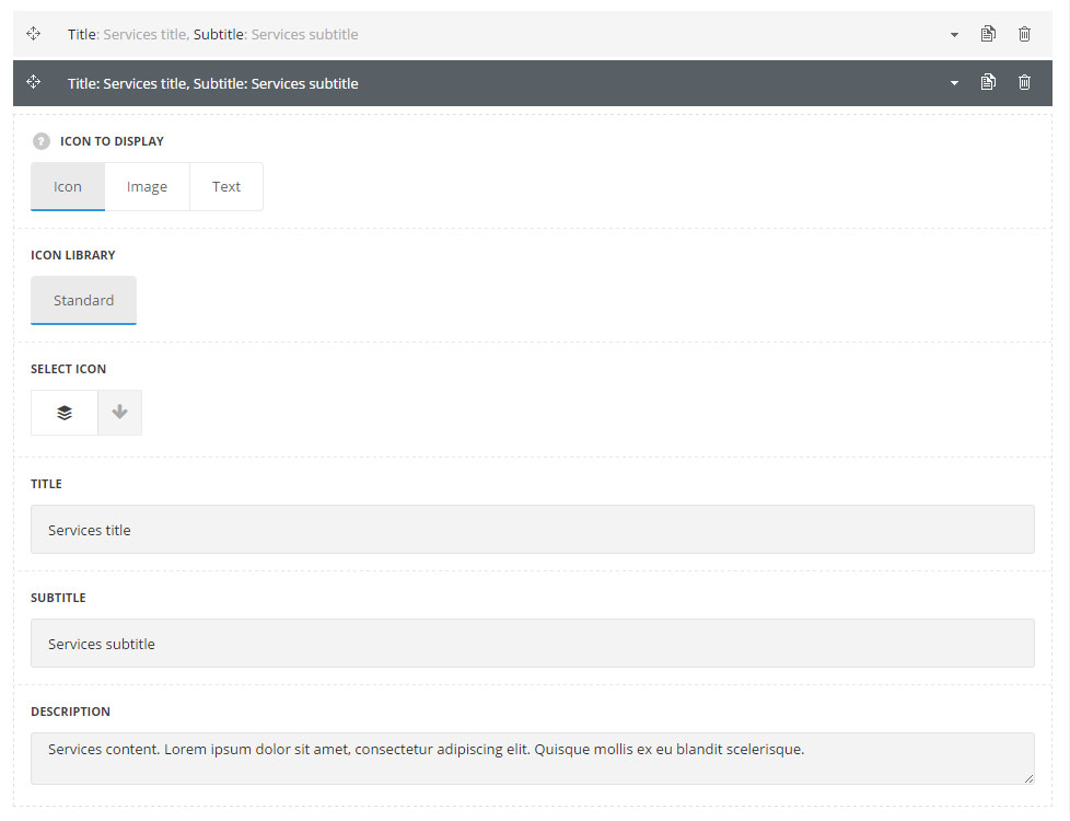
List content
In this section, you can customize the informative blocks of the module.
By clicking on the arrow down icon you can reveal the whole section to adjust it to your needs. Here you are also able to duplicate the blocks, change their order (simply drag-n-drop the blocks) and delete the unnecessary blocks as well.
- Icon to display – select the element to be displayed in the module.
- Icon – select this variant to display the icon in the module.
- Icon library – choose the icon library for the module.
- Select icon – select the icon to be displayed in the module.
- Image – select this variant to display custom image on the left side from the text.
- Upload image – select the image from media library for the module.
- Text – select this variant to display custom text for the module. The default settings are inherited from theme files and are as following: line-height: 1 em, font-family: Montserrat, font-weight: 700, letter-spacing: -1px.
- Text – enter the content to be displayed in the module.
- Icon – select this variant to display the icon in the module.
- Title – enter the title for the module.
- Subtitle – enter the subtitle for the module.
- Description – enter the text for the description.
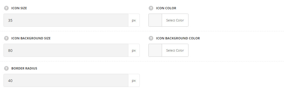
Icon style settings
- Icon size – set the desired size for the icon.
- Icon color – choose the icon color. The default color for the styles Simple and Bordered is #3d3d3d. The default color for the style Background is #fff. The default color for the style Overlay is #ebebeb.
- Icon background size – allows you to set the background size for the icon.
- Icon background color – choose the icon background color. The default color is inherited from
Theme OptionsStyling OptionsMain site color. - Border radius – allows you to set the border radius for the icon background to have rounded corners.
Content style settings
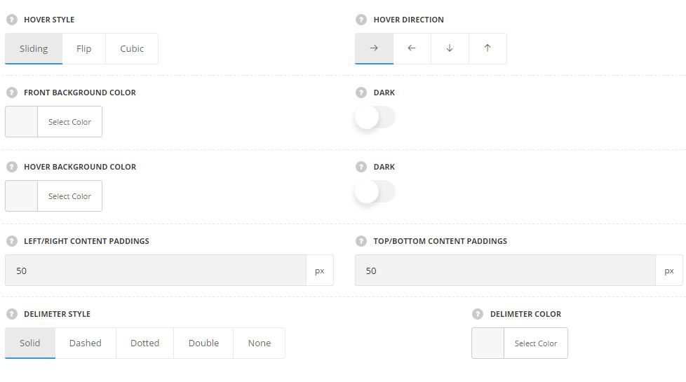
- Hover style – select the best suitable hover effect for the module. Sliding, flip and cubic styles are available.
- Hover direction – choose the direction for the hover animation. Left, right, top and bottom directions are available.
- Front background color – set the background color for the Front side of the service. The color is not set by default.
- Dark – set it to Enable if dark background color was selected, content colors will be changed to make it more visible.
- Hover background color – choose the background color for the hovered side of the service. The color is not set by default.
- Dark – set it to Enable if dark background color for hover was selected, content colors will be changed to make it more visible.
- Left/right content paddings – allows you to add the left and right padding for the content.
- Top/bottom content paddings – allows you to add the top and bottom padding for the content
- Delimiter style – select the best suitable delimiter style for the delimiter between the boxes. Solid, dashed, dotted, double and none variants are available. For Sliding hover style only.
- Delimiter color – сhoose the delimiter color. The default delimiter color is #e7e7e7.
Typography settings
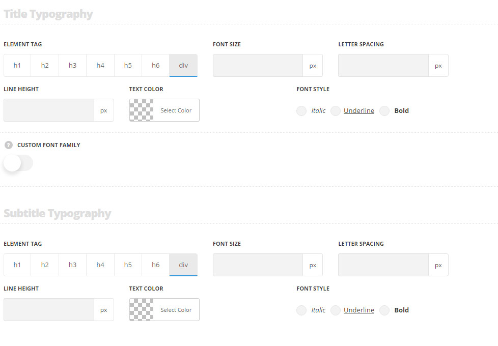
Title typography
These settings are inherited from Theme options Typography/Fonts Headings typography Content title big Typography.
- Element tag – select the tag for the title.
- Font size – set the font size you need to use in the title.
- Letter spacing – set the needed distance between letters.
- Line-height – set the needed distance between lines in the title text.
- Text color – set the color of the font.
- Font style – select the font weight and style (bold, italic) for the title.
- Custom font family – set it to Enable to use custom Google font.
- Font Family – select the font family from the drop-down list.
- Font style – select the font weight and style (bold, italic) for the title.
Subtitle typography
These settings are inherited from Theme options Typography/Fonts Text typography Default text Typography . Font-size is13px, color is #b5b5b5, line-height is 1, padding-top: 8px by default.
- Element tag – select the tag for the subtitle.
- Font size – set the font size you need to use in the subtitle.
- Letter spacing – set the needed distance between letters in the subtitle.
- Line-height – set the needed distance between lines in the subtitle text.
- Text color – set the color of the font.
- Font style – select the font weight and style (bold, italic) from the title.
Content typography
These settings are inherited from Theme options Typography/Fonts Text typography Default text Typography .
- Font size – set the font size you need to use in the text in the module.
- Letter spacing – set the needed distance between letters.
- Line-height – set the needed distance between lines.
- Text color – set the color of the font.
- Font style – select the font weight and style (bold, italic).