If you want to add the noticeable link on your site, new stylish Styled Links module is just for you.
It will definitely make your customers visit the link.
Check the module variations following this link.
Watch the video tutorial on Styled Links module creation for more details.
General settings
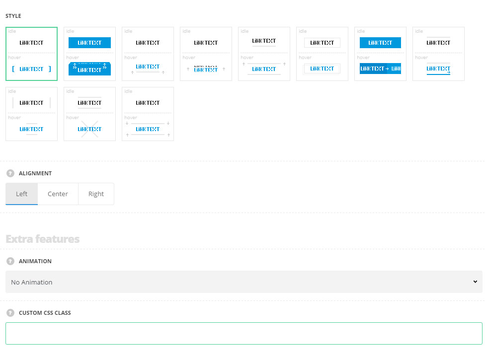
- Style – select the best suitable style for you link among 11 pre-set styles.
- Brackets – brackets decoration from left and right sides is displayed on hover.
- Cubic – the link has 3d cubic animation on hover.
- Bottom line – on hover, the bottom line decoration is displayed.
- Text transform – the link has 3d flip animation from bottom on hover.
- Top line – the idle link has the bottom line decoration and top line decoration is added on hover.
- Moving frame – there is a frame on the link which gets animated on hover.
- Slide text – the link text slides from left to right on hover.
- Slide line – the link has the top line decoration in idle state and bottom line decoration is sliding on hover.
- Lines animation – the left and right lines are transformed into top and bottom lines on hover.
- X-animation – the left and right decoration lines are transformed creating X on hover.
- Top and bottom lines – top and bottom decoration lines appear on hover.
- Alignment – set the alignment for the link. Left, right and center positions are available.
Extra features
- Animation – choose between 14 preset animation effects.
- Custom CSS class – enter our own unique class name for the item – this is a useful option for those who want to create a specific style. E.g.: you can type custom-style class and then go to
Theme optionsGeneral optionsCustom CSS/JSCustom CSSfield and write your own CSS code with this class to get your own style.
Content settings
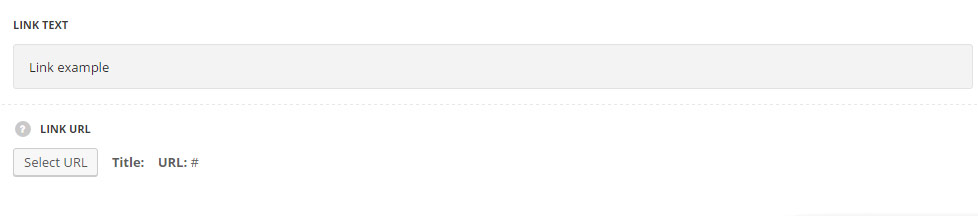
- Link text – enter the text for the link.
- Link URL – assign the link for the text in the module.
Style settings
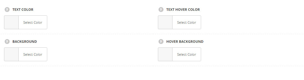
- Text color – set the color for the text in Styled Links module. Default color is #28262b. For the styles Cubic and Slide text the default color is #fff.
- Text hover color – choose the color for the text on hover. Default color is inherited from
Theme OptionsStyling OptionsMain site color. For the styles Cubic and Slide text the default color is #fff. - Background – select the color for the link background. Default color is inherited from
Theme OptionsStyling OptionsMain site color. - Hover background – set the color for the link background on hover. Default color is inherited from
Theme OptionsStyling OptionsMain site color.
Typography settings
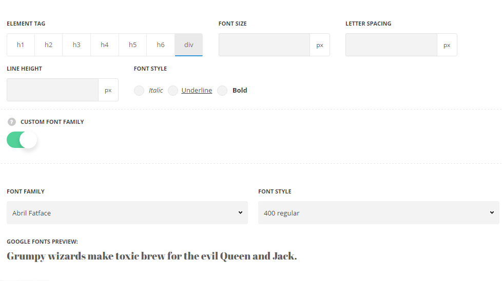
The settings are inherited from inherited from Theme options General options Default button options Default button typographysection.
- Element tag – select the tag for the link text.
- Font size – set the font size you need to use in the link text.
- Letter spacing – set the needed distance between letters.
- Line-height – set the needed distance between lines in the link text.
- Text color – set the color of the font.
- Font style – select the font weight and style (bold, italic) from the link text.
- Custom font family – set it to Enable to use custom Google font.
- Font Family – select the font family from the drop-down list.
- Font style – select the font weight and style (bold, italic) from the link text.