If you want to present your team to the visitors, Team Member module will help you to do this in effortless and stylish way.
You may see the examples of the module on the Team Member page.
Watch the video tutorial on Team Member module creation for more details.
General settings
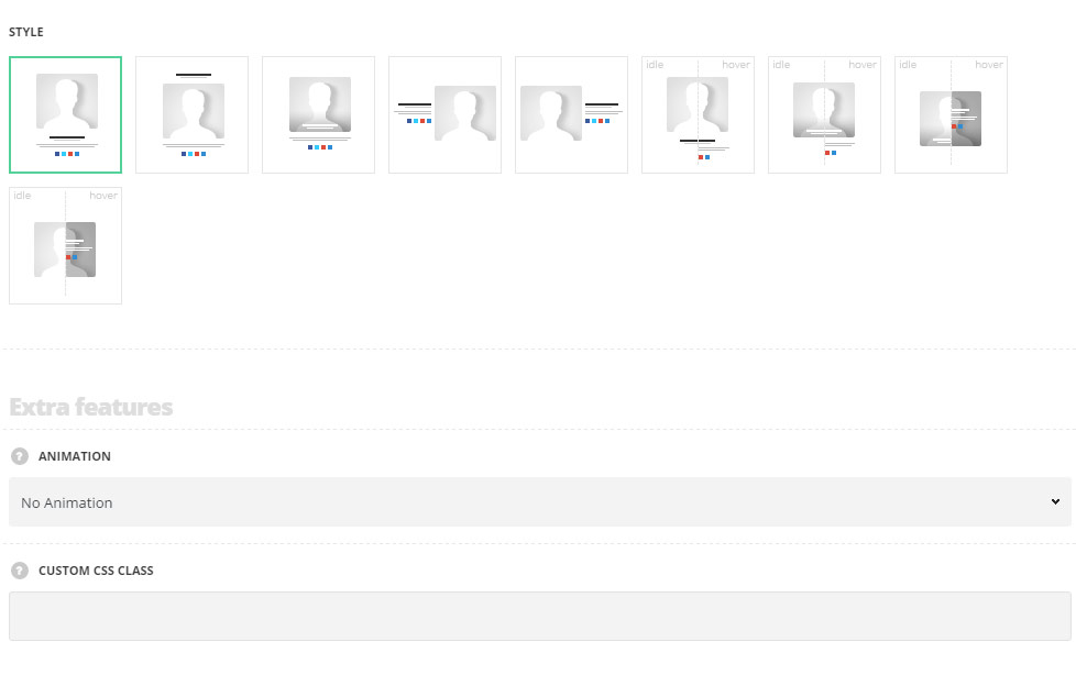
- Style – select the most suitable style for the team section on your site.
- Classic – the module structure has the following displaying: team member image, title, subtitle, description and social accounts below.
- Top title – the title and subtitle of the team member are displayed above the image with description and social accounts below it.
- Bottom content – the title and subtitle of the team member are displayed over the image in its bottom part with description and social accounts below it.
- Left content – all the content is displayed on the left side of the team member image.
- Right content – all the content is displayed on the right side of the team member image.
- Title bottom – the title and subtitle of the team member are displayed below the image with description and social accounts appearing on hover below it.
- Title on image – the title and subtitle of the team member are displayed over the image in its bottom part with description and social accounts appearing on hover below it.
- Hovered content – the title and subtitle of the team member are displayed over the image in its bottom part with all the content appearing on hover in the center of the image.
- Hovered title and content – the image of the team member is displayed in idle state with all the content appearing on hover in its center.
Extra features
- Animation – choose between 14 preset animation effects.
- Custom CSS class – enter our own unique class name for the item – this is a useful option for those who want to create a specific style. E.g.: you can type custom-style class and then go to
Theme optionsGeneral optionsCustom CSS/JSCustom CSSfield and write your own CSS code with this class to get your own style.
Member info
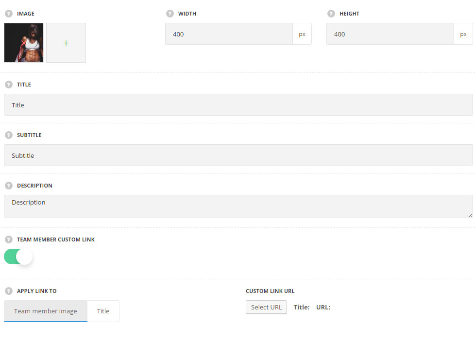
- Image – upload the image for the team member.
- Image width –
- Image height – set the height of the image.
- Title – enter the title of the team member on your site.
- Subtitle – enter the subtitle of the team member on your site.
- Description – add the description of the team member on your site.
- Team member custom link – set it to Enable to add the custom link or choose the existing page for the team member.
- Apply link to – select the element to apply the link to.
- Team member image – select it to have the whole team member clickable.
- Title – select this variant to apply the link to the team member title.
- Custom link URL – add the custom link for the team member.
- Apply link to – select the element to apply the link to.
Typography settings
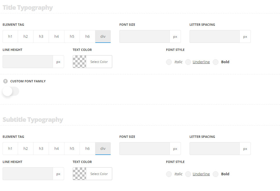
Title typography
These settings are inherited from Theme options Typography/Fonts Headings typography Content title big Typography. The following values are inherited from theme files and are as follows: font-size: 16p. For styles Hovered content, Hovered title and content color is#FFF. For styles Bottom content, Title on image color is #fefefe.
- Element tag – select the tag for the title.
- Font size – set the font size you need to use in the title.
- Letter spacing – set the needed distance between letters.
- Line-height – set the needed distance between lines in the title text.
- Text color – set the color of the font.
- Font style – select the font weight and style (bold, italic) for the title.
- Custom font family – set it to Enable to use custom Google font.
- Font Family – select the font family from the drop-down list.
- Font style – select the font weight and style (bold, italic) for the title.
Subtitle typography
These settings are inherited from Theme options Typography/Fonts Headings typography Content subtitle Typography. Font size is set to 13px, color #b5b5b5, line-height 15px by default.
For styles Hovered content, Hovered title and content, Bottom content, Title on image color is rgba(255,255,255,0.75).
- Element tag – select the tag for the subtitle.
- Font size – set the font size you need to use in the subtitle.
- Letter spacing – set the needed distance between letters in the subtitle.
- Line-height – set the needed distance between lines in the subtitle text.
- Text color – set the color of the font.
- Font style – select the font weight and style (bold, italic) for the subtitle.
Content typography
These settings are inherited from Theme options Typography/Fonts Text typography Default text Typography. For styles Hovered content, Hovered title and content color is#FFF.
- Font size – set the font size you need to use in the text in Info Box module.
- Letter spacing – set the needed distance between letters.
- Line-height – set the needed distance between lines.
- Text color – set the color of the font.
- Font style – select the font weight and style (bold, italic).
Style settings
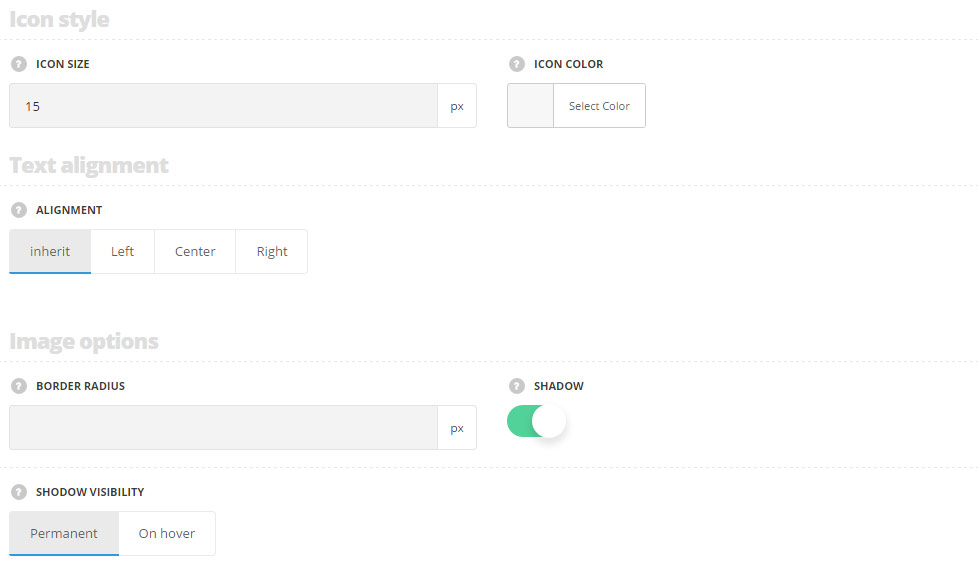
Icon style
- Icon size – set the size for the icons of the social accounts.
- Icon color – set the color for the icons of the social accounts. The default icon color is #000.
Text alignment
- Alignment – set the alignment of the text in horizontal perspective. Left, right, center variants are available. You may select inherit to to inherit the defaul theme settings. By default text alignment is set to center.
Image options
- Border radius – set the border radius for the image to have rounded corners.
- Shadow – switch it to Enable to display the shadow for the team member image.
- Permanent – the shadow effect is displayed on the image in both: idle and hovered styles.
- On hover – the shadow effect is displayed on hover only.
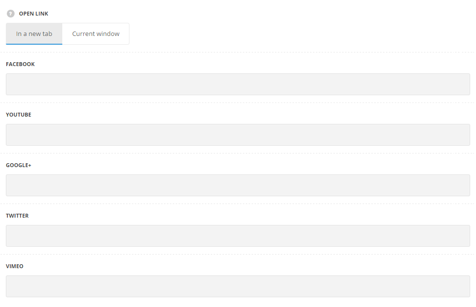
Social accounts
Here you may add links to social profiles of the team member.
- Open link -select whether the link will be opened in a new tab or in a current browser window.
The full list of the social accounts can be viewed in the module settings.