You may create multiple effects with the Text Block module.
The Text block is default module of the Visual Composer plugin and helps in creating various effects when creating pages, posts, and other posts types on your site.
Watch the video tutorial on Text Block and Delimiter module features for more details.
General settings
Text Block has default WYSIWYG editor and you may use its original functions. However, we’ve added some styles to make it suit the theme perfectly.
Below you’ll see how to work with some of the effects.
Blockquote
Add quotes and excerpts within a Text Block.
Watch the video tutorial on Blockquote creation for more details.
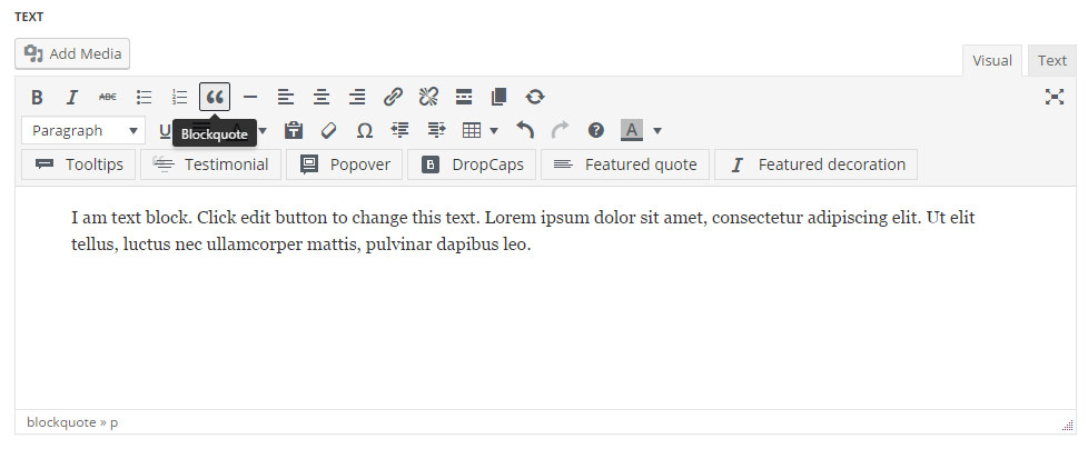
Select the quote content text and click on the Blockquote icon in the WYSIWYG editor.
It’ll add the line and quote icon decoration for the text and change the font style, background etc.
You may check various Blockquotes styles on Blockquotes page.
The settings for this text decoration are inherited from Theme options Typography/fonts Text typographyBlockquote typography section.
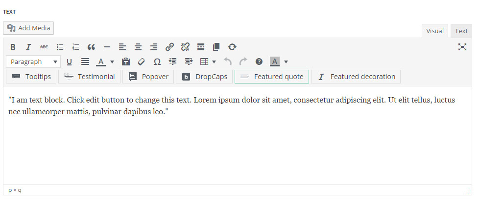
Featured quote
One of the ways of creative and stylish text highlighting.
Enter and select the text to highlight and click on the Featured quote icon in the WYSIWYG editor.
The settings for the featured quote are inherited from Theme optionsTypography/fonts Blog content featured quote section.
Featured decoration
The settings for this text decoration are inherited from Theme options Typography/fonts Text typography Featured decoration typography section.
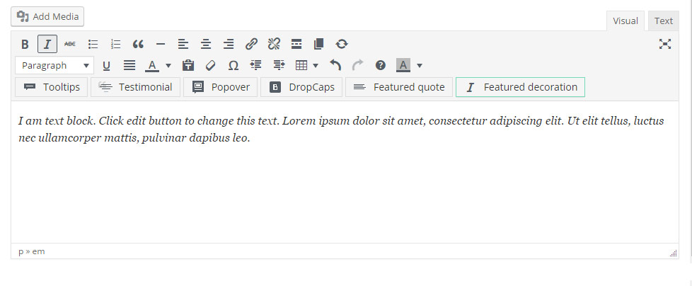
Enter and select the text to highlight and click on the Featured quote icon in the WYSIWYG editor.
Drop caps
Style the first letter differently to attract your visitors.
See the examples of various styles on the Dropcaps page.
Select the first letter in the text editor and select Drop caps icon in the editor.
The pop-up window with additional settings will appear for you, where you’ll be able to set the background color, its text color, and the border color as well.
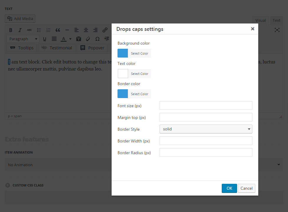
In such a ways you can create stylish and incomparable drop caps for the textual information and attract more visitors.
The default settings are inherited from theme files and are as follows: font-weight: bold, font-size: 43px, color: #3498db, font-family: “Open Sans”, “PT Sans”, sans-serif.
Popovers
Add extra information to the text
See the examples of the popovers used on Popover & Tooltips page.
Select the text where you’d like to add the popover effect on hover. Click on Popover icon in the text editor to reveal the window with additional settings.
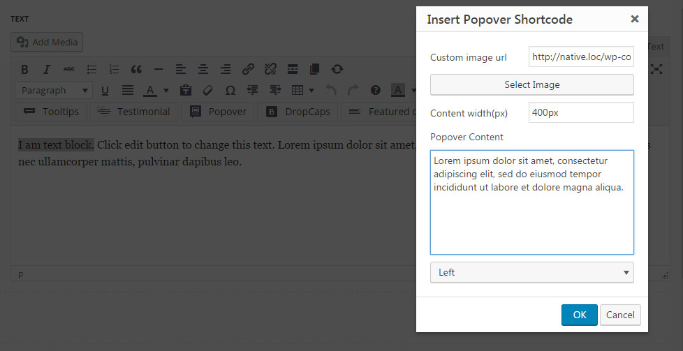
- Custom image URL – enter the link for the image to be displayed on text hover or select it from the media library.
- Content width – set the width for the popover.
- Popover content – enter the text to be displayed on hover.
- Popover position – select the position of the popover from the drop-down list.
The text with popover set on has the following setting by default: the default color is inherited from The default color is inherited fromTheme OptionsStyling OptionsSecond site color. The text color of the text with popover set is inherited from Theme options Typography/Fonts Text typography Default text Typography, and is darker for 18%.
The popover text settings are inherited from Theme options Typography/Fonts Text typography Default text Typography, and have the following styles set by default: line-height: 1.5, color: #fff.
Tooltips
Add stylish tooltips for the text to show additional information or description of the text.
Select the text where you’d like to add the tooltip on hover. Click on Tooltip icon in the text editor to reveal the window with additional settings.
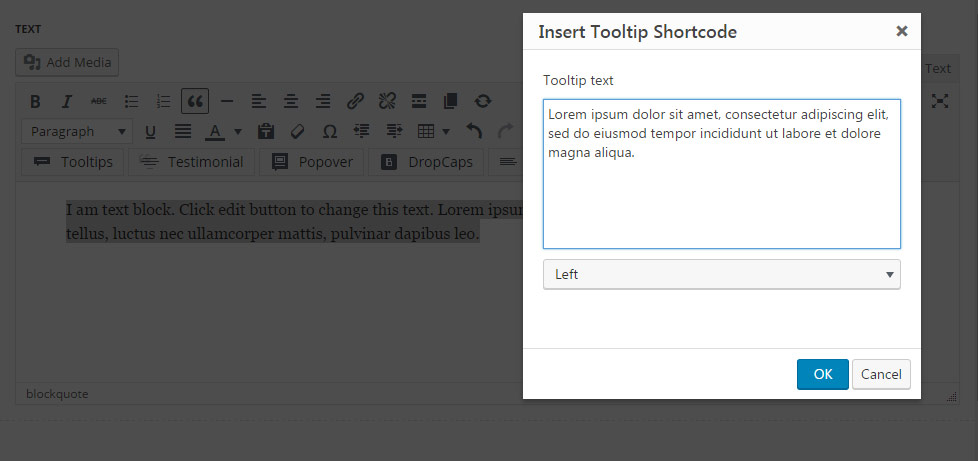
- Tooltip text – enter the content to be displayed on text hover.
- Tooltip position – select the position of the popover from the drop-down list.
The text with tooltip set inherits its settings from Theme options Typography/Fonts Text typography Default text Typography, and is darker for 18%. The following styles of borders are used for it: border-bottom-color: #9c9c9c, border-bottom: 1px dashed.
On hover, the background color is inherited from Theme OptionsStyling OptionsMain site color.
The tooltip content has the following setting by default: inherited from Theme options Typography/Fonts Text typography Default text Typography and font-size: 12px, line-height: 1.5, color: #fff by default.
See the examples of the tooltips used on Popover & Tooltips page.
Extra features
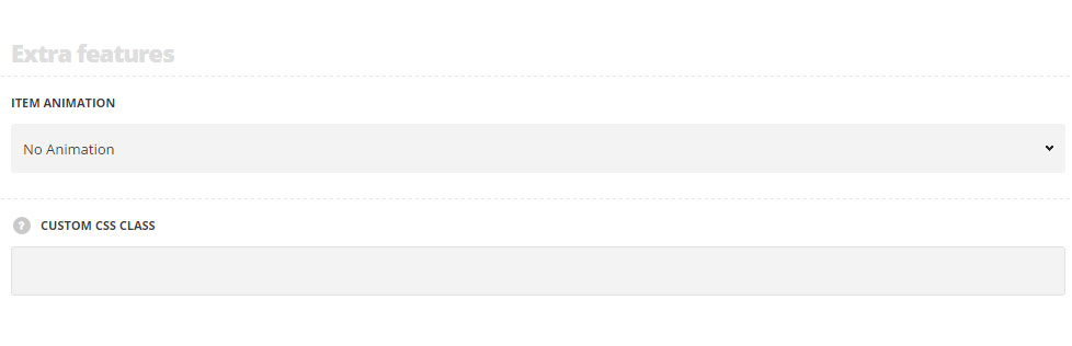
Extra features
- Animation – choose between 14 preset animation effects.
- Custom CSS class – enter our own unique class name for the item – this is a useful option for those who want to create a specific style. E.g.: you can type custom-style class and then go to
Theme optionsGeneral optionsCustom CSS/JSCustom CSSfield and write your own CSS code with this class to get your own style.