Using the Video player module you are able to present videos on your site. Customize the shortcode to get the unique design. Impress your visitors.
You may customize the shortcode and get the unique design.
More module examples can be found here.
Watch the video tutorial on Video Player module creation for more details.
General settings
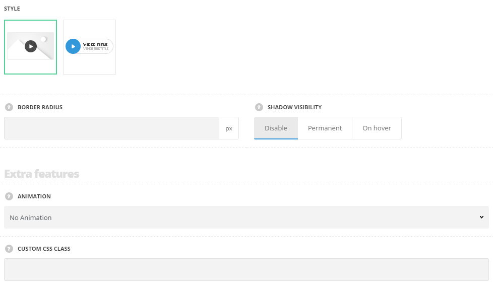
- Style – choose between 2 styles for the video player.
- Background – there is thumbnail image set for the video player as a background.
- Simple – the play button is displayed without thumbnail image.
- Border radius – set the border radius for the video thumbnail to have rounded corners. For Background style only.
- Shadow visibility – set the visibility options for shadow. You may select the shadow to be displayed permanent, on hover or to disable shadow for the video player. For Background style only.
- Shadow parameters – choose shadow parameter and set the color, in accordance with the following structure: horizontal shadow, vertical shadow, blur, and spread. More details can be found following this link.
- Color – set the color for the product category shadow.
- Full screen video animation – select the appear effect among the available 14 preset styles from the drop-down list. It will be applied to the full-screen video when you click on pay button.
Extra features
- Animation – choose between 14 preset animation effects.
- Custom CSS class – enter our own unique class name for the item – this is a useful option for those who want to create a specific style. E.g.: you can type custom-style class and then go to
Theme optionsGeneral optionsCustom CSS/JSCustom CSSfield and write your own CSS code with this class to get your own style.
Content settings
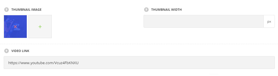
- Thumbnail image – upload the image for the video player. For Background style only.
- Title – enter the title for the module.
- Subtitle – enter the subtitle for the module.
- Video link – add the link to the video. Note, the videos from media library are not supported, the link should be from the external resource.
Style settings
For Background style
Note, if the thumbnail image is not set for the video player, the play button will have the default styles(e.g.: the video uploaded from youtube will have the default youtube button).
If you upload the thumbnail image, you can customize the play button for your site.
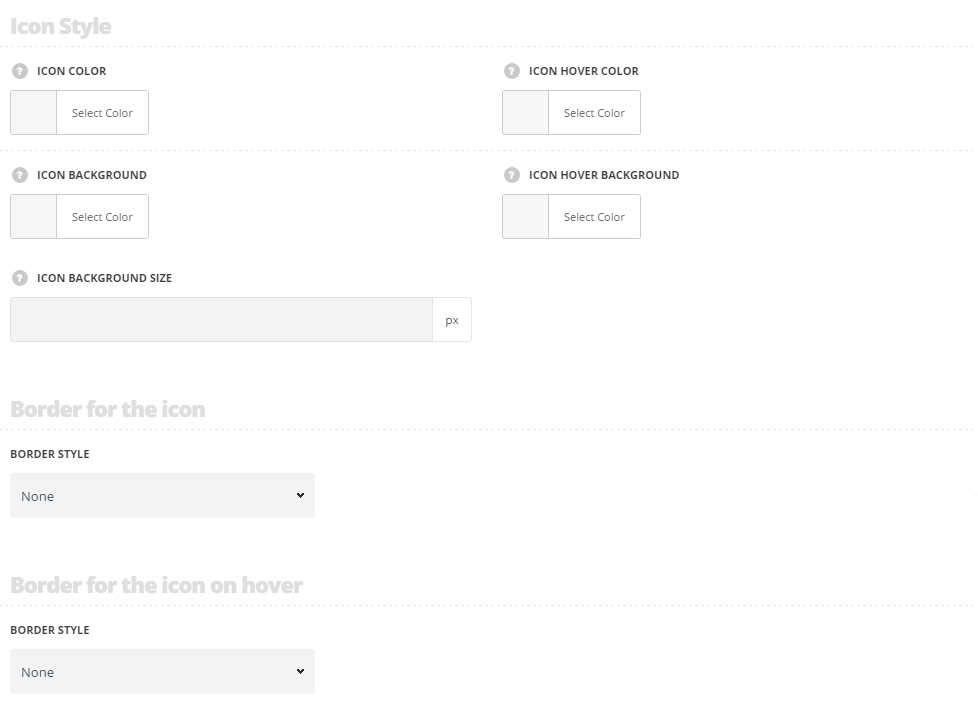
Icon style
- Icon color – choose the icon color. The default color is #fff.
- Icon hover color – set the icon hover color. The default color is #fff.
- Icon background – set the icon background color. The default color for the style Background is #000 with opacity 50%. The default color for the style Simple is inherited from
Theme OptionsStyling OptionsMain site color. - Icon hover background – choose the icon background color. The default color for the style Background is #000 with opacity 50%. The default color for the style Simple is inherited from
Theme OptionsStyling OptionsMain site colordarker for 7%. - Icon background size – set the background size for the icon. The default value is 80px. For background style only.
Border for icon
- Border style – select one of the available border styles for the module. Dotted, dashed and solid variants are available.
- Color – specify the color of the border.
- Border radius – select the border radius for button module to have rounded corners.
- Border width – set the width of the border. You may set the desired width each border: top, right, left and bottom.
Border for icon on hover
- Border style – select one of the available border styles for the module. Dotted, dashed and solid variants are available.
- Color – specify the color of the border.
- Border radius – select the border radius for button module to have rounded corners.
- Border width – set the width of the border. You may set the desired width each border: top, right, left and bottom.
For Simple style
General styles
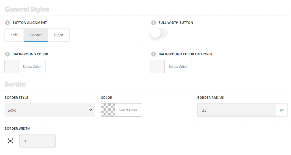
- Button alignment – allows you to choose the horizontal alignment for the video button. Left, right and center positions are available.
- Full with button – set it to Enable to have the full width button depending on the width of its container(row/column width).
- Background color – set the background color for the video module. The color is not set by default.
- Background color on hover – choose the background hover color for the video module. The color is not set by default.
Border
- Border style – select one of the available border styles for the module. Dotted, dashed and solid variants are available.
- Color – specify the color of the border.
- Border radius – select the border radius for button module to have rounded corners.
- Border width – set the width of the border. You may set the desired width each border: top, right, left and bottom.
Border on hover
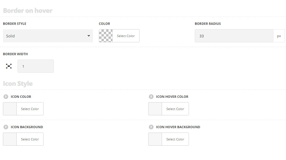
- Border style – select one of the available border styles for the module on hover. Dotted, dashed and solid variants are available.
- Color – specify the color of the border on hover.
- Border radius – select the border radius for the module to have rounded corners on hover.
- Border width – set the width of the border. You may set the desired width each border: top, right, left and bottom.
Icon style
- Icon color – choose the icon color. The default color is #fff.
- Icon hover color – set the icon hover color. The default color is #fff.
- Icon background – set the icon background color. The default color for the style Background is #000 with opacity 50%. The default color for the style Simple is inherited from
Theme OptionsStyling OptionsMain site color. - Icon hover background – choose the icon background color. The default color for the style Background is #000 with opacity 50%. The default color for the style Simple is inherited from
Theme OptionsStyling OptionsMain site color.
Border for the icon
- Border style – select one of the available border styles for the play icon on hover. Dotted, dashed and solid variants are available.
- Color – specify the color of the border on hover.
- Border radius – select the border radius for the play icon to have rounded corners on hover.
- Border width – set the width of the border. You may set the desired width each border: top, right, left and bottom.
Border for the icon on hover
- Border style – select one of the available border styles for the play icon on hover. Dotted, dashed and solid variants are available.
- Color – specify the color of the border on hover.
- Border radius – select the border radius for the play icon to have rounded corners on hover.
- Border width – set the width of the border. You may set the desired width each border: top, right, left and bottom.
Typography settings
For Simple style only
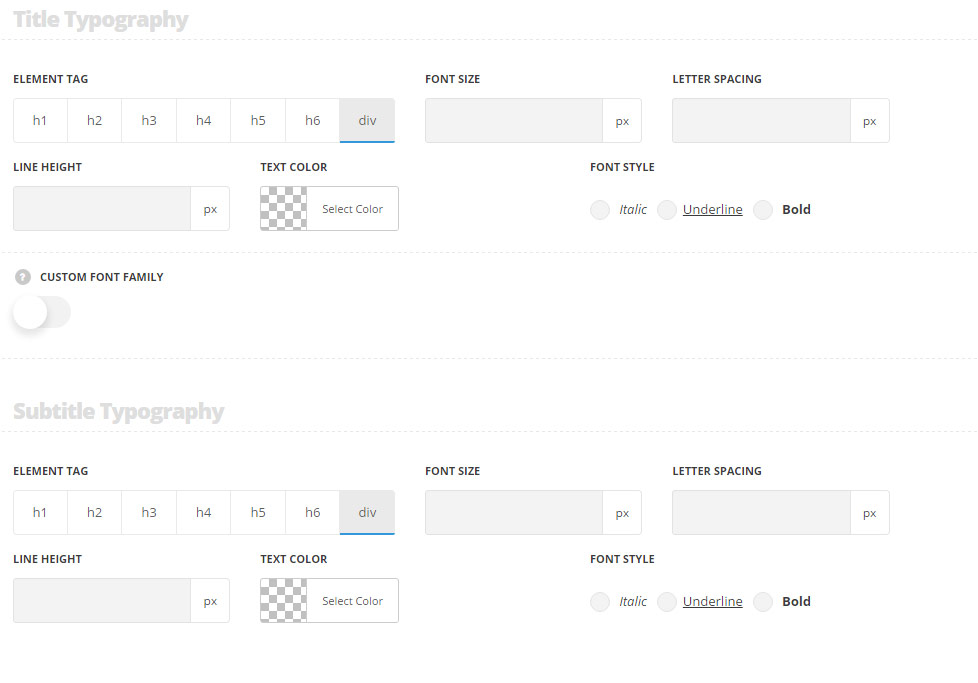
Title typography
These settings are inherited from Theme options Typography/Fonts Widgets typography Widget title Typography.
- Element tag – select the tag for the title.
- Font size – set the font size you need to use in the title.
- Letter spacing – set the needed distance between letters.
- Line-height – set the needed distance between lines in the title text.
- Text color – set the color of the font.
- Font style – select the font weight and style (bold, italic) for the title.
- Custom font family – set it to Enable to use custom Google font.
- Font Family – select the font family from the drop-down list.
- Font style – select the font weight and style (bold, italic) for the title.
Subtitle typography
These settings are inherited from Theme options Typography/Fonts Headings typography Content subtitle Typography with font-size set to 13px, line-height set to 20px and color set to #7b7b7b by default.
- Element tag – select the tag for the subtitle.
- Font size – set the font size you need to use in the subtitle.
- Letter spacing – set the needed distance between letters in the subtitle.
- Line-height – set the needed distance between lines in the subtitle text.
- Text color – set the color of the font.
- Font style – select the font weight and style (bold, italic) for the subtitle.