The menu is one of the most important elements of the site. It provides your visitors with the information about site structure.
So creating the easy and user-friendly menu is the key task.
If your menu has well-thought and conveniently grouped elements, you visitors will be able to find the needed section easily.
Below you may find the overview of the two main menu types and detailed instruction on creating the menu for your site.
Navigate to Appearance Menus section to manage all menus on your site. You may also check more information about the Menus section in the WordPress Codex.
In this section, you may create Simple or Advanced Menu styles for your site.
Watch the video tutorial on Menu creation for more details.
Simple Menu
Create one level menu with the simple structure for your site.
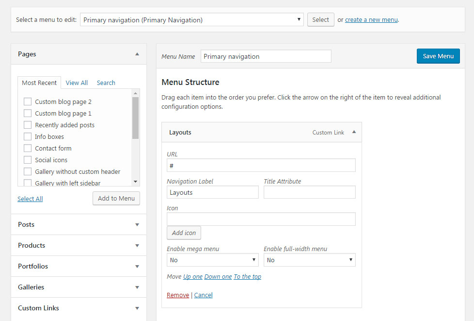
To create new menu navigate to Appearance Menus enter the Menu Name to the field and click Create Menu button.
In Menu Structure section you can arrange menu elements into the navigation. Here you may add the elements from the left column – these can be Pages, Posts, Categories, Custom Links, etc.
Select the needed elements and click Add to Menu button.
To open additional options for each menu element click the arrow icon on the right of the item.
- Navigation Label – specify the title for your menu item.
- Title Attribute – enter the subtitle for the menu element.
- Icon – you may select the icon to be displayed near menu elements in the header.
- Enable mega menu – switch it to Enable to create advanced menu style (with sub-menu items).
- Enable full-width menu – switch it to Enable to set the menu drop-down to full width. Note, Full-width menu will not work if Mega menu is enabled (yes is set in Enable mega menu).
- Move – here you can change the position of the menu item inside the navigation. You may also drag-n-drop the item to any needed position.
- Remove – click in case you want to delete the item.
For more expanded navigation you can create Advanced menu with sub-menus of different levels.
Advanced menu
Create the menu with drop-downs.
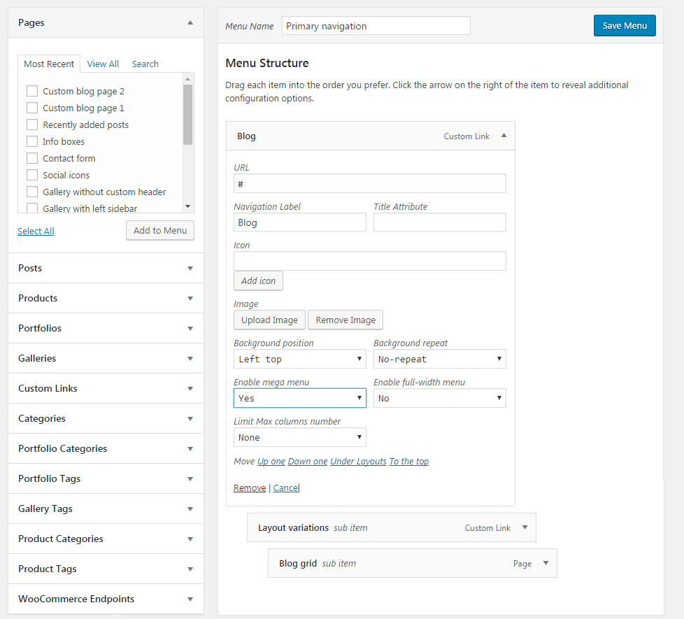
- Navigation Label – specify the title for your menu item.
- Title Attribute – enter the subtitle for the menu element.
- Icon – you may select the icon to be displayed near menu elements in the header.
- Image – here you can upload the image to be displayed as a background. It is applied to the menu item which contains sub-menu elements, so the image will be set as a background for the drop-down list.
- Enable mega menu – switch it to Enable to create advanced menu style (with sub-menu items).
- Enable full-width menu – set it to Enable if your want to have the full-width menu on your site.
- Limit Max columns number – select the number of the columns for the elements to be displayed in the drop-down. Six is the maximum value.
- Move – here you can change the position of the menu item inside the navigation. You may also drag-n-drop the item to any needed position.
- Remove – click in case you want to delete the item.
The menu elements such as Layout variations and Blog grid (see the screenshot above) are located inside the main menu elements and will be displayed as the second and third level of sub-menus respectively.
Menu settings
In this section, you can adjust extra options for the current menu.
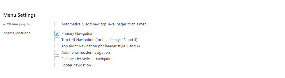
- Auto add pages – you can select whether the new pages will be added automatically to the menu or not.
- Automatically add new top-level pages to this menu – set it to Enable if you want to add each new create Page to the menu automatically.
- Theme locations – you may assign the menu to a certain navigation type on the site.
Check the theme menu locations below and assign the needed menu to them.
Note, these locations can be also set in the Appearance Menus Manage Locations section.
- Primary Navigation – is the main site menu and is used almost in all header styles and menu locations.
- Top Left Navigation (for header style 3 and 4) – menu used in header styles 3 and 4 for the left side navigation.
- Top Right Navigation (for header style 3 and 4) – menu used in header styles 3 and 4 for the right side navigation.
- Additional header navigation – menu used in header styles 5 and 6 as additional header navigation located in the Top info panel.
- Side header style 11 navigation – the menu used for header style 11.
- Footer navigation – menu used in the footer menu, if the Footer menu is enabled in
Theme optionsFooter section optionsMain footer settingssection.
Save the menu after everything is set properly and check it on the site.
Anchors
The perfect solution for One page site to get the convenient menu to navigate within a page.
Watch the video tutorial on Anchors creation for more details.
Below you can find the short instruction on anchor menu creation.
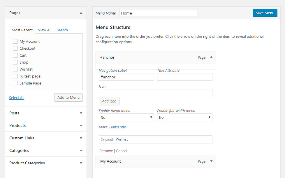
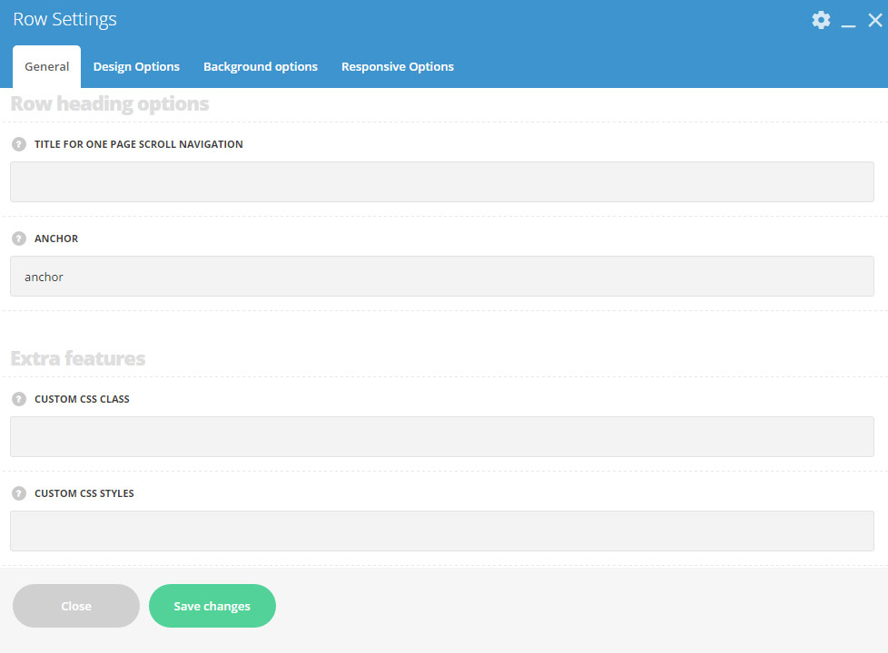
- Add anchors to any row of the page. Navigate to
Row SettingsRow heading optionsand type the anchor title to theAnchorfield. - After that, you’ll have to add this anchor to the menu navigation. Go to
AppearanceMenusand add Custom link element to the menu. Type the anchor title with the ‘sharp’ sign – # before it to the Link field of the menu element. Note, you need to avoid spaces between anchor titles within menu element.
Note, in case you have portfolios or other elements placed not on the home page, and you’ll need your visitors to navigate back to the homepage from various inner pages, you’ll have to type the site address before anchors, e.g: http://your-site-url#anchor
Note, the anchors on One Page Scroll page template types need to be added with ‘section-‘ word before anchor sign, e.g.: #section-2, while in the Row Settings, only the number should be entered, e.g: 2. Also, it is necessary to have the anchor added to each of the rows if One Page Scroll page template is selected.