All the modules which are frequently used in Carousel module, already have such variation.
Anyway, we’ve created a separate Carousel module for your convenience. You may add the content inside the carousel and create various sliders on your page.
More examples of the carousel can be found here.
Watch the video tutorial on Carousel module creation for more details.
General settings
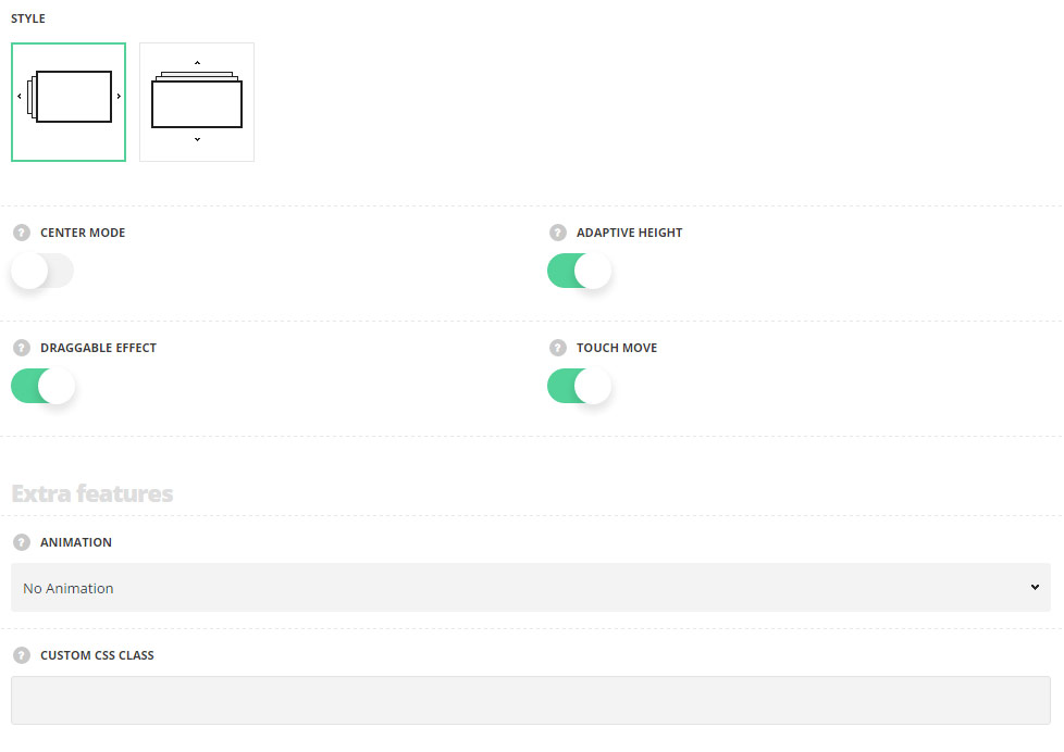
- Style – select the style of the carousel module for your site.
- Horizontal – select this style to create the carousel with the horizontal slide.
- Vertical – select this style to create the carousel with the vertical slide.
- Center mode – set it to Enable to set the active element in the center.
- Adaptive height – switch it to Enable to adapt the carousel according to the content size. The option is available when you set one slide to show.
- Draggable effect – set it to Enable to allow drag the carousel with the mouse.
- Touch move – switch it to Enable to allow scroll the carousel with touch actions. For Horizontal style only.
Extra features
- Animation – choose between 14 preset animation effects.
- Custom CSS class – enter our own unique class name for the item – this is a useful option for those who want to create a specific style. E.g.: you can type custom-style class and then go to
Theme optionsGeneral optionsCustom CSS/JSCustom CSSfield and write your own CSS code with this class to get your own style.
Slideshow settings
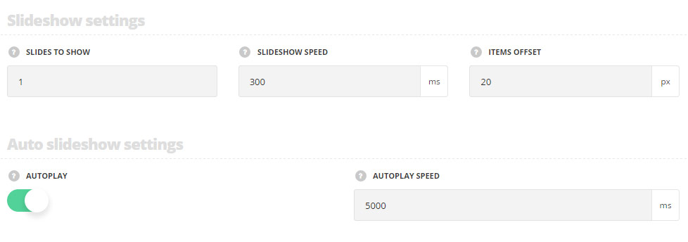
- Slides to show – specify the number of slides to show at a time.
- Slideshow speed – set the speed of the slideshow.
- Items offset – set the spacing between carousel elements.
Auto slideshow settings
- Autoplay – switch it to Enable to activate the autoplay for the carousel.
- Autoplay speed – specify the speed automatically sliding carousel.
Responsive settings
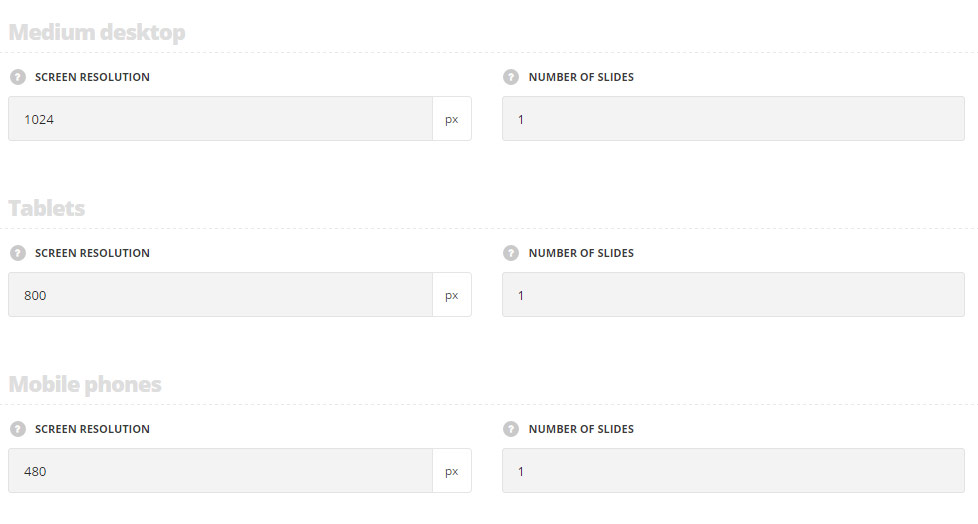
Medium desktop
- Screen resolution – set the screen resolution for the medium desktops.
- Number of slides – set the number of slides to show for the medium desktops.
Tablets
- Screen resolution – set the screen resolution for the tablets.
- Number of slides – set the number of slides to show for the tablets.
Mobile phones
- Screen resolution – set the screen resolution for the mobile devices.
- Number of slides – set the number of slides to show for the mobiles.
Navigation style
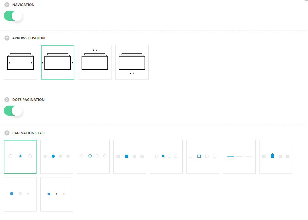
- Navigation – set it to Enable to activate the navigation between the previous and next slides inside the carousel.
- Arrows position – select the best suitable position of the navigation arrows.
- Dots pagination – set it to Enable to display the navigation bullets.
- Pagination style – select the style of the buttons for the carousel.
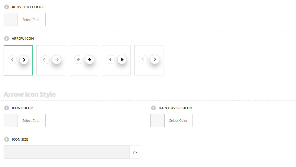
- Active dot color – choose the color for the active dot. The default color is inherited from
Theme OptionsStyling OptionsMain site color. - Arrow icon – select the style of the icon for the navigation arrows.
Arrow icon style
- Icon color – choose icon color. The default color is #343434.
- Icon hover color – choose icon hover color. The default color is #9a9a9a.
- Icon size – set the size of the icon. The default font size is 10px.
Arrow background style
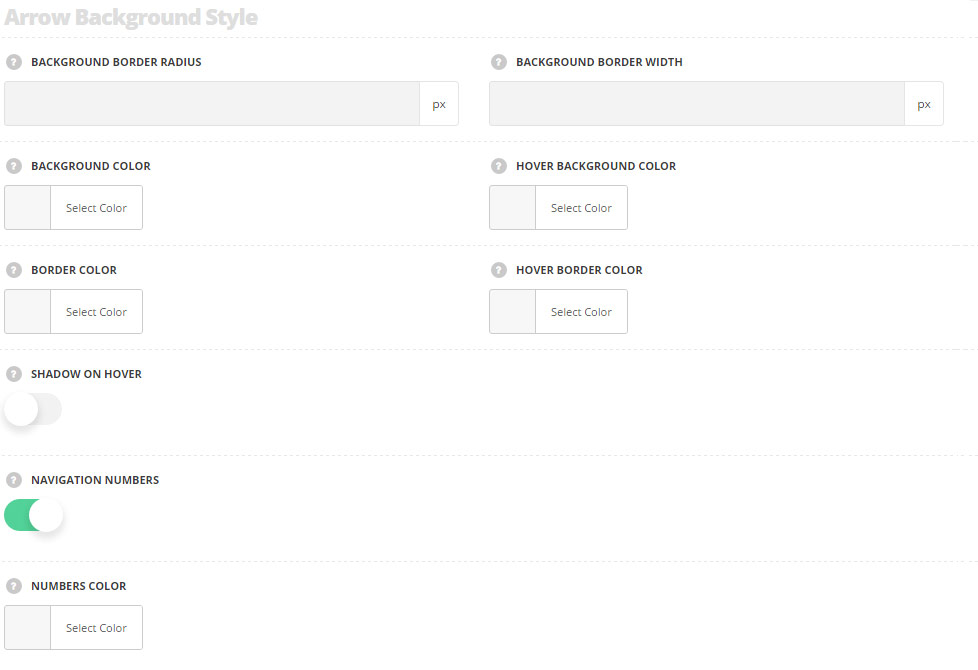
- Background border radius – set the border radius for the icon’s background.
- Background border width – set border width for the icon’s background.
- Background color – set the background color for the navigation icon.
- Hover background color – set the background color for the navigation icon on hover.
- Border color – select the border color for the navigation icon.
- Hover border color – select the border color for the navigation icon on hover.
- Shadow on hover – set it to Enable to activate the shadow on hover for the icon.
- Navigation numbers – switch it to Enable to show navigation numbers above the arrows.
- Numbers color – choose the color for the numbers. The default color is #c3c3c3.