If you want to create the stylish section to present the logos of your clients, partners, sponsors, affiliates, etc, Clients Logos module is the excellent solution for you.
Check the more examples of the module on Client Logos page.
Watch the video tutorial on Client Logos module creation for more details.
General settings
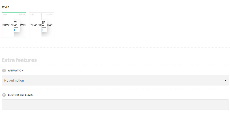
- Style – select the best suitable style for your site.
- Simple – the element in this style has the following displaying: title, subtitle, logo image and descriptions with shadow hover effect.
- Slide up – in this style, the element’s title and subtitle are displayed below the image with sliding effect on hover.
Extra features
- Animation – choose between 14 preset animation effects.
- Custom CSS class – enter our own unique class name for the item – this is a useful option for those who want to create a specific style. E.g.: you can type custom-style class and then go to
Theme optionsGeneral optionsCustom CSS/JSCustom CSSfield and write your own CSS code with this class to get your own style.
Content settings
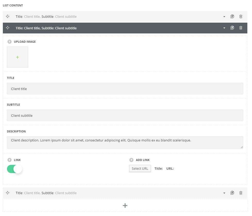
List content
In this section, you can customize the client logos of the module.
By clicking on the arrow down icon you can reveal the whole section to adjust it to your needs. Here you are also able to duplicate the client logos, change their order (simply drag-n-drop the blocks) and delete the unnecessary logos as well.
- Upload image – upload the image for the client logo.
- Title – enter the title of the client logo on your site.
- Subtitle – enter the subtitle of the client logo on your site.
- Description – add the description of the client logo on your site.
- Link – switch it to Enable to apply the link for the client logo.
- Add link – enter the link for the logo.
Settings
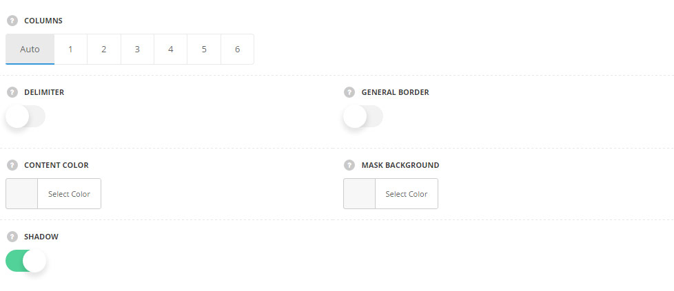
- Columns – choose the number of columns you would like to show your logos. Auto sets the client logos in 4 columns automatically.
- Delimiter – switch it to Enable to display delimiter between the logo images.
- General border – switch it to Enable to display the general border for the client logos.
- Content color – set the color for the title, subtitle, and description on your site. The default title color is inherited from These settings are inherited from
Theme optionsTypography/FontsHeadings typographyContent title big Typography. The default subtitle color is #b5b5b5. The default content color is inherited fromTheme optionsTypography/FontsText typographyDefault text Typography. - Mask background – set the color for the mask overlay background (the area around the logo element on hover). The default mask color is #fff.
- Shadow – set it to Enable to display shadow on hover for the client logo on hover.
Typography settings
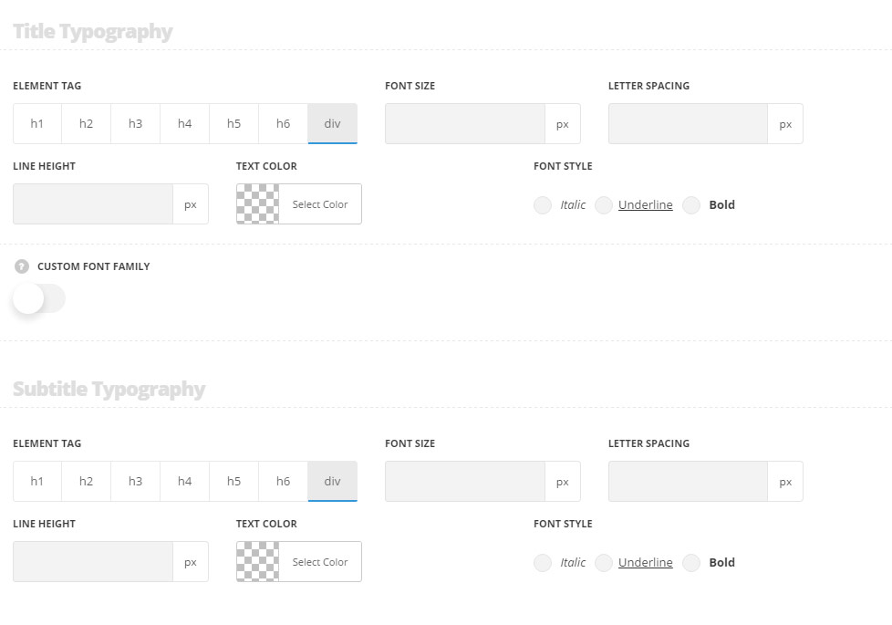
These settings are inherited from Theme options Typography/Fonts Headings typography Content title big Typography.
- Element tag – select the tag for the title.
- Font size – set the font size you need to use in the title.
- Letter spacing – set the needed distance between letters.
- Line-height – set the needed distance between lines in the title text.
- Text color – set the color of the font.
- Font style – select the font weight and style (bold, italic) for the title.
- Custom font family – set it to Enable to use custom Google font.
- Font Family – select the font family from the drop-down list.
- Font style – select the font weight and style (bold, italic) for the title.
Subtitle typography
These settings are inherited from Theme options Typography/Fonts Text typography Default text Typography. Font size is 12px, color is #b5b5b5 and line-height is 1.3 by default.
- Element tag – select the tag for the subtitle.
- Font size – set the font size you need to use in the subtitle.
- Letter spacing – set the needed distance between letters in the subtitle.
- Line-height – set the needed distance between lines in the subtitle text.
- Text color – set the color of the font.
- Font style – select the font weight and style (bold, italic) for the subtitle.
Description typography
These settings are inherited from Theme options Typography/Fonts Text typography Default text Typography.
- Font size – set the font size you need to use in the description in the module.
- Letter spacing – set the needed distance between letters.
- Line-height – set the needed distance between lines.
- Text color – set the color of the font.
- Font style – select the font weight and style (bold, italic).