Tabs module allows you to present the information in separate tabs to show any kind of the information on one page.
A number of tabs are unlimited.
You may check the module examples on the Tabs page.
This is a nested shortcode – module that includes other modules. You may style the container and then fill it in with elements.
Watch the video tutorial on DFD Tabs module creation for more details.
General settings
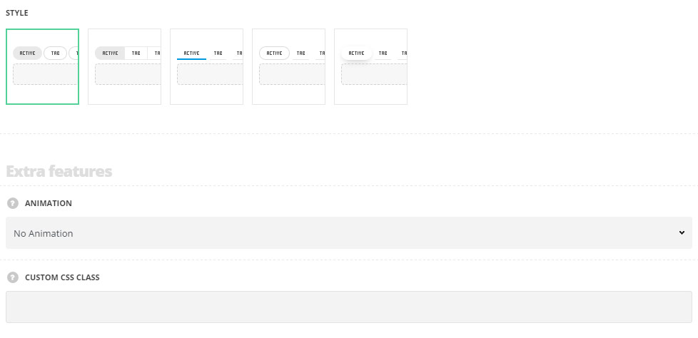
- Style – select the most suitable style of the tabs for your site.
- Classic – the tabs have the transparent background color set for each of them, except for the active tab, the background color for which can be set in module settings.
- General background – the tabs are displayed on the transparent background and are not separate with spaces, but are located in one container, and the activate tab has the background color set.
- Underline – the tabs are displayed with underline decoration. The underline color is different for the active tab.
- Active tab border – the inactive tabs are displayed with underline decoration while the active tab has the transparent background color with the border around.
- Active tab background – the inactive tabs are displayed with underline decoration while the active tab has the transparent background color with the shadow decoration effect.
Extra features
- Animation – choose between 14 preset animation effects.
- Custom CSS class – enter our own unique class name for the item – this is a useful option for those who want to create a specific style. E.g.: you can type custom-style class and then go to
Theme optionsGeneral optionsCustom CSS/JSCustom CSSfield and write your own CSS code with this class to get your own style.
Tabs style

- Border radius – set the border radius for the tabs to have rounded corners. For Classic and General background styles only.
- Background color – set the background color for inactive tabs. The background is not set by default. For Classic and General background styles only.
- Hover background color – set the hover background color for inactive tabs. The background is not set by default.
- Border color – set the border color. The default border color is inherited from
Theme OptionsStyling OptionsMain site color. - Border hover color – choose the border hover color. The default border hover color is inherited from
Theme OptionsStyling OptionsMain site color. - Active tab border color – set the border color for the active tab. For the style Underline it will be set as underline color for the active tab. The default underline color for the style Underline is inherited from
Theme OptionsStyling OptionsMain site color. The default border color for others styles is inherited fromTheme OptionsStyling OptionsSecond site color. - Active tab background color – select the background color for the active tab. The default background color for styles Classic and General Background is inherited from
Theme OptionsStyling OptionsSecond site color. The color for the styles Active tab border and Active tab background is not set by default. - Border width – set the border width for the tabs.
- Active tab border width – set the border width for the active tab. For Underline and Active tab border styles only.
- Active tab border radius – set the border radius for the active tab to have rounded corners. For Active tab border and Active tab background styles only.
- Underline on inactive tab – set it to Enable to display the underline decoration under inactive tabs. For Underline, Active tab border and Active tab background styles only.
- Underline height – specify the height of the underline decoration in px. For Underline, Active tab border and Active tab background styles only.
- Underline color – choose the underline color for the inactive tabs. The default underline color is inherited from
Theme OptionsStyling OptionsSecond site color. For Underline, Active tab border and Active tab background styles only. - Underline hover color – choose the underline color for the inactive tabs on hover. The default underline color is inherited from
Theme OptionsStyling OptionsSecond site color. For Underline, Active tab border and Active tab background styles only. - Autorotate – enable the automatical tabs rotation, choose the periodicity of tabs rotation in seconds.
- Active section – enter the number of the section which should be active on page load. Note: to have all sections closed on initial load enter non-existing number of the tabs in the module used.
Title style
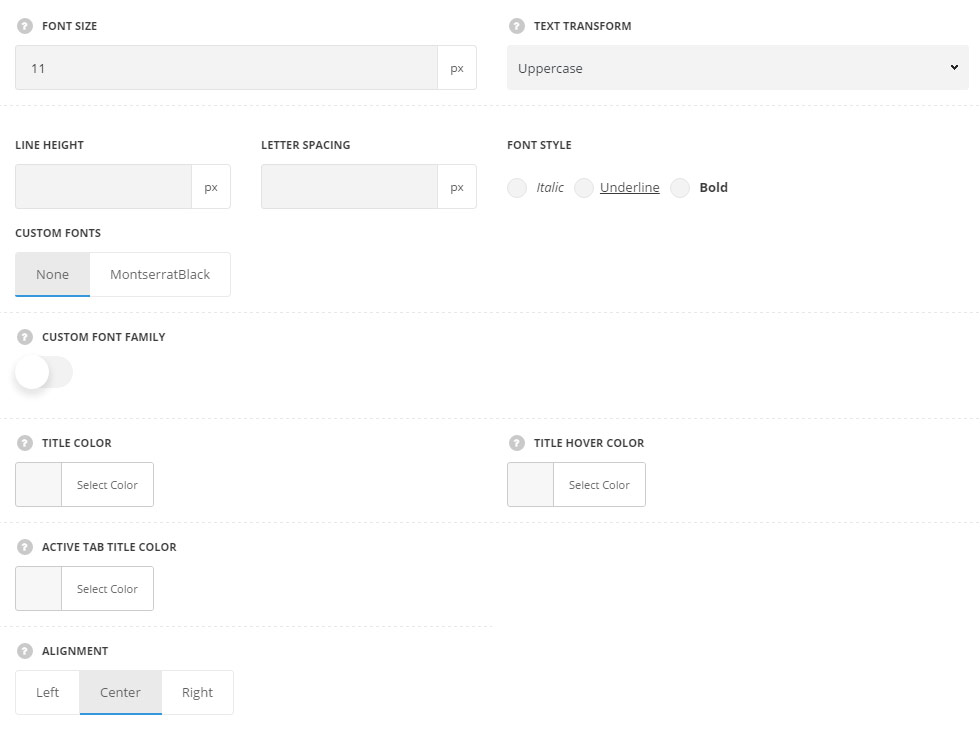
These settings are inherited directly from theme files and are as follows: font-family: “Montserrat”, “Open Sans”, “PT Sans”, sans-serif, font-size: 11px, letter-spacing: 0.6pt.
- Font size – set the font size for the Tab title.
- Text transform – set the text-transform value for the tab’s title. The default value is Uppercase.
- Line-height – set the needed distance between lines in the title text.
- Letter spacing – set the needed distance between letters.
- Font style – select the font weight and style (bold, italic) for the title.
- Custom font family – set it to Enable to use custom Google font.
- Font Family – select the font family from the drop-down list.
- Font style – select the font weight and style (bold, italic) for the title.
- Title color – set the color for the tab title. The default color is #1b1b1b.
- Title hover color – set the color for the tab title on hover. The default color is inherited from
Theme OptionsStyling OptionsMain site color. - Active tab title color – set the color for the active tab title. The default color is #1b1b1b.
- Alignment – set the tab title alignment. Left, right and center positions are available.
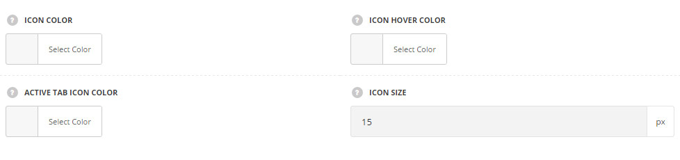
Icon style
Set the style of the icon used in tab section. Each icon can be set in Section settings of the tab.
- Icon color – set the icon color. The default color is #28262b.
- Icon hover color – set the icon color on hover. The default color is inherited from
Theme OptionsStyling OptionsMain site color. - Active tab icon color – choose the active tab icon color. The default color is #28262b.
- Icon size – set the size for the icon.
Section settings
By clicking on edit icon of each section you can set the icons for it and customize it to your needs.
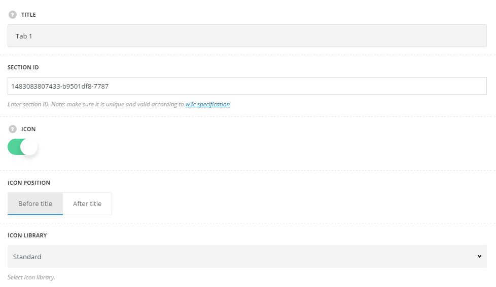
- Title – enter the title of the section.
- Section ID – enter section ID. Note: make sure it is unique and valid according to W3c specification.
- Icon – set it to Enable to show the icon in the tab.
- Icon position – select position of the icon in the tab. It can be set before and after the title.
- Icon library – choose the icon library for the module.
- Select icon – select the icon to be displayed in the module.
- Custom CSS class – enter our own unique class name for the item – this is a useful option for those who want to create a specific style. E.g.: you can type custom-style class and then go to
Theme optionsGeneral optionsCustom CSS/JSCustom CSSfield and write your own CSS code with this class to get your own style.