The excellent way to show the most interesting facts on your site and impress the visitors with stylish presentation.
Check the example of the module with this link.
Watch the video tutorial on Facts module creation for more details.
General settings
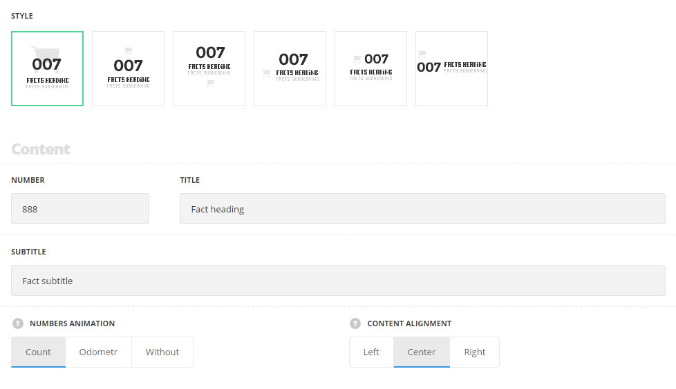
- Style – select the appearance for the module.
- Standard – the icon is set as a background for the module.
- Top icon – the icon is displayed on top of the module.
- Bottom icon – the icon is displayed on the bottom of the module.
- Title with icon – the icon is displayed on the left side of the title, in one line.
- Number with icon – the icon is displayed on the left side of the number, in one line.
- Side number – the number is displayed aside from the content with icon on top of it.
Content
- Number – enter the fact’s number.
- Title – enter the title for the fact element.
- Subtitle – enter the subtitle for the fact element.
- Numbers animation – allows you to choose the animation for the number.
- Count – the counting animation effect is applied to the number in fact element.
- Odometer – the numbers will be counted in the stylish odometer container.
- Without – no animation is set for the numbers.
- Content alignment – select the align for the content in horizontal respect. Left, right and center positions are available. For Side Number style only left and right alignment positions are available.
Extra features
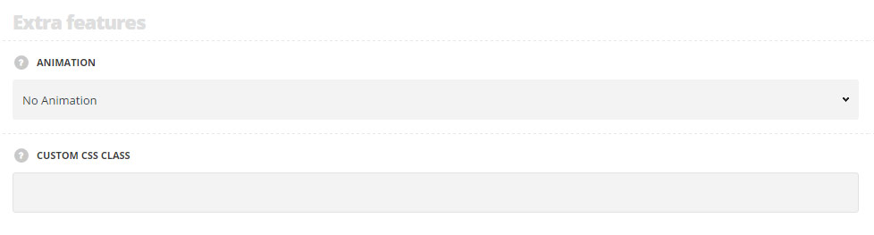
- Animation – choose between 14 preset animation effects.
- Custom CSS class – enter our own unique class name for the item – this is a useful option for those who want to create a specific style. E.g.: you can type custom-style class and then go to
Theme optionsGeneral optionsCustom CSS/JSCustom CSSfield and write your own CSS code with this class to get your own style.
Icon settings
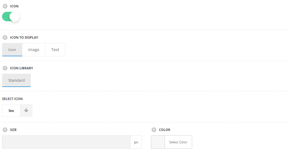
- Icon – switch it to Enable to display the icon in fact element.
- Icon to display – select the element to be displayed in the module.
- Icon – select this variant to display the icon in the module.
- Icon library – choose the icon library for the module.
- Select icon – select the icon to be displayed in the module.
- Size – set the size for the icon.
- Color – choose the icon color. The default color is #e5e5e5.
- Image – select this variant to display custom image on the left side from the text.
- Upload image – select the image from media library for the module.
- Size – set the size for the image.
- Text – select this variant to display custom text for the module. The default settings are inherited from theme files and are as following: line-height: 1 em, font-family: Montserrat, font-weight: 700, letter-spacing: -1px.
- Text – enter the content to be displayed in the module.
- Font size – set the font size you need to use in the text.
- Letter spacing – set the needed distance between letters.
- Line-height – set the needed distance between lines.
- Text color – set the color of the font.
- Font style – select the font weight and style (bold, italic).
- Custom font family – set it to Enable to use custom Google font.
- Font Family – select the font family from the drop-down list.
- Font style – select the font weight and style (bold, italic) for the text.
- Icon – select this variant to display the icon in the module.
- Icon to display – select the element to be displayed in the module.
Typography settings
Number typography
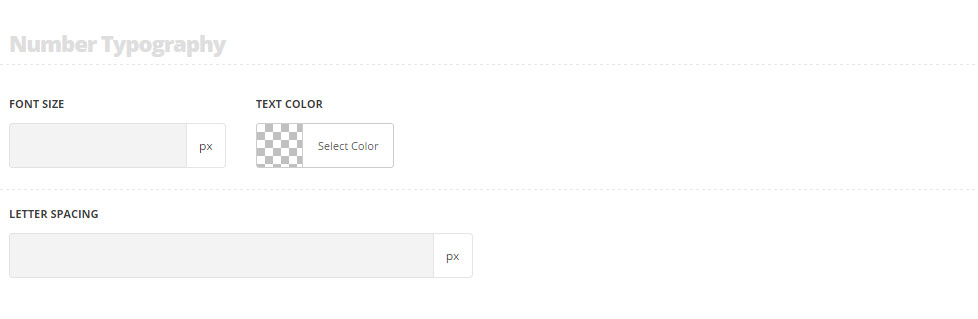
These settings are inherited from Theme options Typography/Fonts Headings typography Content title big Typography. And the following values are inherited directly from theme files: font-size: 60px, line-height: 1.
- Font size – set the font size you need to use in the number in the module.
- Text color – set the color of the text in the module.
- Letter spacing – set the desired distance between letters.
Title typography
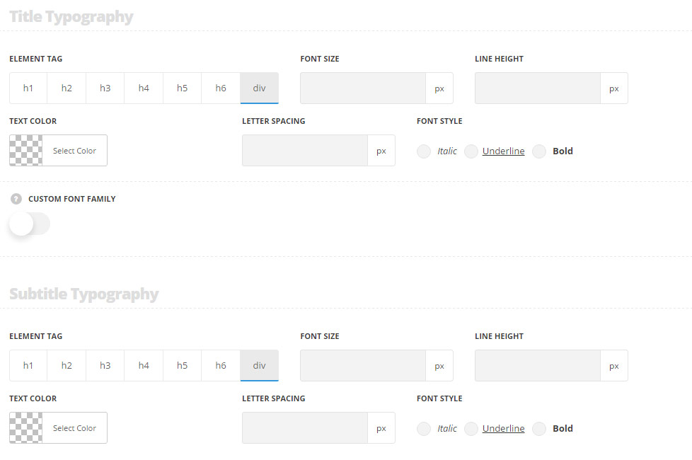
These settings are inherited from Theme options Typography/Fonts Headings typography Content title big Typography. And the following values are inherited from theme files are as follows: font-size: 15px.
- Element tag – select the tag for the title.
- Font size – set the font size you need to use in the title.
- Letter spacing – set the needed distance between letters.
- Line-height – set the needed distance between lines in the title text.
- Text color – set the color of the font.
- Font style – select the font weight and style (bold, italic) for the title.
- Custom font family – set it to Enable to use custom Google font.
- Font Family – select the font family from the drop-down list.
- Font style – select the font weight and style (bold, italic) for the title.
Subtitle typography
These settings are inherited from Theme options Typography/Fonts Text typography Default text Typography . Font-size is 13px, color: #b5b5b5, line-height: 1.6, padding-top: 5px by default.
- Element tag – select the tag for the subtitle.
- Font size – set the font size you need to use in the subtitle.
- Letter spacing – set the needed distance between letters in the subtitle.
- Line-height – set the needed distance between lines in the subtitle text.
- Text color – set the color of the font.
- Font style – select the font weight and style (bold, italic) for the subtitle.
Responsive settings
Number responsive settings
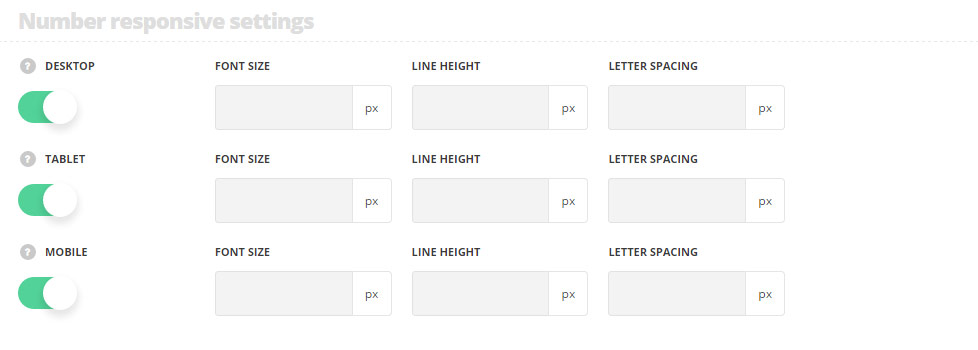
- Desktop – set the number font size, line height and letter spacing for the screen resolutions from 1280px to 1025px.
- Tablet – set the number font size, line height and letter spacing for the screen resolutions from 1024px to 800px.
- Mobile – set the number font size, line height and letter spacing for the screen resolutions less than 800px.