Arrange the gallery works into awesome-looking carousel module. More examples can be found on Gallery Carousel page.
Before displaying the gallery items in Gallery module, you need to create gallery items in the corresponding section of the admin panel. Check the Gallery item creation section of the theme documentation for more information.
Watch the video tutorial on Gallery Tilted Carousel module creation for more details.
General settings
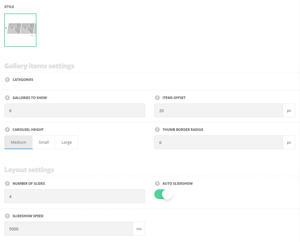
- Style – there is one style Carousel available in the module and selected by default.
Gallery item settings
- Categories – select the categories of the gallery items to be displayed within the module.
- Galleries to show – select the number of the gallery works to be displayed in the module.
- Items offset – set the offset between the works to add some space.
- Carousel height – set the height for the gallery carousel. Medium, small and large variants are available.
- Thumb border radius – set the border radius for the featured images of the gallery works to have rounded corners.
Layout settings
- Number of slides – select the number of slides to show in the carousel.
- Auto slideshow – set it to Enable to activate the autoplay for the carousel.
- Sideshow speed – set the speed of the slideshow in milliseconds.
Extra features
- Animation – choose between 14 preset animation effects.
- Custom CSS class – enter our own unique class name for the item – this is a useful option for those who want to create a specific style. E.g.: you can type custom-style class and then go to
Theme optionsGeneral optionsCustom CSS/JSCustom CSSfield and write your own CSS code with this class to get your own style.
Hover settings
More information regarding the gallery hover settings may find in the Gallery options post (Gallery hover style options section).
Main hover settings
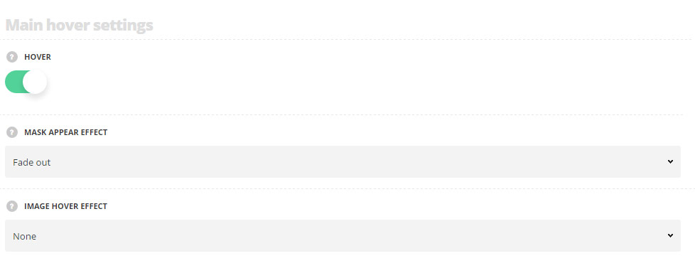
- Hover – switch it to Enable to activate hover effect for your gallery items inside the module.
- Mask appear effect – select the hover effect for the mask appearing from the available ones.
- Image hover effect – choose behavior for the featured image on hover.
Hover mask settings
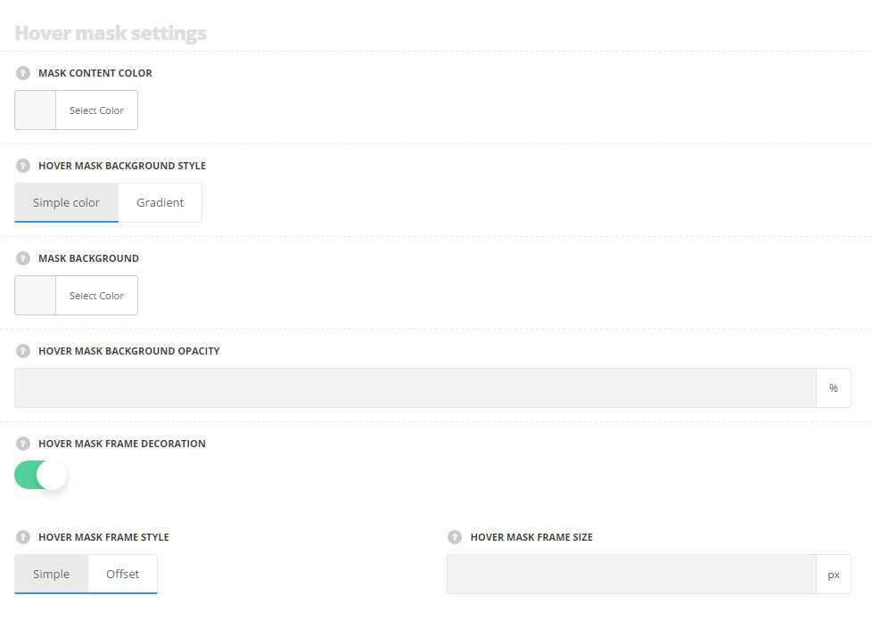
- Mask content color – choose the color for the content text. The default value is inherited from
Theme optionsGallery optionsGallery hover style optionsText color. - Hover mask background style – select the mask background style, you can choose simple color or gradient. The default value is inherited from
Theme optionsGallery optionsGallery hover style optionsHover mask background style. - Mask background – choose the mask background color. The default value is inherited from
Theme optionsGallery optionsGallery hover style optionsHover mask background color. - Mask background opacity– choose the mask background color. The default value is inherited from
Theme optionsGallery optionsGallery hover style optionsHover mask background opacity. - Hover mask frame decoration – set it to Enable to display the frame decoration on hover.
- Hover mask background style – select the style of the mask decoration. Simple and Offset styles are available.
- Hover mask frame size – set the size for the frame decoration on hover.
Hover decoration settings
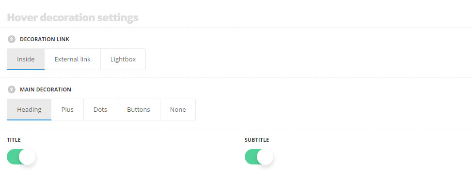
- Decoration link – choose the behavior for the decoration link. It may be leading to the inner gallery item page, to the external link or to the lightbox.
- Main decoration – choose the main decoration style for the hover. More information regarding each style you may find in the Gallery options post (Gallery hover style options section).
- Title – set it to Enable to display the title of the gallery item on hover.
- Subtitle – set it to Enable to display the subtitle of the gallery item on hover.
Pagination settings
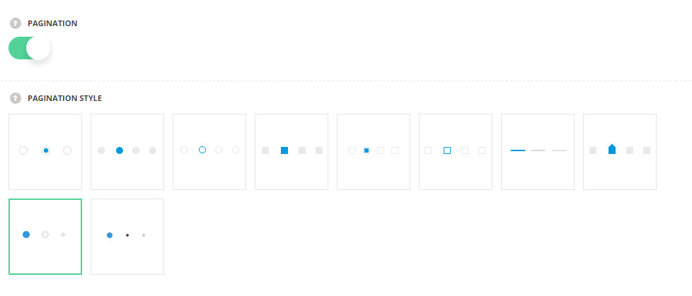
- Pagination – set it to Enable to display the pagination for the gallery carousel.
- Pagination style – select the most suitable pagination dots from the list of available ones.
Typography settings
Title typography
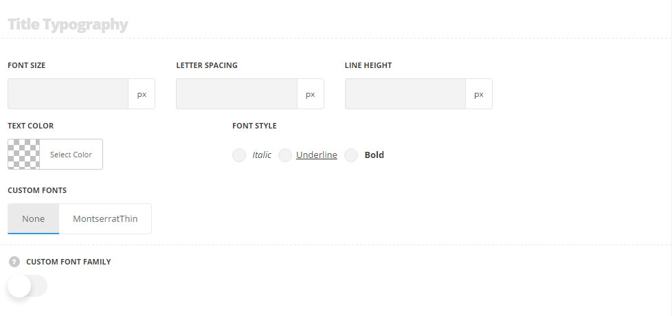
These settings are inherited from Theme options Typography/Fonts Gallery typography Gallery item title Typography.
- Font size – set the font size you need to use in the title.
- Letter spacing – set the needed distance between letters.
- Line-height – set the needed distance between lines in the title text.
- Text color – set the color of the font.
- Font style – select the font weight and style (bold, italic) for the title.
- Custom font family – set it to Enable to use custom Google font.
- Font Family – select the font family from the drop-down list.
- Font style – select the font weight and style (bold, italic) for the title.
Subtitle typography
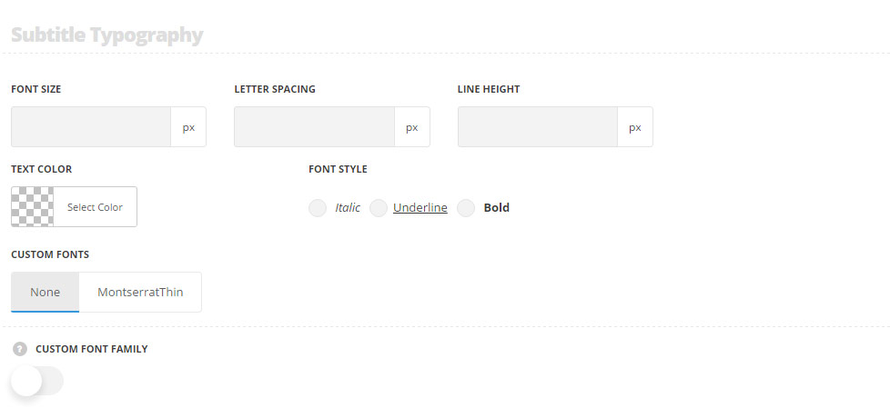
These settings are inherited from Theme optionsTypography/FontsGallery typography Gallery item subtitle Typography.
- Font size – set the font size you need to use in the subtitle.
- Letter spacing – set the needed distance between letters.
- Line-height – set the needed distance between lines in the subtitle text.
- Text color – set the color of the font.
- Font style – select the font weight and style (bold, italic) for the subtitle.
- Custom font family – set it to Enable to use custom Google font.
- Font Family – select the font family from the drop-down list.
- Font style – select the font weight and style (bold, italic) for the subtitle.