Icon list module allows you to add the list with the custom icons or dots.
You may check the module variations with this link.
Watch the video tutorial on Icon List module creation for more details.
General settings

- Style – choose between 3 preset styles.
- Simple – the icons and content are displayed in a simple list, without delimiters.
- Divided – there is delimiter added between each list item.
- With Short Delimiter – there is a short delimiter (under icon) added between each list item.
- Icon alignment – select the horizontal alignment for the icon. Left align, right align and justify positions are available.
Extra features
- Animation – choose between 14 preset animation effects.
- Custom CSS class – enter our own unique class name for the item – this is a useful option for those who want to create a specific style. E.g.: you can type custom-style class and then go to
Theme optionsGeneral optionsCustom CSS/JSCustom CSSfield and write your own CSS code with this class to get your own style.
Content settings
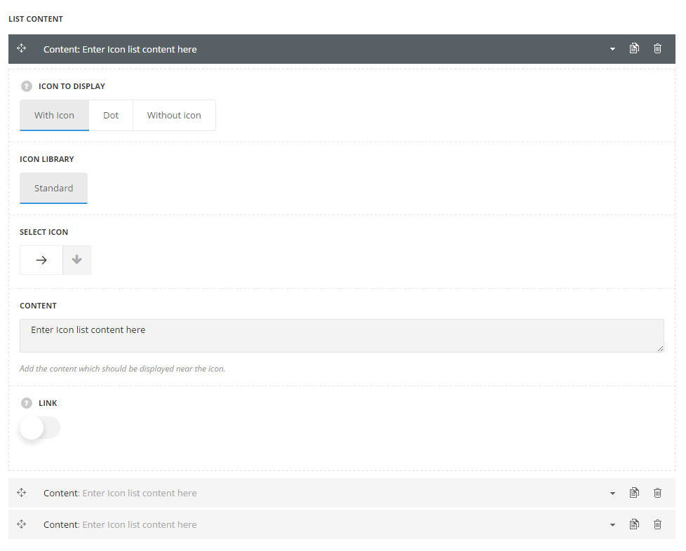
- Icon to display – select whether the list will be with or without the icon. The dot style is also available.
- Icon library – choose the icon library for the module.
- Select icon – select the icon to be displayed in the module.
- Content – add the textual content for the list item.
- Link – set it to Enable to add the link to the list icon item.
- Add link – set the link and ts title for the icon list item.
Styles
Please note! In case, in the Content settings ‘Without Icon’ style for list item was selected, the icon style settings do not influence the icon appearance.
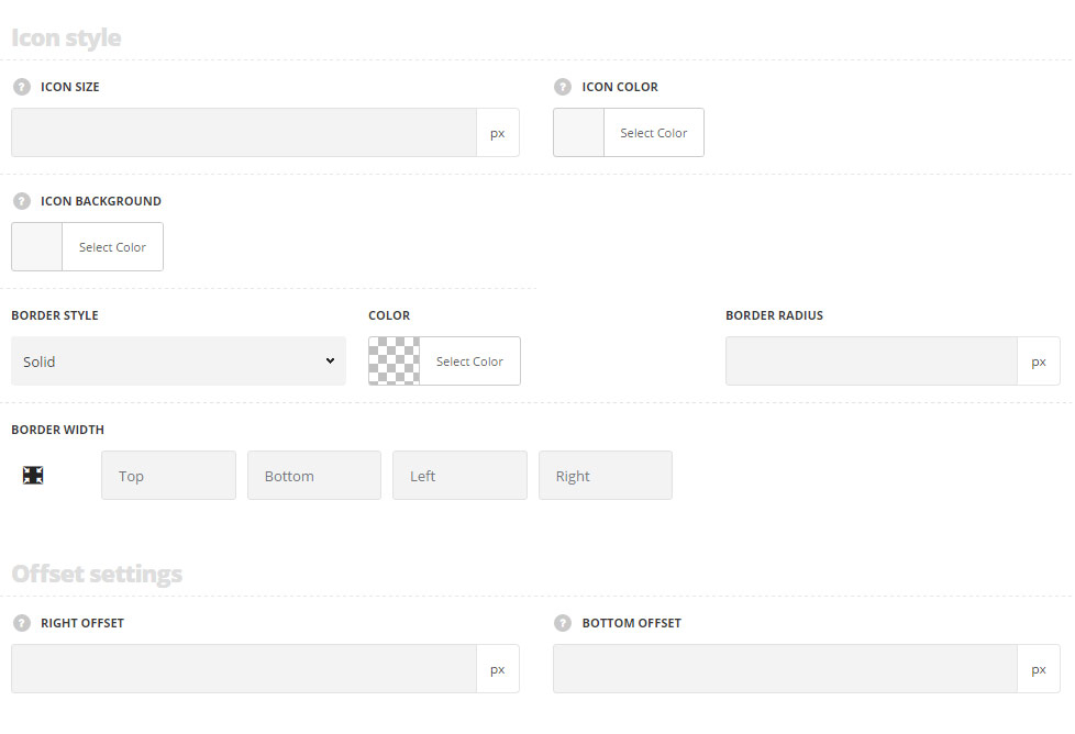
Icon style
- Icon size – select the size for the icons for Icon List module.
- Icon color – specify the color of the icon.
- Icon background – select the background color for the icon.
- Border style – select one of the available border styles. Dotted, dashed and solid variants are available.Theme default style will be inherited directly from theme files.
- Color – specify the color of the border.
- Border radius – select the border radius for Icon List module to have rounded corners.
- Border width – set the width of the border. You may set the desired width each border: top, right, left and bottom.
Offset settings
- Right offset – set the offset between the icon and the content.
- Bottom offset – set the offset between the list items.
Typography settings
These settings are set directly in theme files and are as follows:
- font-size: 12px;
- font-style: normal;
- font-weight: 400;
- text-transform: none;
- line-height: 1.6;
- letter-spacing: -.2px;
- color: #333333;
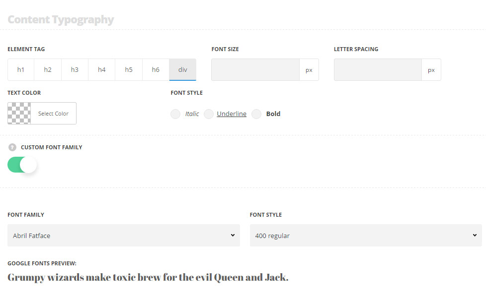
Content Typography
- Element tag – select the tag for the list.
- Font size – set the font size you need to use in the list.
- Letter spacing – set the needed distance between letters.
- Text color – set the color of the font.
- Font style – select the font weight and style (bold, italic) from the list.
- Custom font family – set it to Enable to use custom Google font.
- Font Family – select the font family from the drop-down list.
- Font style – select the font weight and style (bold, italic) from the list.