Pie Charts are convenient tools for presenting the colored diagrams in a simple and clear way.
You may also add the icons to make to pie charts noticeable and informative.
More examples of the module can be found here.
Watch the video tutorial on Pie Charts module creation for more details.
General settings
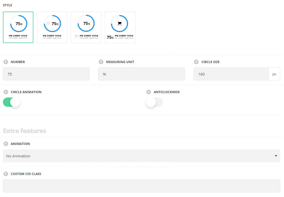
- Style – select the best suitable style for the pie chart element.
- Simple – the diagram displays the number inside and the title under it.
- Icon inside – there is icons added inside the diagram with the number.
- Icon near title – the icon is displayed below the diagram on the left side of the title, in one line.
- Number – enter the number to be presented.
- Measuring unit – set the measuring units you’d like to display in the pie chart, e.g: %.
- Circle size – set the size of the pie chart circle.
- Circle animation – switch it to Enable to have the animation on the diagram.
- Anticlockwise – switch it to Enable to set the direction for the animation anticlockwise.
Extra features
- Animation – choose between 14 preset animation effects.
- Custom CSS class – enter our own unique class name for the item – this is a useful option for those who want to create a specific style. E.g.: you can type custom-style class and then go to
Theme optionsGeneral optionsCustom CSS/JSCustom CSSfield and write your own CSS code with this class to get your own style.
Content settings
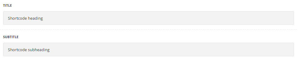
- Title – enter the title for the module.
- Subtitle – enter the subtitle for the module.
Style settings
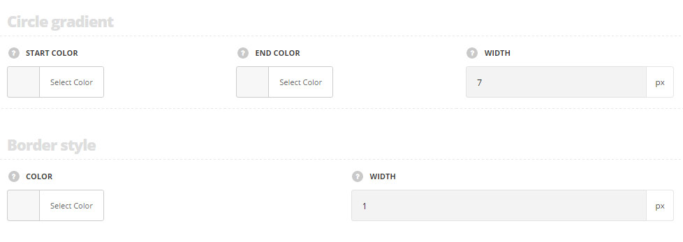
Circle gradient
- Start color – set the start color for the pie chart circle. The default value is #3498db.
- End color – choose the end color for the pie chart circle. The default value is #3498db.
- Width – specify the width of the pie chart circle.
Border style
- Color – set the border color. The default border color is #e7e7e7.
- Width – specify the width of the border.
Typography settings
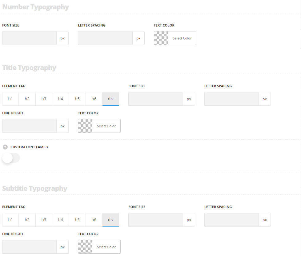
Number typography
These settings are inherited from Theme options Typography/Fonts Headings typography Content title big Typography. And the following values are inherited from theme files are as follows: font-size: 35px, letter-spacing: -2px.
- Font size – set the font size you need to use in the number in the module.
- Text color – set the color of the text in the module.
- Letter spacing – set the desired distance between letters
Title typography
These settings are inherited from Theme options Typography/Fonts Headings typography Content title big Typography. And the following values are inherited from theme files are as follows: font-size: 15px, line-height: 15px.
- Element tag – select the tag for the title.
- Font size – set the font size you need to use in the title.
- Letter spacing – set the needed distance between letters.
- Line-height – set the needed distance between lines in the title text.
- Text color – set the color of the font.
- Font style – select the font weight and style (bold, italic) for the title.
- Custom font family – set it to Enable to use custom Google font.
- Font Family – select the font family from the drop-down list.
- Font style – select the font weight and style (bold, italic) for the title.
Subtitle typography
These settings are inherited from Theme options Typography/Fonts Text typography Default text Typography. Font-size is 13px by default.
- Element tag – select the tag for the subtitle.
- Font size – set the font size you need to use in the subtitle.
- Letter spacing – set the needed distance between letters in the subtitle.
- Line-height – set the needed distance between lines in the subtitle text.
- Text color – set the color of the font.
- Font style – select the font weight and style (bold, italic) for the subtitle.