Create a page, select the needed page template (we’d recommend you to use For Page Builder page template to build a page with VC elements) and navigate to the Visual Composer section.
You may also edit the existing page, then simply scroll to the Visual Composer section to edit the content.
All the elements are added inside the rows. Rows can be divided into columns to structure the content inside. You may find more information about Columns in this post of the theme documentation.
Below you may find the details information about row settings section. By clicking on the Edit button in the top right corner of each row you may reveal the row settings window.
Also, more examples can be found following Rows&Columns page.
General settings
Select the general appearance and add some cool features to the row.
Row sizing options
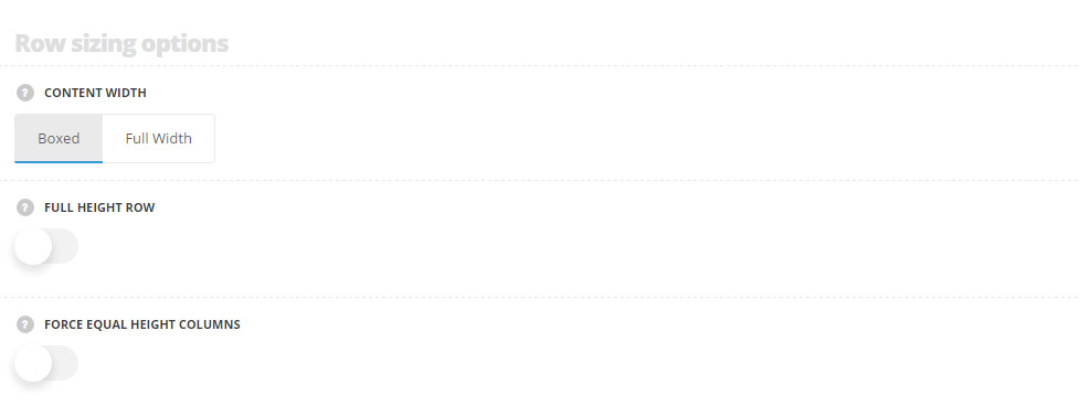
- Content width – select the width of the row. You may set the row to boxed or full width.
- Full height row – set it to Enable to set the row to full-screen.
- Enable custom columns offset – set it to Enable to add the offset from left and right sides for each column.
- Columns offset – specify the offset value in px. If you set for example 80px, the columns will have 40px offset from the left and 40px from the right side.
- Force equal height columns – switch it to Enable to make the columns equal height and adjust the columns content to the height to the bigger one.
Content and Row width
Boxed content width
Background color is set for the column and the content is displayed inside 1200px wide container (it’s default width for the theme).
Boxed content with full-width background
Background color is set for the row and the content is displayed inside 1200px wide container (it’s default width for the theme).
Full-width content
Background color is set for the row and the content is stretched to the full screen width.
Equal height columns
There’s a lot of content in this column.
Phasellus quis arcu malesuada, tincidunt leo sed, porta diam. Pellentesque sed feugiat neque. Etiam luctus lacinia pulvinar. Praesent consequat nibh laoreet mi faucibus aliquet. In a magna lorem. Vestibulum ante ipsum primis in faucibus orci luctus et ultrices posuere cubilia Curae.
Morbi ornare est eget mi auctor tristique. Integer sed consequat arcu, ut elementum sapien. Etiam sit amet semper enim, vitae tincidunt eros. Proin interdum scelerisque risus sed semper.
This column contains less content.
However, its background is stretched to match the left column height.
Align content vertically option is enabled so the text is also aligned in the middle of the left column.
Disabled Equal height columns
There’s a lot of content in this column.
Phasellus quis arcu malesuada, tincidunt leo sed, porta diam. Pellentesque sed feugiat neque. Etiam luctus lacinia pulvinar. Praesent consequat nibh laoreet mi faucibus aliquet. In a magna lorem. Vestibulum ante ipsum primis in faucibus orci luctus et ultrices posuere cubilia Curae.
Morbi ornare est eget mi auctor tristique. Integer sed consequat arcu, ut elementum sapien. Etiam sit amet semper enim, vitae tincidunt eros. Proin interdum scelerisque risus sed semper.
This column contains less content.
Its background isn’t stretched and adjusts only to the content amount.
Row effect options
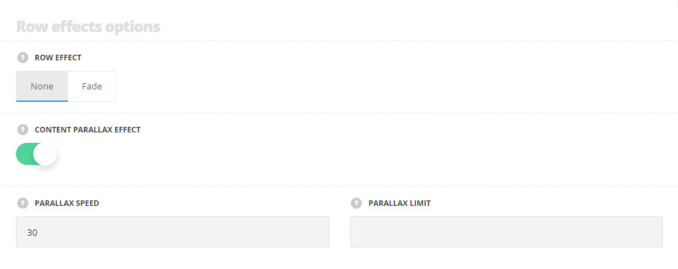
- Row effect – select the effect when the row is on the top of the viewport. None and fade variants are available.
- Content parallax effect – set it to Enable to have the parallax effect for the content.
- Parallax speed – control the speed of parallax. Values from 1 to 100 are acceptable.
- Parallax limit – set the parallax shift limit. Values from 50 to 400 are acceptable. Units should be set in px.
Fade on scroll effect with Content parallax
The content slides up and down while you scroll. We’ve set 100px parallax limit so that it doesn’t overlap other page content.
The content also becomes transparent as soon as the top of the row reaches the top of the viewport.
Nulla vestibulum quam ac ultricies tristique. Quisque et lacus in sapien ultricies egestas. Nam leo libero, ultrices vehicula dolor eget, pretium consectetur enim. Donec mollis, ante vel ultricies egestas, nunc est malesuada lorem, ut sollicitudin mi dolor sed justo. Etiam tincidunt vitae nunc in finibus. Praesent lacinia ante felis, vel dictum quam porttitor sed. Sed posuere auctor justo, eget gravida arcu blandit quis.
Row heading options
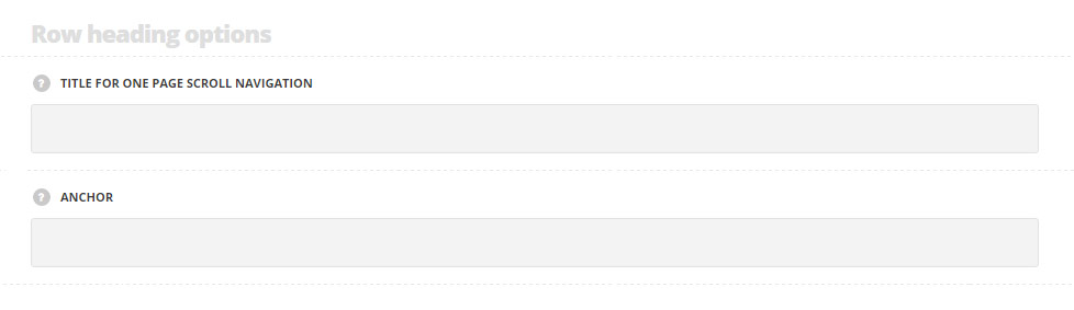
- Title for one page scroll navigation – add the title for the one page scroll dots navigation. For the pages with One page Scroll page templates selected.
- Anchor – add the unique anchor name. The anchor can be used for the anchor navigation in the menu. More details can be found in the Menu creation post.
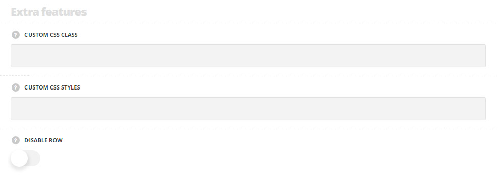
Extra features
- Animation – choose between 14 preset animation effects.
- Custom CSS class – enter our own unique class name for the item – this is a useful option for those who want to create a specific style. E.g.: you can type custom-style class and then go to
Theme optionsGeneral optionsCustom CSS/JSCustom CSSfield and write your own CSS code with this class to get your own style. - Disable row – set it to Enable to hide the row on the public side of your website. You can switch it back when you need to show it.
Design settings
Add any margin, border, and padding for the row. Both, pixels and percents are acceptable.
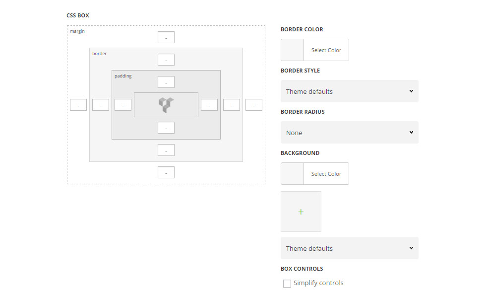
- Margin – enter the needed value for the margins, negative values and percents can be accepted.
- Border – enter the needed value for the border. Note, you also have to select its style and color to display it on the site.
- Border color – select the color for the border.
- Border style – select the style of the border – solid, dotted, etc.
- Border radius – set the value for border radius to have rounded corners of the border.
- Padding – enter the needed values for the element’s padding.
More information about margin, border and padding you may find in this post.
- Background – select the color of the row.
- Image – select the image to be set as the row background.
- Background attachment (in the drop-down list) – select the background-attachment for the image.
- Theme defaults – the default image position – the full size aligned top left.
- Cover – the image will fit it’s container: it’ll be resized to make the narrowest side fit the container so that there will be no blank spaces inside.
- Contain – the image will have the biggest side that will fit the container: at least one side will fit the container and there may be gaps between the image and the row.
- Repeat – the image will be repeated and create a pattern.
- No Repeat – the image will be inserted full width, aligned top left, and with no repeat.
More examples of background image attachment you may find in this post.
- Box controls – set it to Enable in case you want to set the same margins/borders/paddings for all four sides of the row. It’ll save our time, as the inserted value will be applied to the top, right, bottom and left elements.
Background options
In this section, you can customize the row background according to your needs.
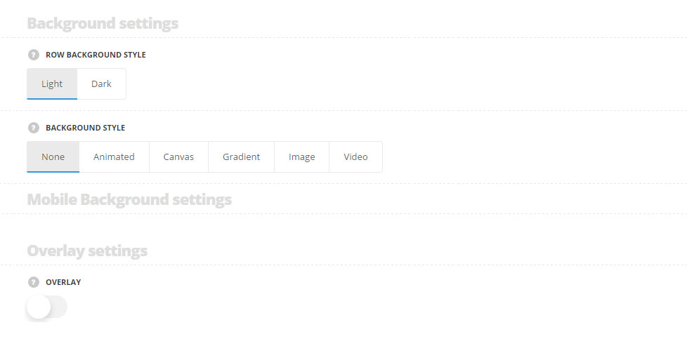
- Row background style – choose the background style for the row. The text colors will be changed according to the style you choose to make it more readable. Light and dark variants are available.
- Background style – select the background style for the row.
Below you can find more detailed information about each style.
- None – no effect will be applied to the row.
Animated background style
In this section, you can customize the colors for the row background of the module.
By clicking on the arrow down icon you can reveal the whole section to adjust it to your needs. Here you are also able to duplicate the colors for the row, change their order (simply drag-n-drop the blocks) and delete the unnecessary ones as well.
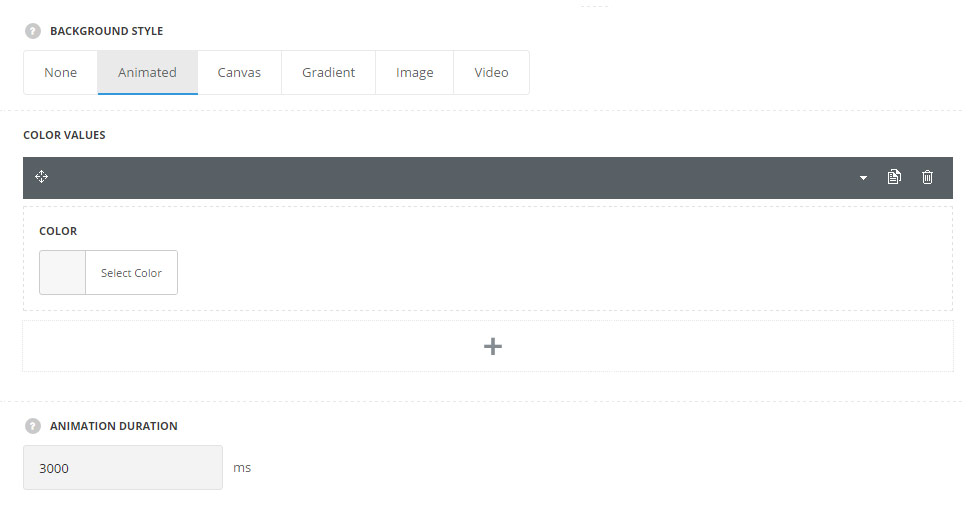
- Color values – select the color for the background row.
- Animation duration – set the animation duration in ms.
Animated background style is applied to the row.
The gradient is from dark blue to pink.
Canvas background style
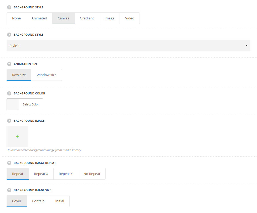
- Background style – select one of the three canvas styles.
- Animation size – select whether you’d like the animation to be applied to the Row Size or Window Size.
- Background color – set the background color for the row.
- Animated lines color – select the color for the animation. For Style 2 only.
- Background image – upload the image to be used ad the row background.
- Background image repeat – select the repeat for the selected image. You can select vertical, horizontal, repeat in both directions or disable repeat for the image.
- Background image size – select the background-attachment for the image. Cover, contain and initial values are available.
Canvas background Style 1 is applied to the row.
Canvas background Style 2 is applied to the row.
Canvas background Style 3 is applied to the row.
Gradient background style
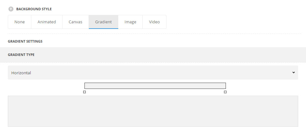
- Gradient type – select what gradient type you want to apply for the row. You may select horizontal, vertical or custom to be able to enter custom direction in degrees.
Gradient background Horizontal style is applied to the row.
Gradient background Vertical style is applied to the row.
Gradient background Custom style with 45 degrees angle is applied to the row.
You may set any angle for the gradient.
Gradient background Custom style with 45 degrees angle is applied to the row.
You may also add multiple colors to the gradient. It’s light blue, dark blue and pink in the example.
Image background style
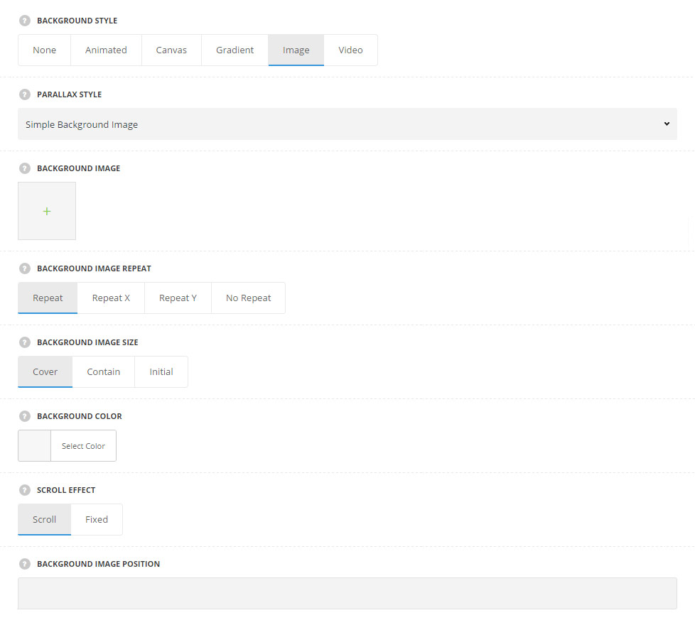
- Parallax style – choose the parallax style you would like to have for the background image. The following variants are available:
- Simple background image – no parallax effect is applied to the image.
- Auto moving background – select this style to have the auto moving image on the row background.
- Background image – upload the image from the media library to be set as the background image for the row.
- Background color – choose the background color for the row.
- Scroll effect – choose scroll effect for the image. It can be fixed or scroll with the content.
- Parallax speed – control the speed of parallax. Values from 1 to 100 are acceptable.
- Animation direction – сhoose the animation direction for your moving parallax. To right, to left, to bottom, to top options are available.
-
- Horizontal parallax on scroll – the background will move horizontally while scroll.
- Background image – upload the image from the media library to be set as the background image for the row.
- Background image repeat – select the repeat for the selected image. You can select vertical, horizontal, repeat in both directions or disable repeat for the image.
- Scroll effect – choose scroll effect for the image. It can be fixed or scroll with the content.
- Background image size – select the background-attachment for the image. Cover, contain and initial values are available.
- Background color – choose the background color for the row.
- Scroll effect – choose scroll effect for the image. It can be fixed or scroll with the content.
- Parallax speed – control the speed of parallax. Values from 1 to 100 are acceptable.
- Parallax offset – specify the parallax start offset value. Enter a value between -500 to 500.
- Horizontal parallax on scroll – the background will move horizontally while scroll.
-
- Vertical parallax on scroll – set the parallax background while scrolling the layout.
- Background image – upload the image from the media library to be set as the background image for the row.
- Background image repeat – select the repeat for the selected image. You can select vertical, horizontal, repeat in both directions or disable repeat for the image.
- Scroll effect – choose scroll effect for the image. It can be fixed or scroll with the content.
- Background image size – select the background-attachment for the image. Cover, contain and initial values are available.
- Background color – choose the background color for the row.
- Scroll effect – choose scroll effect for the image. It can be fixed or scroll with the content.
- Parallax speed – control the speed of parallax. Values from 1 to 100 are acceptable.
- Vertical parallax on scroll – set the parallax background while scrolling the layout.
-
- Interactive parallax on mouse move – the images added will be displayed as layers creating one image with parallax effect following the mouse cursor.
- Layer images – upload or select background images from media gallery. To achieve the best effect, we’d recommend you to use images of different size and bigger than the row size.
- Background color – allows you to choose the background color for the row.
- Parallax speed – control the speed of parallax. Values from 1 to 100 are acceptable.
- Interactive parallax on mouse move – the images added will be displayed as layers creating one image with parallax effect following the mouse cursor.

-
- Multilayer vertical parallax – select this type to have the images be displayed in layers with parallax on scroll.
- Layer images – upload or select background images from media gallery.
- Background color – allows you to choose the background color for the row.
- Parallax speed – control the speed of parallax. Values from 1 to 100 are acceptable.
- Multilayer vertical parallax – select this type to have the images be displayed in layers with parallax on scroll.
Mobile background settings
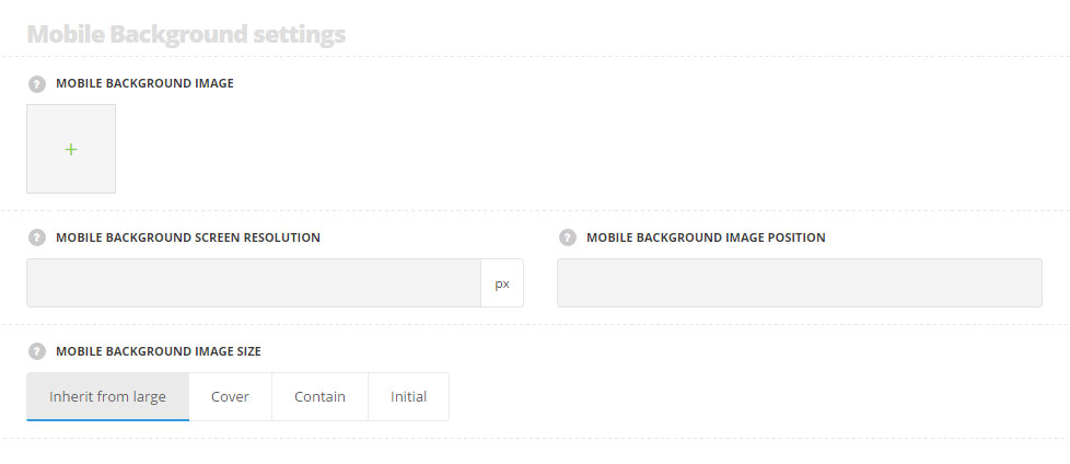
- Mobile background image – upload the image from the media library to be set as the background image for the row on mobile devices. For Simple background image, Auto moving background, Vertical and Horizontal parallax styles only.
- Mobile background screen resolution – allows you to specify screen resolution to apply settings from. Set the value in pixels. For Simple background image style only.
- Mobile background image position – set the background image position on mobile devices. For Simple background image style only.
- Mobile background image size – allows you to choose the image size on mobile devices. Initial, cover, contain and inherit from large variants are available. or Simple background image, Vertical and Horizontal parallax styles only.
Video background style
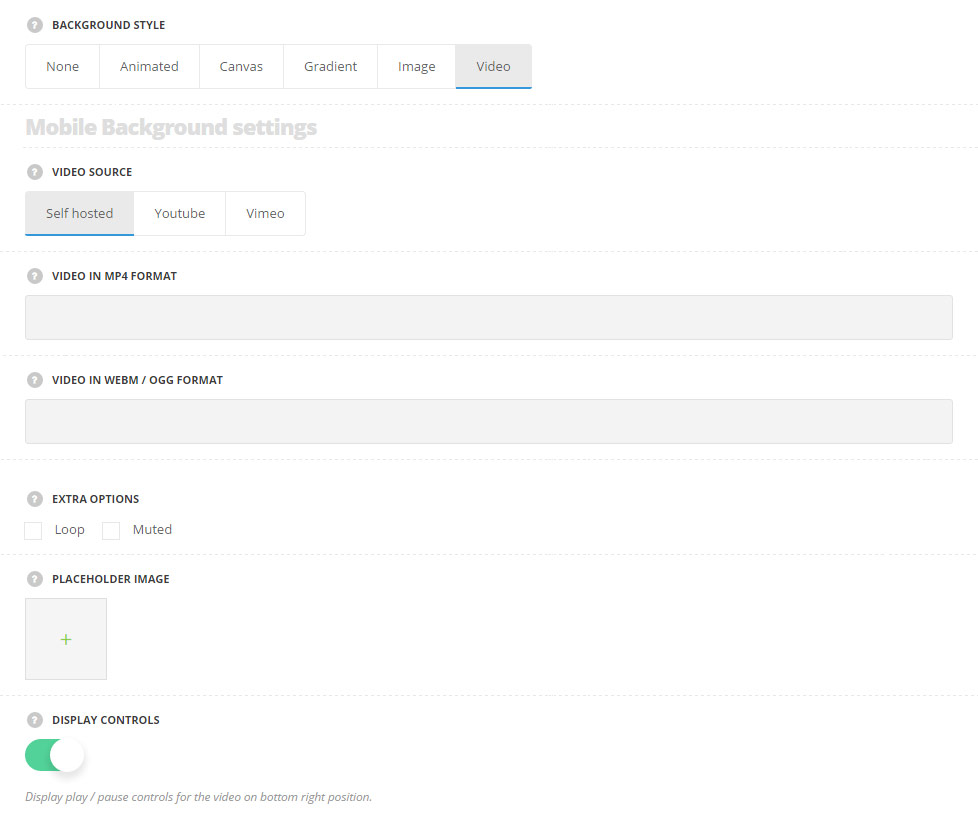
- Video source – select the source of the video to be displayed as the background for the row.
- Self hosted – select this source if you need to upload the video from the media library.
- Video in mp4 format – add the link to your video in mp4 format.
- Video in webm/ogg format – add the link to your video in WebM / Ogg format.
- Youtube – select this source if you need to upload the video from youtube.
- Youtube video ID – add the video ID. Look at the URL of that page, and at the end of it, you should see a combination of numbers and letters after an equal sign (=).
- Vimeo – select this type if you need to use the video for the row background from Vimeo.
- Vimeo video ID – add the video ID. Copy the numeric code that appears at the end of its URL at the top of your browser window.
- Self hosted – select this source if you need to upload the video from the media library.
- Extra options – put the check marks in the corresponding fields to Loop the video or make it Muted.
- Place holder image – upload the image to be displayed in case background video is restricted. For example, on mobiles.
Overlay settings
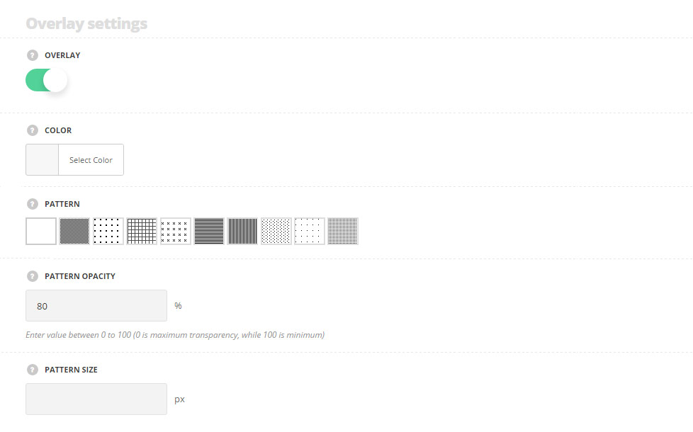
- Overlay – set it to Enable to add the overlay for the row.
- Color – choose the color for the overlay.
- Pattern – select the most suitable the pattern for the overlay from the list of available ones.
- Pattern opacity – control the pattern’s opacity for the overlay. Enter value between 0 to 100 (0 is transparent).
- Pattern size – specify the pattern’s size for the overlay.
More details about the Row Responsive options can be found in this post.