Simple Advertisement module is the element for creating stylish and attractive banners for presenting any offers on your site.
It is very convenient way to create the banner and diversify the content.
You may find more module examples on Simple Advertisement page.
Watch the video tutorial on Simple Advertisement module creation for more details.
General settings
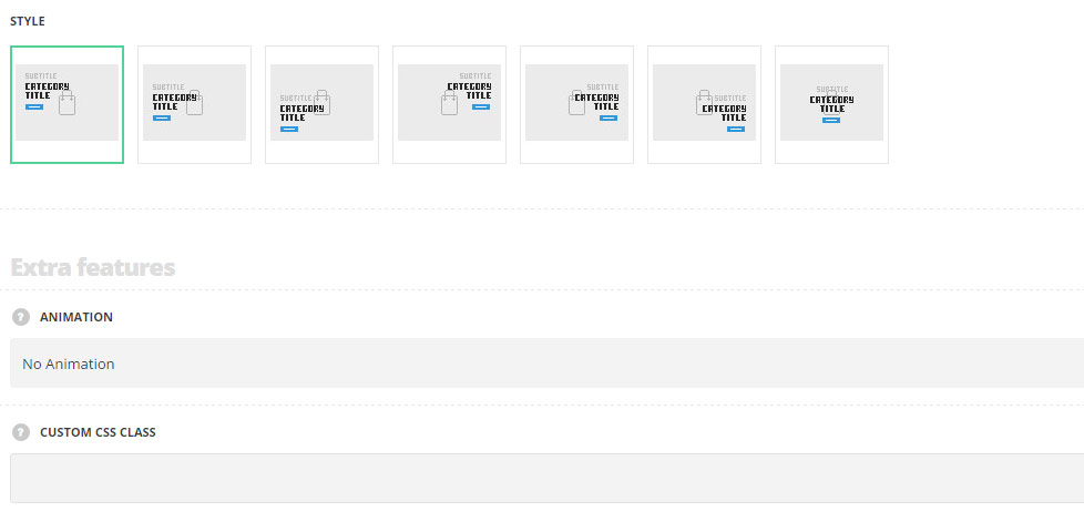
- Style – choose the most suitable one between 7 preset styles.
- Left top – the title, subtitle and Info label are displayed in the top left corner of the image.
- Left center – the title, subtitle and Info label are displayed left aligned in the center of the image.
- Left bottom – the title, subtitle and Info label are displayed left aligned in the bottom of the image.
- Right top – the title, subtitle and Info label are displayed in the top right corner of the image.
- Right center – the title, subtitle and Info label are displayed right aligned in the center of the image.
- Right bottom – the title, subtitle and Info label are displayed right aligned in the bottom of the image.
- Centered – all the content is displayed in the center of the image.
Extra features
- Animation – choose between 14 preset animation effects.
- Custom CSS class – enter our own unique class name for the item – this is a useful option for those who want to create a specific style. E.g.: you can type custom-style class and then go to
Theme optionsGeneral optionsCustom CSS/JSCustom CSSfield and write your own CSS code with this class to get your own style.
Content settings
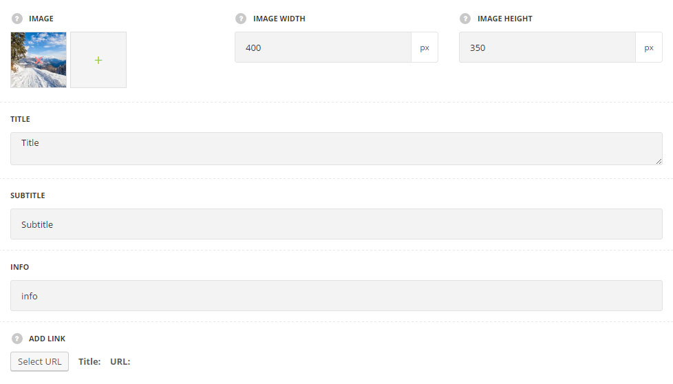
- Image – select image from media library for the Simple Advertisement module.
- Image width – specify the width of the image.
- Image height – specify the height of the image.
- Image on hover – select image from media library for the Simple Advertisement module to be displayed on hover (for Hover image changing style only).
- Title – enter the title for the module.
- Subtitle – enter the subtitle for the module.
- Content – enter the main content for the Simple Advertisement module.
- Info – enter the content to be displayed in the label below the title.
- Add link – enter a custom link or select existing page. You can remove existing link as well.
Style settings
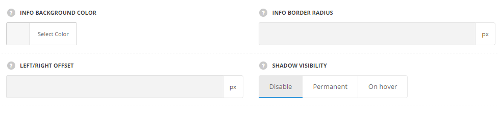
- Info background color – select the background color for the Info label. The default color is inherited from
Theme OptionsStyling OptionsMain site color. - Info border radius – set the border radius for the info. The default value is 4px.
- Left/right offset – set the left/right offset for the info. The default value is 10px.
- Shadow visibility – set the visibility options for shadow. You may select the shadow to be displayed permanent, on hover or to disable shadow.
- Shadow parameters – choose shadow parameter and set the color, in accordance with the following structure: horizontal shadow, vertical shadow, blur, and spread. More details can be found following this link.
- Color – set the color for the shadow.
Hover settings
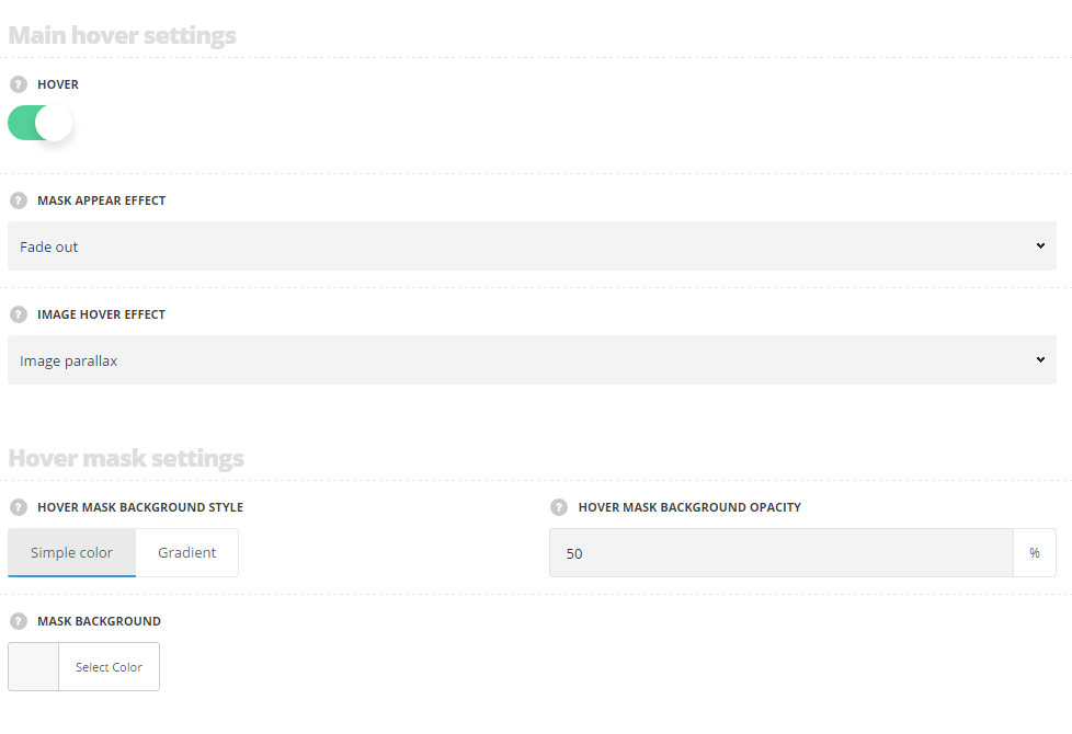
- Hover – set it to Enable to activate hover effect for the advertisement.
- Mask appear effect – select the hover effect for the mask appearing available from the drop-down list.
- Image hover effect – allows you to choose the image behaviour on hover available from the drop-down list.
Hover mask settings
- Hover mask background style – select the mask background style for the image.
- Simple – select this variant to display the single color as a mask overlay.
- Mask background – select the color for the mask.
- Gradient – you may select the colors to be displayed as a gradient background color for the image.
- Start color – select the start color for the background mask which is displayed on hovered image.
- End color – select the end color for the background gradient mask which is displayed on hovered image.
- Simple – select this variant to display the single color as a mask overlay.
- Hover mask background opacity – set the hover mask background opacity (100% is opaque color).
Typography settings
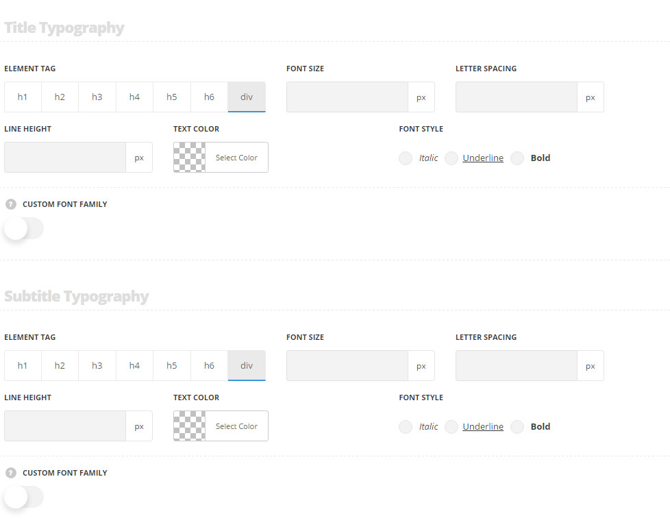
Title typography
The settings are inherited directly from theme files and are as follows: font-family: H3, color: #fff, font-size: 32px , font-weight: bold, line-height: 38px.
- Element tag – select the tag for the title.
- Font size – set the font size you need to use in the title.
- Letter spacing – set the needed distance between letters.
- Line-height – set the needed distance between lines in the title text.
- Text color – set the color of the font.
- Font style – select the font weight and style (bold, italic) for the title.
- Custom font family – set it to Enable to use custom Google font.
- Font Family – select the font family from the drop-down list.
- Font style – select the font weight and style (bold, italic) for the title.
Subtitle typography
These settings are inherited from Theme options Typography/Fonts Text typography Default text Typography and the following values are set in theme files directly: color: #fff, opacity: 0.5, font-size: 13px.
- Element tag – select the tag for the subtitle.
- Font size – set the font size you need to use in the subtitle.
- Letter spacing – set the needed distance between letters in the subtitle.
- Line-height – set the needed distance between lines in the subtitle text.
- Text color – set the color of the font.
- Font style – select the font weight and style (bold, italic) from the subtitle.
- Custom font family – set it to Enable to use custom Google font.
- Font Family – select the font family from the drop-down list.
- Font style – select the font weight and style (bold, italic) for the subtitle.
Info block typography
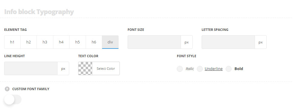
These settings are inherited from theme files and are as follows: font-family: Montserrat, color:#fff, text-transform: uppercase, font-size: 10px.
- Element tag – select the tag for the text in Info section.
- Font size – set the font size you need to use in the text in Info section.
- Letter spacing – set the needed distance between letters.
- Line-height – set the needed distance between lines.
- Text color – set the color of the font.
- Font style – select the font weight and style (bold, italic).
- Custom font family – set it to Enable to use custom Google font.
- Font Family – select the font family from the drop-down list.
- Font style – select the font weight and style (bold, italic) for the text.
Responsive settings
Here you may set the font-size for the title on different screen resolutions.
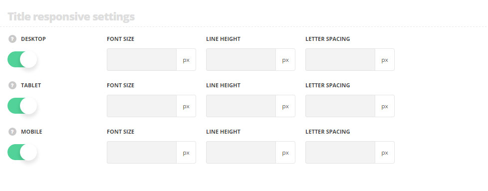
- Desktop – set the font size, line height and letter spacing for the screen resolutions from 1280px to 1025px.
- Tablet – set the font size, line height and letter spacing for the screen resolutions from 1024px to 800px.
- Mobile – set the font size, line height and letter spacing for the screen resolutions less than 800px.