Add the images on the page using Single image module and diversify the content.
Watch the video tutorial on Single Image module creation for more details.
General settings
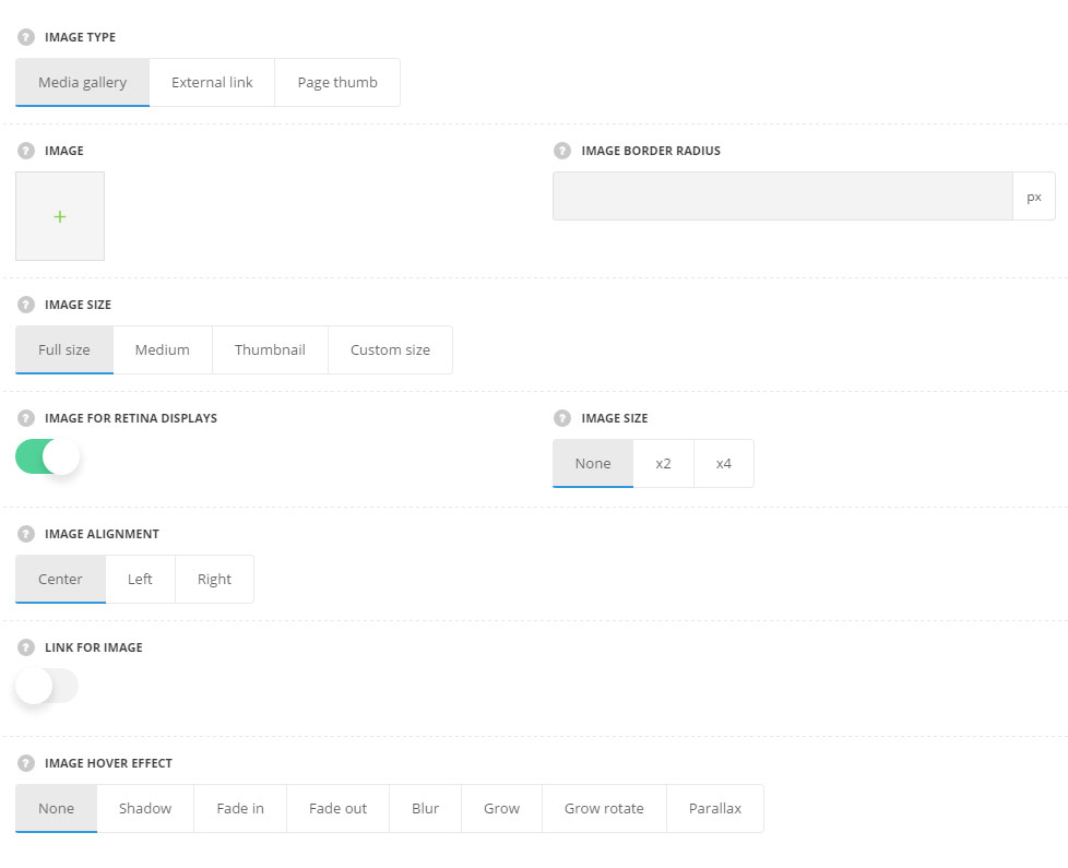
- Image type – choose the image type to be displayed in the module.
- Media gallery – allows you to upload the image from the media library on your site.
- Image – select the image to display.
- External link – allows you to upload the image from the external resource.
- External image URL – enter the link to the image to be displayed in the module.
- Page thumb – allows you to display the featured image set for the current page in the Featured image meta box.
- Media gallery – allows you to upload the image from the media library on your site.
- Image border radius – set the border radius for the page to have rounded corners.
- Image size – select the size of the image to be displayed. You may select full size, medium, thumbnail or custom size and specify the sizes for the image. For Media Gallery image type only.
- Image for retina displays – set it to Enable to display the image for the retina, so you may add the x2 or x4 image. For Media Gallery image type only.
- Image size – choose the size of the image on retina. For Media Gallery image type only.
- Image alignment – select the horizontal alignment for the image. Left, right and center positions are available.
- Link for image – set it to Enable to apply the link to the image.
- Apply link to – select to what element the link will be applied.
- Lightbox – select it to open the link in lightbox on click.
- External link – select this variant to add the external link to the single image.
- External link URL – enter the link for the image.
- One page scroll nav – select this variant to use the image as the navigation for the One Page Scroll page template selected.
- Navigate to – select the navigation for the image. It may link to previous or next slide.
- Apply link to – select to what element the link will be applied.
- Image hover effect – select the hover effect for the image from the list of available ones.
Extra features
- Animation – choose between 14 preset animation effects.
- Custom CSS class – enter our own unique class name for the item – this is a useful option for those who want to create a specific style. E.g.: you can type custom-style class and then go to
Theme optionsGeneral optionsCustom CSS/JSCustom CSSfield and write your own CSS code with this class to get your own style.