Add the stylish subscribe form to your site and let the users subscribe to your news.
All the styles of the module can be found on Subscribe page.
Watch the video tutorial on Subscribe module creation for more details.
General settings
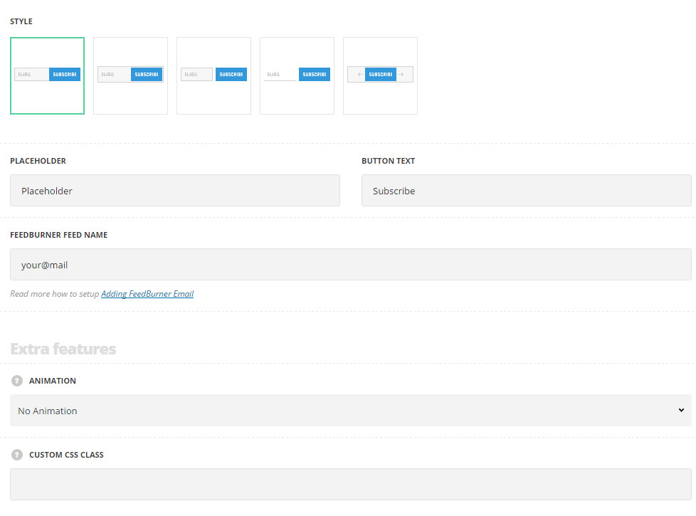
- Style – choose between 5 preset styles.
- Standard – the subscribe form consists of two parts: input field and the subscribe button, with hover effect on input.
- Inside – the subscribe button is displayed inside of the input field.
- Separated – the input field and button are separated by the offset.
- Simple – the input field has no border around with the button displayed on the right side of it.
- Animated – there is subscribe button displayed in idle state only, which on hover reveal the input field to enter the email address.
- Placeholder – enter the text to be displayed in the input field of the subscribe form.
- Button text – enter the title for the button.
- Feedburner Feed Name – read more how to setup Adding FeedBurner Email.
Extra features
- Animation – choose between 14 preset animation effects.
- Custom CSS class – enter our own unique class name for the item – this is a useful option for those who want to create a specific style. E.g.: you can type custom-style class and then go to
Theme optionsGeneral optionsCustom CSS/JSCustom CSSfield and write your own CSS code with this class to get your own style.
Style settings
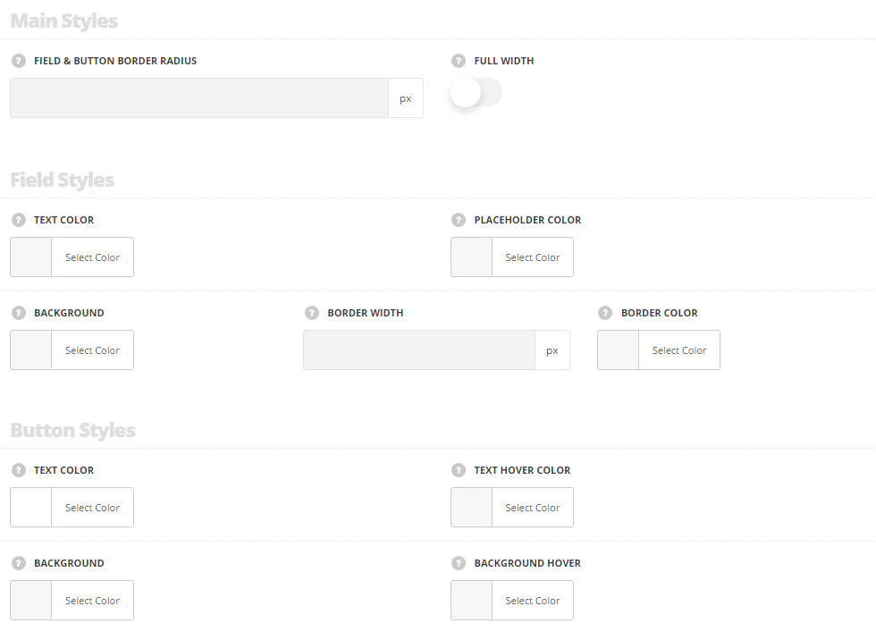
Main styles
- Field & button border radius – set the border radius for the field and button to have rounded corners.
- Full width – set it to Enable to have the full width subscribe form depending on the container it is inside, e.g.: the row/column width.
Field styles
- Text color – set the text color for the text typed in the field. The default value is #28262b.
- Placeholder color – choose the placeholder color for the text typed in the field (the text which is displayed in the files before the cursor is added). The default value is #28262.
- Background – choose the background color for the field. The default value is #f2f2f2. The background color for the style Simple style is not set.
- Border width – set the border width for the field. The default border width is 1px.
- Border color – set the border color for the field. The default border color is #e7e7e7.
Button styles
- Text color – choose the text color for the button’s text. The default value is #fff.
- Text hover color – set the text hover color for the button’s text. The default value is #fff.
- Background – choose the background color for the button. The default color is inherited from
Theme OptionsStyling OptionsMain site color. - Background hover – set the background hover color for the button. The default color is inherited from
Theme OptionsStyling OptionsMain site colorwith box shadow.