Add a slider and carousel with one module.
You may see the example of the module in the first section on the Testimonials page.
Watch the video tutorial on Testimonial Slider module creation for more details.
General settings
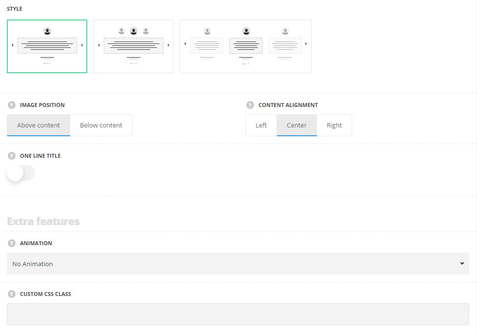
- Style – select the style of the testimonial slider for your site.
- Simple – the author image is displayed on the top with the testimonial text below it and the title and subtitle below the testimonial text.
- Centered – the author image is displayed on the top and the author images of the previous and next testimonials are displayed on the left and right sides correspondingly with opacity set for them and the testimonial text is set below it and the title and subtitle below the testimonial text.
- Full width – the testimonial slider is set to full width with the opacity effect applied to the previous and next testimonials.
- Image position – select the position of the author image in the testimonial.
- Above content – the image is displayed above the testimonial content.
- Below content – the image is displayed below the testimonial content.
- Content align – set the alignment of the testimonial content in horizontal respect. Left, right and center positions are available.
- One line title – set it to Enable to display the title and the subtitle in one line (first title and then subtitle will be displayed).
Extra features
- Animation – choose between 14 preset animation effects.
- Custom CSS class – enter our own unique class name for the item – this is a useful option for those who want to create a specific style. E.g.: you can type custom-style class and then go to
Theme optionsGeneral optionsCustom CSS/JSCustom CSSfield and write your own CSS code with this class to get your own style.
Slides
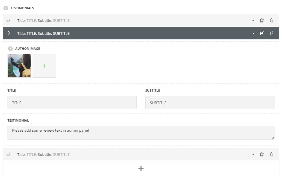
Testimonials
In this section, you can customize the testimonials of the module.
By clicking on the arrow down icon you can reveal the whole section to adjust it to your needs. Here you are also able to duplicate the testimonials, change their order (simply drag-n-drop the blocks) and delete the unnecessary testimonials as well.
- Author image – select the image to be displayed as author image in the testimonial.
- Title – enter the title for the module.
- Subtitle – enter the subtitle for the module.
- Testimonial – enter the testimonial text.
Slider settings
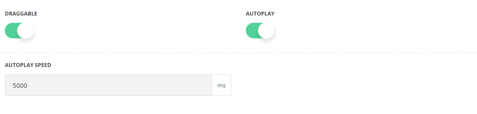
- Draggable – set it to Enable to activate the mouse drag effect while scrolling the slides.
- Autoplay – set it to Enable to activate automatic slides scrolling.
- Autoplay speed – specify the speed of the slides scrolling.
Style settings
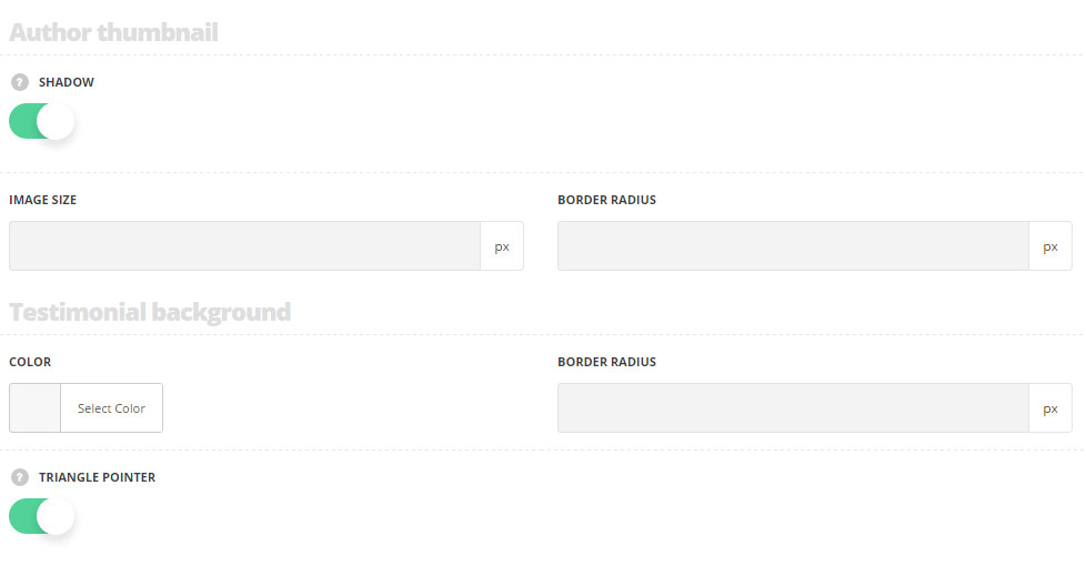
Author thumbnail
- Shadow – set it to Enable to display shadow effect around author image.
- Image size – specify the size of the image displayed as author thumbnail image.
- Border radius – set the border radius of the image to have rounded corners.
Testimonial background
- Color – set the background color for the testimonial. The default color is set to transparent.
- Border radius – set the border radius of the testimonial to have rounded corners.
- Triangle pointer – set it to Enable to display the triangle pointer decoration for the testimonial. It is displayed if the background color is selected.
Typography
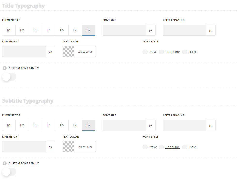
Title typography
These settings are inherited from Theme options Typography/Fonts Headings typography Content title big Typography. Font size is set to 14px and line-height to 24px by default.
- Element tag – select the tag for the title.
- Font size – set the font size you need to use in the title.
- Letter spacing – set the needed distance between letters.
- Line-height – set the needed distance between lines in the title text.
- Text color – set the color of the font.
- Font style – select the font weight and style (bold, italic) for the title.
- Custom font family – set it to Enable to use custom Google font.
- Font Family – select the font family from the drop-down list.
- Font style – select the font weight and style (bold, italic) for the title.
Subtitle typography
These settings are inherited from Theme options Typography/Fonts Headings typography Content subtitle Typography with font size set to 13px and line-height set to 27px by default.
- Element tag – select the tag for the subtitle.
- Font size – set the font size you need to use in the subtitle.
- Letter spacing – set the needed distance between letters in the subtitle.
- Line-height – set the needed distance between lines in the subtitle text.
- Text color – set the color of the font.
- Font style – select the font weight and style (bold, italic) from the subtitle.
- Custom font family – set it to Enable to use custom Google font.
- Font Family – select the font family from the drop-down list.
- Font style – select the font weight and style (bold, italic) for the subtitle.
Content typography
The default settings are inherited from Theme optionsTypography/Fonts Text typography Default text Typography.
- Font size – set the font size you need to use in the text in the testimonial.
- Letter spacing – set the needed distance between letters.
- Line-height – set the needed distance between lines.
- Text color – set the color of the font.
- Font style – select the font weight and style (bold, italic).
- Custom font family – set it to Enable to use custom Google font.
- Font Family – select the font family from the drop-down list.
- Font style – select the font weight and style (bold, italic) for the text in the testimonial.
Pagination settings
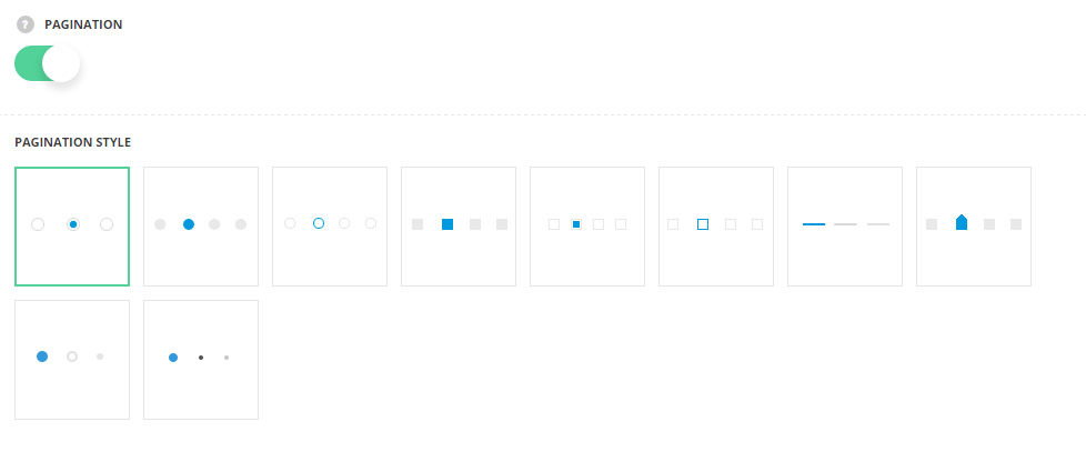
- Pagination – switch it to Enable to display the pagination in the testimonial slider.
- Pagination style – select the most suitable style of the pagination for your testimonial slider.
Navigation style
For Simple and Centered styles only.
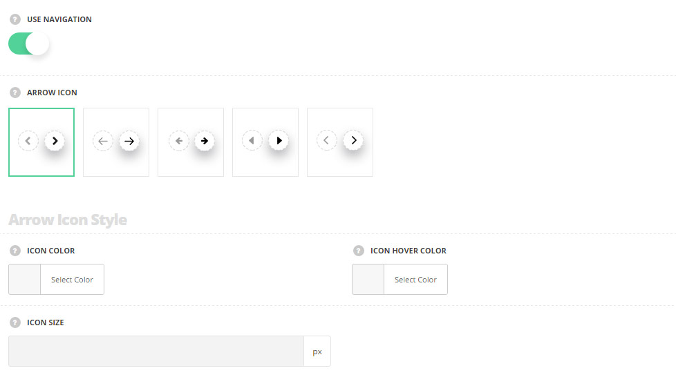
- Use navigation – set it to Enable to display the navigation between the previous and next testimonial inside the slider.
- Arrow icon -select the most suitable icon style for the pagination.
Arrow icon style
- Icon color – choose the icon color. The default color is #343434.
- Icon hover color – set the color for the icon on hover. The default color is #9a9a9a.
- Icon size – set the size of the icon. The default font size is 10px.
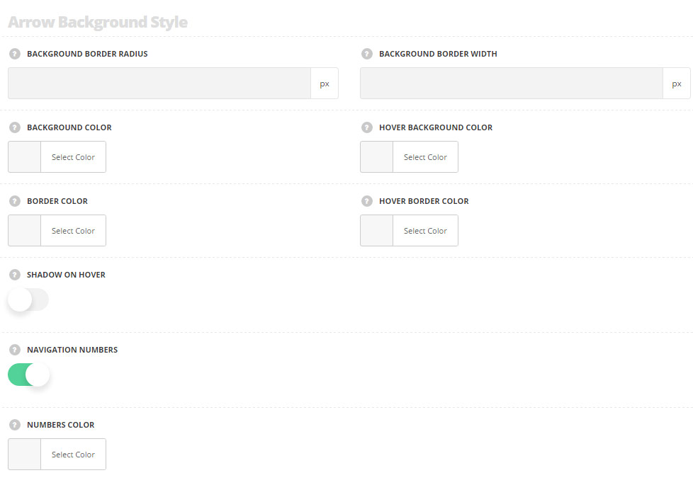
Arrow background style
The default settings for the icon are inherited from theme files and are as follows: color: #343434, box-sizing: content-box, icon hover color is #9a9a9a.
- Background border radius – set the border radius for the background of the arrow icon to have rounded corners.
- Background border width – set the width of the border around the arrow icon.
- Background color – set the color for the background of the icon.
- Hover background color – set the color for the background of the icon on hover.
- Border color – choose border color for the icon.
- Hover border color – choose border color for the icon on hover.
- Shadow on hover – switch it to Enable to display the shadow effect for the arrow icon on hover.
- Navigation number – switch it to Enable to display numbers above the arrows.
- Numbers color – set the color for the numbers. The default color is #c3c3c3.
The default settings for the numbers are inherited from theme files and are as follows: font-size: 11px, letter-spacing: 1.4px, font-family: “Montserrat”, color: #c3c3c3.