Rotate Box module allows you to create the stylish and informative section on your site with amazing rotate effect on hover.
You can check all the module variations on this page.
Watch the video tutorial on Rotate Box module creation for more details.
General settings
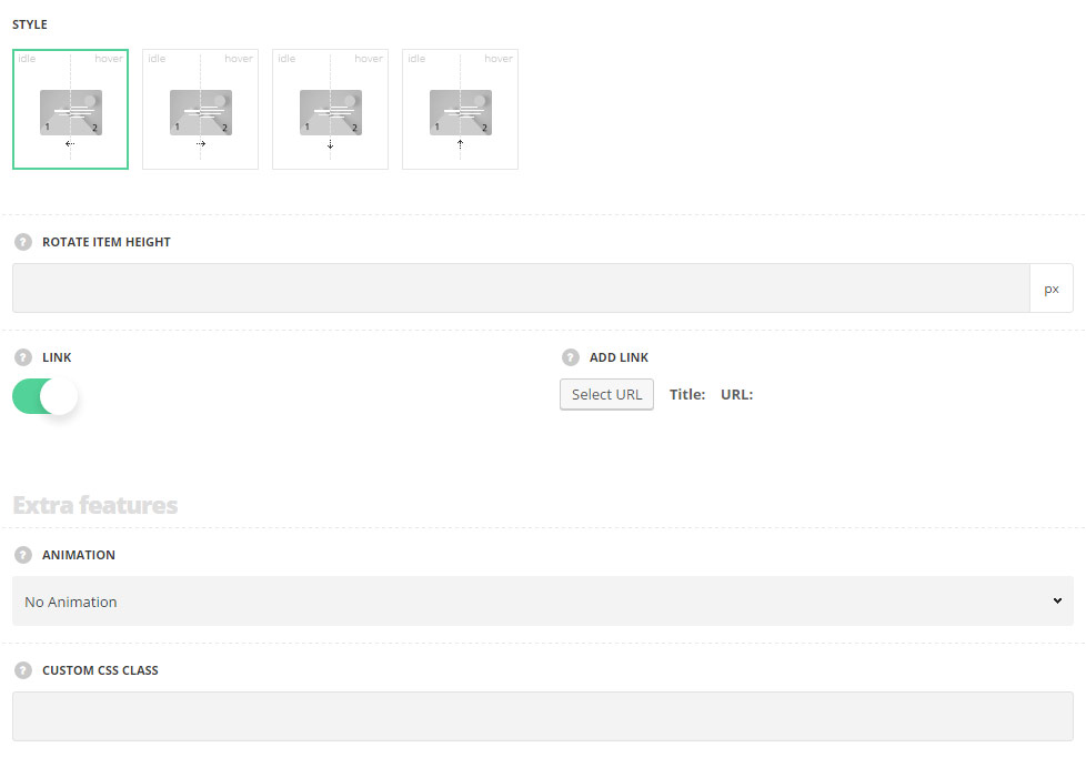
- Style – select the best suitable style for your site among the 4 preset styles according to the rotation direction.
- Rotate Left – the rotate hover effect direction is from left to right.
- Rotate Right – the rotate hover effect direction is from right to left.
- Rotate Bottom – the rotate hover effect direction is from bottom to top.
- Rotate Top – the rotate hover effect direction is from top to bottom.
- Rotate item height – set the height for the Rotate Box item. The default value is 300px.
- Link – set it to Enable if you want to apply the link for the link for the Rotate Box. The link will be applied to the whole item.
- Add link – enter the link and the link text which will be applied to the Rotate Box item. The text of the link will be displayed on hover as a tooltip for the mouse cursor.
Extra features
- Animation – choose between 14 preset animation effects.
- Custom CSS class – enter our own unique class name for the item – this is a useful option for those who want to create a specific style. E.g.: you can type custom-style class and then go to
Theme optionsGeneral optionsCustom CSS/JSCustom CSSfield and write your own CSS code with this class to get your own style.
Content settings
Front side
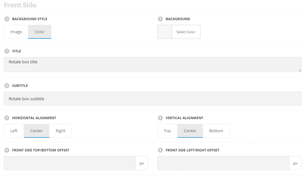
- Background style – select the background style for the front side of the Rotate Box item.
- Image – select this style if you’d like to display the image on the front side of the box.
- Upload image – select the custom image from the media library.
- Color – select this style to apply the desired color as a background for the Rotate Box item.
- Background – select the background color for the front side. The default color is inherited from
Theme OptionsStyling OptionsMain site color.
- Background – select the background color for the front side. The default color is inherited from
- Image – select this style if you’d like to display the image on the front side of the box.
- Title – enter the title for the item. It will be displayed in the center of the front side of the Rotate Box item.
- Subtitle – enter the subtitle for the item. It will be displayed in the center of the front side of the Rotate Box item below the title.
- Horizontal alignment – set the horizontal alignment for the content on the front side.
- Vertical alignment – set the vertical alignment for the content on the front side.
- Front side top/bottom offset – set the top/bottom offset for the content on the front side of the rotate box. The default offset value is 50px.
- Front side left/right offset – set the left/right offset for the content on the front side of the rotate box. The default offset value is 50px.
Back Side
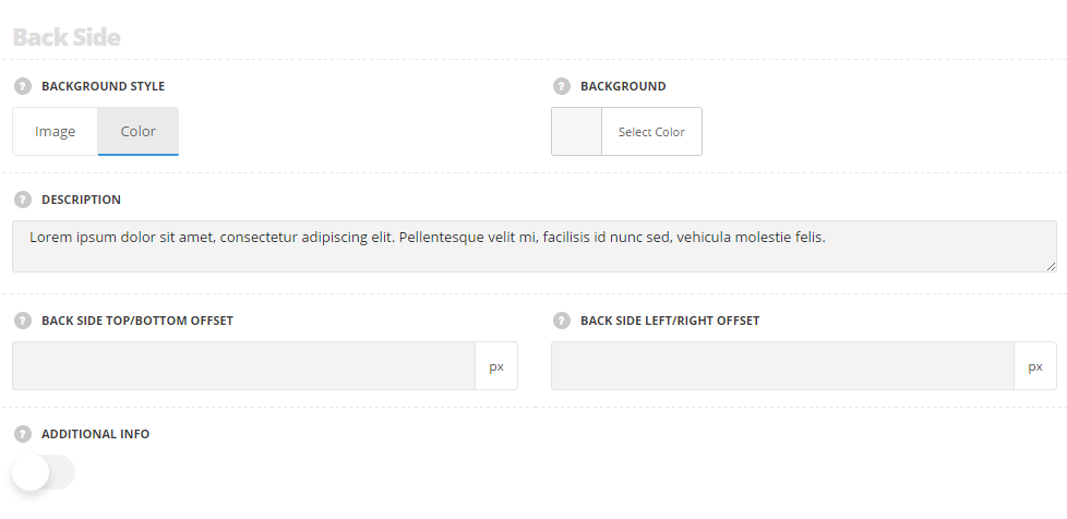
- Background style – select the background style for the front side of the Rotate Box item.
- Image – select this style if you’d like to display the image on the back side of the box.
- Upload image – select the custom image from the media library.
- Color – select this style to apply the desired color as a background for the Rotate Box item.
- Background – select the background color for the back side. The default color is inherited from
Theme OptionsStyling OptionsMain site color.
- Background – select the background color for the back side. The default color is inherited from
- Description – enter the description for the Rotate Box item. It will be displayed in the center of the back side.
- Additional info – set it to Enable to display the number or any additional text at Rotate Box.
- Info – enter the number or the text you’d like to display at the Rotate Box item.
- Alignment – set the horizontal alignment of the number or text. Left, right and center positions are available.
- Position – select the position of the number or text element.
- Before – the number or text element will be displayed on top of the Rotate Box item.
- After – the number or text element will be displayed on the bottom of the Rotate Box item.
- Back side top/bottom offset – set the top/bottom offset for the content on the back side of the rotate box. The default offset value is 50px.
- Back side left/right offset – set the left/right offset for the content on the back side of the rotate box. The default offset value is 50px.
Typography settings
Title settings
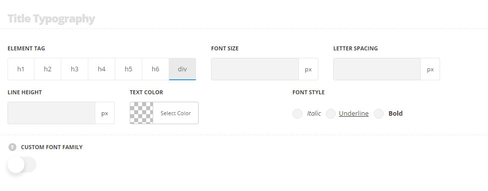
These settings are inherited from Theme options Typography/Fonts Headings typography Content title big Typography with font color set to #ffffff by default.
- Element tag – select the tag for the title.
- Font size – set the font size you need to use in the title.
- Letter spacing – set the needed distance between letters.
- Line-height – set the needed distance between lines in the title text.
- Text color – set the color of the font.
- Font style – select the font weight and style (bold, italic) for the title.
- Custom font family – set it to Enable to use custom Google font.
- Font Family – select the font family from the drop-down list.
- Font style – select the font weight and style (bold, italic) for the title.
Subtitle typography
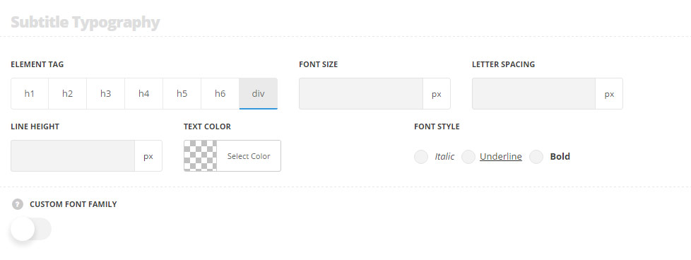
These settings are inherited from Theme optionsTypography/Fonts Headings typography Content title small typography with font color set to #ffffff by default.
- Element tag – select the tag for the subtitle.
- Font size – set the font size you need to use in the subtitle.
- Letter spacing – set the needed distance between letters in the subtitle.
- Line-height – set the needed distance between lines in the subtitle text.
- Text color – set the color of the font.
- Font style – select the font weight and style (bold, italic) from the title.
Description typography
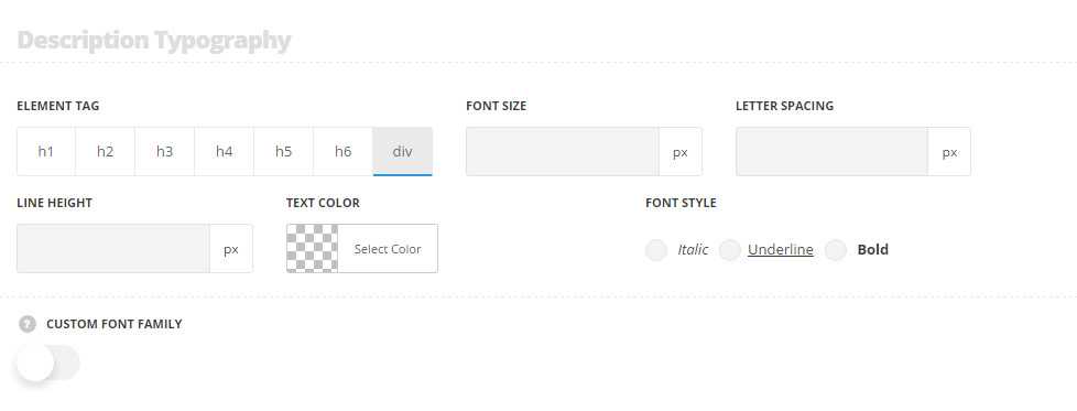
These settings are inherited from Theme options Typography/Fonts Text typography Default text Typography and the text color is set to #ffffff by default.
- Element tag – select the tag for the text in the module.
- Font size – set the font size you need to use in the text in the module.
- Letter spacing – set the needed distance between letters.
- Line-height – set the needed distance between lines.
- Text color – set the color of the font.
- Font style – select the font weight and style (bold, italic).
- Custom font family – set it to Enable to use custom Google font.
- Font Family – select the font family from the drop-down list.
- Font style – select the font weight and style (bold, italic) for the text.
Info typography
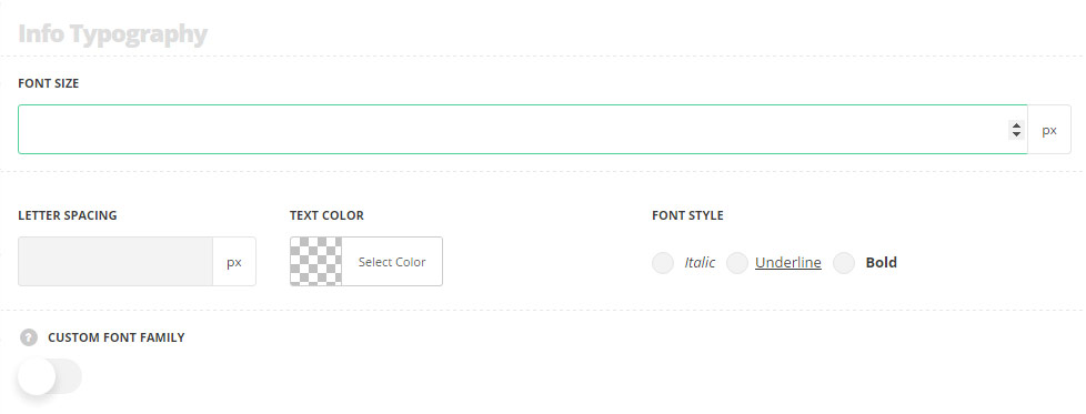
These settings are inherited from Theme options Typography/Fonts Headings typography Content title big Typography and the text color is set to #2b2b2b by default.
- Font size – set the font size you need to use in the text in Info Box module.
- Letter spacing – set the needed distance between letters.
- Line-height – set the needed distance between lines.
- Text color – set the color of the font.
- Font style – select the font weight and style (bold, italic).
- Custom font family – set it to Enable to use custom Google font.
- Font Family – select the font family from the drop-down list.
- Font style – select the font weight and style (bold, italic) for the text.