Simple Image Gallery module is the creative way to create the media section of the image with single images arranged into three styles available.
General settings
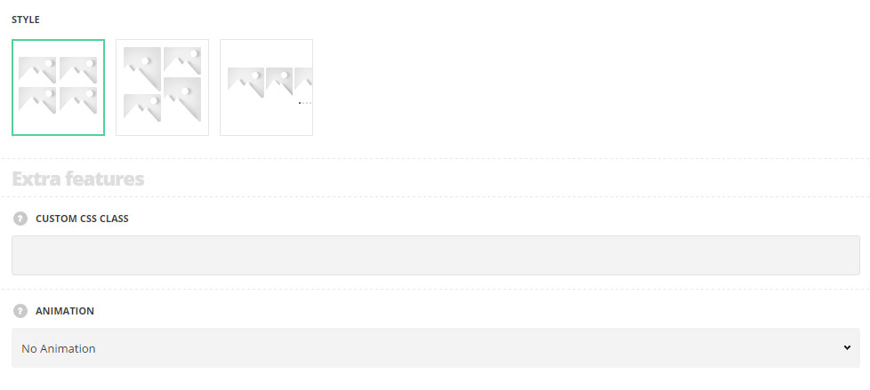
- Style – choose between 3 preset styles.
- Grid – allows you to show regularly spaced horizontal and vertical elements.
- Masonry– select this style to display the elements one after another, first in the horizontal direction, then vertically.
- Carousel – select this style to arrange the images into the carousel slider.
Extra features
- Animation – choose between 14 preset animation effects.
- Custom CSS class – enter our own unique class name for the item – this is a useful option for those who want to create a specific style. E.g.: you can type custom-style class and then go to
Theme optionsGeneral optionsCustom CSS/JSCustom CSSfield and write your own CSS code with this class to get your own style.
Gallery settings
Gallery images

- Images – select as many images as you need to be displayed inside the Simple Image Gallery module.
Content settings
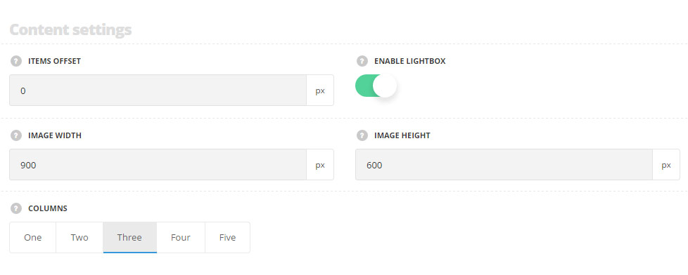
- Items offset – define the offset between the images inside the module.
- Enable lightbox – set the lightbox option for gallery images to Enable, so the images will be opened in the lightbox in original size after click on image.
- Image width – define the image width. This option is used for image resize action.
- Image height – set the image height. This option is used for image resize action. For Grid and Carousel styles only.
- Columns – define the number of columns of the gallery. Five is the maximum number.
- Crop images – set it to Enable, to activate hard image crop option. You will get the slides of equal size without saving image ration if you enable this option. You can also disable it and the images will keep the original aspect ratio in that case. For Carousel style only.
- Autoplay – set it to Enable to activate auto slideshow for the images carousel. For Carousel style only.
- Slides to show – select the number of the images to be displayed in the module. For Carousel style only.
- Slides to scroll – select the number of the images to be scrolled per one time in the module. For Carousel style only.
- Slideshow speed – set the speed of the slideshow in milliseconds. For Carousel style only.
- Pagination – set it to Enable to display the pagination. For Carousel style only.
- Pagination style – select the most suitable pagination dots from the list of available ones.